On desktop (Mac) I like the font size to be 14, but then on mobile (iPhone) 16 is what I like.
I am thinking that maybe using CSS I would be able to do this?
I’m familiar with CSS in general, but still not very familiar with Obsidian approaches this and how (if) this would be possible to achieve?
Found the solution.
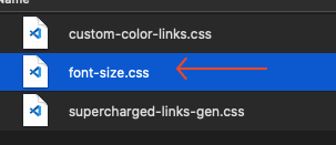
For others looking for the same thing and are new to Obsidian like I am, add a CSS snippet (Preferences > Appearance > CSS Snippets at the bottom).
Then add the following css to the file, adjust the font size per device:
Another solution is to make copies of the .obsidian config folder, rename it to e.g. PC, Mac, mobile, etc. and in the About setting, relaunch with either of these config folders.
The downside is that one needs to manually update individual core settings and plugin store data.json settings across each config folders or write a script that syncs or updates the changes. (Or one can use FreeFileSync to semi-manually update the changes on PC.)
The sync feature is still a bit confusing to me…
So the sync feature is a paid feature, right? But I’m using iCloud and it’s syncing all my notes across my devices. So I’m confused…
And what do you mean by “Obsidian will try to sync the changes done on one device to all your devices.”
?
If the CSS file is targeting each device, how will the sync affect that?
Again, I’m still new to Obsidian and the sync feature is a bit confusing, since I’m able to sync my notes using the free versions of Obsidian
But isn’t the css solution good enough for this particular case?
Also, I noticed that the sidebar wasn’t affected.
After a few changes and tests I was able to achieve it, but I’m sure this is not the right way to do it. I added some classes I found online and I got to this (which is working on my desktop and mobile with the sizes I want). Can you check if there’s stuff that doesn’t need to be there or if I should approach it with different classes?
Unfortunately CSS is not the ideal solution, because now all text will have the same size, including Headings, which is not ideal.
If there’s a way to target all text and resize it proportionally, related to the original size, that would be awesome. I would guess that using percentages or something like that would be the way to go, but I would have to know the right css class that affects all text.
If someone knows this and would like to share it, I’d appreciate it
There are a few ways of going about this depending on what you want to change. You could start with these (adjust the values as desired):
/* body font for Editing and Reading views */
.is-phone :is(.markdown-source-view, .markdown-preview-view) {
    font-size: 1.2em;
}

/* sidebar font and smaller font in search & backlinks results, etc */
.is-phone {
    --nav-item-size: 18px;
    --font-ui-smaller: 15px;
}