This snippet is 100% copied from Minimal.css .
This was inspired by this video that does most of the job but doesn’t take care of the resizing of the Cards if there are only a few of them in a table, or if you want the table to take up the max width. So I had a look at the theme code and copied out everything I thought would be useful. So far it seems it has worked, as I can now access the Minimal Cards section in Style Settings even when not using Minimal theme, so that’s a success. This part is necessary, as far as I can tell for the resizing and max width bit.
One thing I’m not sure if it’s usual is that my Cards now seem to have a bit of white space on the left of the cover image. But I can’t tell if that also occurs in regular Minimal theme version. Maybe someone can tell me.
I thought maybe this is useful to someone. I love Minimal theme, but like the option of using Cards in another theme
Cards.css (60.1 KB)
EDIT fixed the padding on the left!
.table-100 table th:first-child,
.table-100 table td:first-child,
.table-100 .dataview.table-view-table th:first-child,
.table-100 .dataview.table-view-table td:first-child,
.table-100 .markdown-source-view.mod-cm6 td:first-child,
.table-100 .markdown-source-view.mod-cm6 th:first-child {
  padding-left: 20px !important; }
.table-100 table th:last-child,
.table-100 table td:last-child,
.table-100 .dataview.table-view-table th:last-child,
.table-100 .dataview.table-view-table td:last-child {
  padding-right: 20px; }
Turning the padding-left: 20px into padding-left: 0px solved it. I don’t really understand why the padding-right makes no difference in this case. I changed that to 0 too, though it doesn’t seem to make a difference.
Here’s the updated file:Cards.css (60.1 KB)
If anyone knows how to get the Dataview table Cards to show on the full width of the note (as you can do with the Minimal Theme Settings plugin), please let me know
18 Likes
Just wanted to drop a word of thanks. This was something I really wanted to solve and I was able to tweak your work to perfectly solve my problem. Really appreciate it!
1 Like
Would you care to share your tweaks? I haven’t actually moved away from Minimal Theme because with this snippet the cards didn’t take up the whole width of the note /leaf.
Can you send me a screen shot of what you mean? I believe you’re referring to the additional Minimal table helper class to adjust the table which the cards are structured within.
Sorry for the delay!
Here’s a screenshot of my Cards with Minimal Theme:
And here’s the same Cards but with another theme (Shimmering Focus, which I use for all my other Obsidian vaults):
I was referring to the white spaces to the left and right of the Cards.
Thanks
2 Likes
This here will give you the full width of the note by using a cssClass in the frontmatter it will work on just the notes you want: GitHub - efemkay/obsidian-modular-css-layout: CSS Layout hack for Obsidian.md
Thanks, but that doesn’t seem to be working for me. I downloaded (and activated) the wide snippet, but that doesn’t make a difference for me. The white space to the left and right is still there, but somehow I can’t make the comparison with the Minimal theme right now, as there seems to be an issue with that.
Any other ideas?
Fdo1985
November 30, 2023, 7:08pm
8
I installed the snippet but when I try to execute it in my vault, the result is this:
Does anyone knows the solution?
ariehen
November 30, 2023, 7:55pm
9
If you are using Obsidian v1.5+, you’ll need to get the new version from Minimal’s GitHub page.
Convert the cards scss to css, or copy the relevant sections out of Minimal’s main.css
3 Likes
Thanks for posting this CSS file!
One issue I would like to point out that others may also be experiencing:
The CSS file you’ve provided overwrites the “readable line length” setting and enforces wide page for all notes in your vault. This behaviour is quite likely not ideal for most people. You would only want wide pages for certain dashboard or dataview pages.
At line 486 of the original file:
/* With readable line width */
/*.markdown-preview-view.is-readable-line-width .markdown-preview-sizer {
  max-width: var(--max-width);
  width: var(--line-width-adaptive);
  padding-left: 0; }

.markdown-source-view.is-readable-line-width .CodeMirror {
  padding-left: 0;
  padding-right: 0;
  margin: 0 auto 0 auto;
  width: var(--line-width-adaptive);
  max-width: var(--max-width); }
This part should be commented out so that it does not overwrite the readable line length setting.
In order to allow some notes to be wide-page, a better approach would be to add in dedicated “wide-page” snippet which I found from this GitHub repo . Just add this style tag to the movie database note.
1 Like
Biliaa
December 29, 2023, 5:46pm
12
Here Is A Working Css File.
:root {
  --cards-min-width: 180px;
  --cards-max-width: 1fr;
  --cards-mobile-width: 120px;
  --cards-image-height: 400px;
  --cards-padding: 1.2em;
  --cards-image-fit: contain;
  --cards-background: transparent;
  --cards-border-width: 1px;
  --cards-aspect-ratio: auto;
  --cards-columns: repeat(auto-fit, minmax(var(--cards-min-width), var(--cards-max-width))); }

  @media (max-width: 400pt) {
    body {
      --cards-min-width:var(--cards-mobile-width); } }
  .cards.table-100 table.dataview tbody,
  .table-100 .cards table.dataview tbody {
    padding: 0.25rem 0.75rem; }

  .cards table.dataview {
    --table-width: 100%;
    --table-edge-cell-padding-first: calc(var(--cards-padding)/2);
    --table-edge-cell-padding-last: calc(var(--cards-padding)/2);
    --table-cell-padding: calc(var(--cards-padding)/3) calc(var(--cards-padding)/2);
    line-height: 1.3; }
    .cards table.dataview tbody {
      clear: both;
      padding: 0.5rem 0;
      display: grid;
      grid-template-columns: var(--cards-columns);
      grid-column-gap: 0.75rem;
      grid-row-gap: 0.75rem; }
    .cards table.dataview > tbody > tr {
      background-color: var(--cards-background);
      border: var(--cards-border-width) solid var(--background-modifier-border);
      display: flex;
      flex-direction: column;
      margin: 0;
      padding: 0 0 calc(var(--cards-padding)/3) 0;
      border-radius: 6px;
      overflow: hidden;
      transition: box-shadow 0.15s linear;
      max-width: var(--cards-max-width);
      height: auto; }
    .cards table.dataview > tbody > tr:hover {
      border: var(--cards-border-width) solid var(--background-modifier-border-hover);
      box-shadow: 0 4px 6px 0px rgba(0, 0, 0, 0.05), 0 1px 3px 1px rgba(0, 0, 0, 0.025);
      transition: box-shadow 0.15s linear; }
    .cards table.dataview tbody > tr > td {
      /* Paragraphs */
      /* Links */
      /* Buttons */
      /* Lists */
      /* Images */ }
  .cards table.dataview tbody > tr > td:first-child {
    font-weight: var(--bold-weight); }
  .cards table.dataview tbody > tr > td:first-child a {
    padding: 0 0 calc(var(--cards-padding)/3);
    display: block; }
  .cards table.dataview tbody > tr > td:not(:first-child) {
    font-size: 90%;
    color: var(--text-muted); }
  .cards table.dataview tbody > tr > td .el-p {
    display: block;
    width: 100%; }
  .cards table.dataview tbody > tr > td > *:not(.el-embed-image) {
    padding: calc(var(--cards-padding)/3) 0; }
  .cards table.dataview tbody > tr > td:not(:last-child):not(:first-child) > .el-p:not(.el-embed-image) {
    border-bottom: 1px solid var(--background-modifier-border);
    width: 100%; }
  .cards table.dataview tbody > tr > td a {
    text-decoration: none; }
  .cards table.dataview tbody > tr > td > button {
    width: 100%;
    margin: calc(var(--cards-padding)/2) 0; }
  .cards table.dataview tbody > tr > td:last-child > button {
    margin-bottom: calc(var(--cards-padding)/6); }
  .cards table.dataview tbody > tr > td > ul {
    width: 100%;
    padding: 0.25em 0 !important;
    margin: 0 auto !important; }
  .cards table.dataview tbody > tr > td:not(:last-child) > ul {
    border-bottom: 1px solid var(--background-modifier-border); }
  .cards table.dataview tbody > tr > td .el-embed-image {
    background-color: var(--background-secondary);
    display: block;
    margin: 0 calc(var(--cards-padding)/-2) 0 calc(var(--cards-padding)/-2);
    width: calc(100% + var(--cards-padding)); }
  .cards table.dataview tbody > tr > td img {
    aspect-ratio: var(--cards-aspect-ratio);
    width: 100%;
    object-fit: var(--cards-image-fit);
    max-height: var(--cards-image-height);
    background-color: var(--background-secondary);
    vertical-align: bottom; }

.markdown-source-view.mod-cm6.cards .dataview.table-view-table > tbody > tr > td,
.trim-cols .cards table.dataview tbody > tr > td {
  white-space: normal; }

.cards .dataview.table-view-table > tbody > tr > td,
.cards table.dataview tbody > tr > td,
.markdown-source-view.mod-cm6.cards .dataview.table-view-table > tbody > tr > td,
.markdown-source-view.mod-cm6.cards table.dataview tbody > tr > td {
  border-bottom: none;
  padding: 0 !important;
  line-height: 1.2;
  width: calc(100% - var(--cards-padding));
  margin: 0 auto;
  overflow: visible !important;
  max-width: 100%;
  display: flex; }

.links-int-on .cards table.dataview tbody > tr > td a {
  text-decoration: none; }

/* Block button */
.markdown-source-view.mod-cm6.cards .edit-block-button {
  top: 0px; }

/* ------------------- */
/* Sorting menu */
.cards.table-100 table.dataview thead > tr,
.table-100 .cards table.dataview thead > tr {
  right: 0.75rem; }

.table-100 .cards table.dataview thead:before,
.cards.table-100 table.dataview thead:before {
  margin-right: 0.75rem; }

.theme-light .cards table.dataview thead:before {
  background-image: url('data:image/svg+xml;utf8,<svg xmlns="http://www.w3.org/2000/svg" fill="none" viewBox="0 0 100 100"><path fill="black" d="M49.792 33.125l-5.892 5.892L33.333 28.45V83.333H25V28.45L14.438 39.017L8.542 33.125L29.167 12.5l20.625 20.625zm41.667 33.75L70.833 87.5l-20.625 -20.625l5.892 -5.892l10.571 10.567L66.667 16.667h8.333v54.883l10.567 -10.567l5.892 5.892z"></path></svg>'); }

.cards .el-pre + .el-lang-dataview .table-view-thead {
  padding-top: 8px; }
.cards table.dataview thead {
  user-select: none;
  width: 180px;
  display: block;
  float: right;
  position: relative;
  text-align: right;
  height: 24px;
  padding-bottom: 4px; }
.cards table.dataview thead:hover:before {
  opacity: 0.5;
  background-color: var(--background-modifier-hover); }
.cards table.dataview thead:before {
  content: '';
  position: absolute;
  right: 0;
  top: 0;
  width: 10px;
  height: 16px;
  background-repeat: no-repeat;
  cursor: var(--cursor);
  text-align: right;
  padding: var(--size-4-1) var(--size-4-2);
  margin-bottom: 2px;
  border-radius: var(--radius-s);
  font-weight: 500;
  font-size: var(--font-adaptive-small);
  opacity: 0.25;
  background-position: center center;
  background-size: 16px;
  background-image: url('data:image/svg+xml;utf8,<svg xmlns="http://www.w3.org/2000/svg" fill="none" viewBox="0 0 100 100"><path fill="white" d="M49.792 33.125l-5.892 5.892L33.333 28.45V83.333H25V28.45L14.438 39.017L8.542 33.125L29.167 12.5l20.625 20.625zm41.667 33.75L70.833 87.5l-20.625 -20.625l5.892 -5.892l10.571 10.567L66.667 16.667h8.333v54.883l10.567 -10.567l5.892 5.892z"></path></svg>'); }
.cards table.dataview thead > tr {
  top: -1px;
  position: absolute;
  display: none;
  z-index: 9;
  border: 1px solid var(--background-modifier-border-hover);
  background-color: var(--background-secondary);
  box-shadow: var(--shadow-s);
  padding: 6px;
  border-radius: var(--radius-m);
  flex-direction: column;
  margin: 26px 0 0 0;
  width: 100%; }
.cards table.dataview thead:hover > tr {
  display: flex; }
.cards table.dataview thead > tr > th {
  display: block;
  padding: 3px 30px 3px 6px !important;
  border-radius: var(--radius-s);
  width: 100%;
  font-weight: 400;
  color: var(--text-normal);
  cursor: var(--cursor);
  border: none;
  font-size: var(--font-ui-small); }
.cards table.dataview thead > tr > th[sortable-style="sortable-asc"],
.cards table.dataview thead > tr > th[sortable-style="sortable-desc"] {
  color: var(--text-normal); }
.cards table.dataview thead > tr > th:hover {
  color: var(--text-normal);
  background-color: var(--background-modifier-hover); }

/* ------------------- */
/* Helper classes */
.cards.cards-16-9 {
  --cards-aspect-ratio: 16/9; }
.cards.cards-1-1 {
  --cards-aspect-ratio: 1/1; }
.cards.cards-2-1 {
  --cards-aspect-ratio: 2/1; }
.cards.cards-2-3 {
  --cards-aspect-ratio: 2/3; }
.cards.cards-cols-1 {
  --cards-columns: repeat(1, minmax(0, 1fr)); }
.cards.cards-cols-2 {
  --cards-columns: repeat(2, minmax(0, 1fr)); }
.cards.cards-cover table.dataview tbody > tr > td img {
  object-fit: cover; }
.cards.cards-align-bottom table.dataview tbody > tr > td:last-child {
  align-items: flex-end;
  flex-grow: 1; }

@media (max-width: 400pt) {
  .cards table.dataview tbody > tr > td:not(:first-child) {
    font-size: 80%; } }
@media (min-width: 400pt) {
  .cards-cols-3 {
    --cards-columns: repeat(3, minmax(0, 1fr)); }

  .cards-cols-4 {
    --cards-columns: repeat(4, minmax(0, 1fr)); }

  .cards-cols-5 {
    --cards-columns: repeat(5, minmax(0, 1fr)); }

  .cards-cols-6 {
    --cards-columns: repeat(6, minmax(0, 1fr)); }

  .cards-cols-7 {
    --cards-columns: repeat(7, minmax(0, 1fr)); }

  .cards-cols-8 {
    --cards-columns: repeat(8, minmax(0, 1fr)); } }
6 Likes
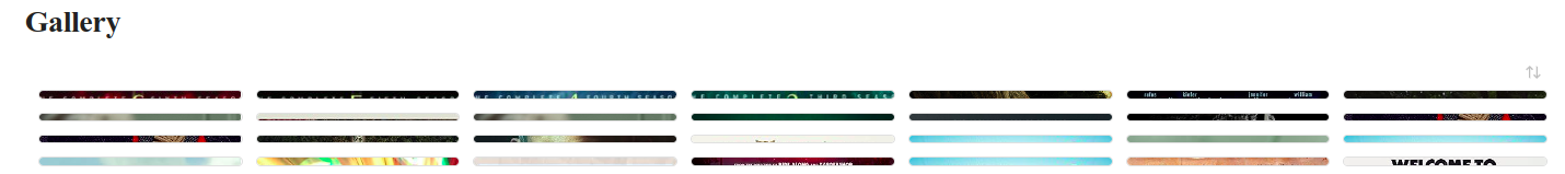
This only gives me three cards in a line. Plus since one of the newest Obsidian updates I’m only getting really flat “cards”:
Each of those lines should be a whole card which includes text and an image. Currently my cards only show correctly in Minimal Theme. Any ideas?
2 Likes
It must be that the css is not updated for obsidian 1.5+. Use the css Biliaa gave before(it works from my testing)
1 Like
sebarey
January 1, 2024, 11:39pm
15
Only three items in a row are visible with Biliaa snippet.
This works very well for me (things theme + obsidian-1.5.3). Great! Thanks very much.
I’m having the same issue. All the cards are short like that.
I’ve used CSS from GitHub - efemkay/obsidian-modular-css-layout: CSS Layout hack for Obsidian.md and for a note added property cssclasses with value wide-table and now it’s whole width. You can also add this globally.
Works with all themes in Obsidian 1.5!
Is there a way to make these cards show the note preview?
1 Like