Really nice! I like it a lot–love the font.
Two issues I’m seeing:
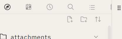
- Padding of sidebar tabs is rather extreme. At the top of this screenshot you can see how much space is between the tab icons; such that one of the icons is nearly completely crowded out of visibility; it has been pushed past the right edge of the sidebar.
- Highlighted text, due to the text styling, looks kind of blurry and is hard to read. IMO, doesn’t match the feel of the rest of the theme. Maybe this is borderline up to personal preference, but maybe you will think it’s a little hard to read too. See example.
![]()
Thanks for a cool theme!