Right scrollbar (of the note) too small after clicking

I have this css snippet for the scrollbars

.theme-dark  {
  --scrollbar-active-thumb-bg: #c81c8088;  /* backgroundcolor of the active thumb */
  --scrollbar-thumb-bg: none;
  /*--scrollbar-bg: ; */
}

/* dark-mode, not hover */
.theme-dark ::-webkit-scrollbar-thumb:not(:hover),
.theme-dark ::-webkit-scrollbar:not(:hover)  {
  --scrollbar-thumb-bg: var(--scrollbar-active-thumb-bg); /* backgroundcolor, not hover */
  width: 1.3em !important; /* <--- the problem */
}

/* dark-mode, hover */
.theme-dark ::-webkit-scrollbar-track:hover  {
  background-color: var(--scrollbar-bg) !important; /* backgroundcolor, hover */
}

When I click the right scrollbar, its size gets to (standard) small.

Before clicking the right scrollbar (ok)

After clicking the right scrollbar (not ok)

When I click into the text of the note, the scrollbar is broad again.

What can I do to solve this issue?

(Tried with windows 10, my productive vault and with a small test vault. Standard theme and MagicUser theme tested.)

1 Like

Can you briefly explain what you’d like to happen with the scrollbar?

For example, it is always larger and has a custom color no matter if you are using it or not? It only gets wider when you click on it and scroll? Something like that could help.

Thank you very much for your request.

I would like to achieve the following:

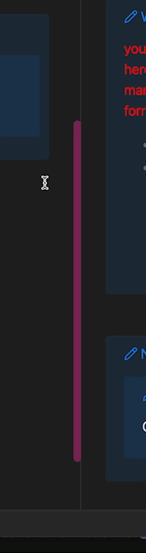
(Only) the thumb should always be visible, so that I always know where I am in the displayed window. If I am in a note, the colored thumb shows me that I am approximately in the middle of the text, for example. If I am in the left-hand window, I can see how much of the display is above and how much is below the thumb.

However, the track disturbs the visual appearance. It should only appear when I need it. This is when I hover over or click on the thumb or the (not yet visible) track.

If I do not need the thumb, it should be displayed narrowly (default width). (I just want to always see where I am in relative terms.) The track should not be displayed at all in normal cases. Only when I click on the thumb or the (invisible) track hover or one of both should the track and thumb be displayed. But then in a larger width so that I can click on them easily. (I have difficulty “hitting” the thumb or track, which is too thin for me).

1 Like

You could try playing around with this to see if it’s closer to what you are looking for:

.theme-dark  {
    --scrollbar-active-thumb-bg: #c81c8088; 
    --scrollbar-thumb-bg: transparent;
}

body.theme-dark ::-webkit-scrollbar {
    width: 10px;
}

body.theme-dark ::-webkit-scrollbar:hover {
    background-color: var(--scrollbar-bg);
    -webkit-border-radius: var(--radius-l);
    width: 1.1em;
}

body.theme-dark ::-webkit-scrollbar-thumb {
    background-color: var(--scrollbar-active-thumb-bg);
    -webkit-border-radius: var(--radius-l);
}

CleanShot 2024-05-11 at 09.38.49

1 Like

Also, this is the entire section controlling scrollbars from the app.css. The CSS above only includes the sections needed to get that result. If you are looking to adjust further, you may need to add another section or two to your snippet to overwrite the defaults.

body:not(.native-scrollbars) ::-webkit-scrollbar {
  background-color: var(--scrollbar-bg);
  width: 12px;
  height: 12px;
  -webkit-border-radius: var(--radius-l);
  background-color: transparent;
}
body:not(.native-scrollbars) ::-webkit-scrollbar-track {
  background-color: transparent;
}
body:not(.native-scrollbars) ::-webkit-scrollbar-thumb {
  background-color: var(--scrollbar-thumb-bg);
  -webkit-border-radius: var(--radius-l);
  background-clip: padding-box;
  border: 2px solid transparent;
  border-width: 3px 3px 3px 2px;
  min-height: 45px;
}
body:not(.native-scrollbars) ::-webkit-scrollbar-thumb:active {
  -webkit-border-radius: var(--radius-l);
}
body:not(.native-scrollbars) ::-webkit-scrollbar-thumb:hover,
body:not(.native-scrollbars) ::-webkit-scrollbar-thumb:active {
  background-color: var(--scrollbar-active-thumb-bg);
}
body:not(.native-scrollbars) ::-webkit-scrollbar-corner {
  background: transparent;
}
@supports not selector(::-webkit-scrollbar) {
  body:not(.native-scrollbars) {
    scrollbar-width: thin;
    scrollbar-color: var(--scrollbar-thumb-bg) var(--scrollbar-bg);
  }
}
1 Like

Thanks for your help.

Now I have the following code with these issues:

.theme-dark  {
    --scrollbar-active-thumb-bg: #c81c8088; 
    --scrollbar-thumb-bg: transparent;
}

body.theme-dark ::-webkit-scrollbar {
width: 15px;
}

body.theme-dark ::-webkit-scrollbar:hover,
body.theme-dark ::-webkit-scrollbar:active
 {
    background-color: var(--scrollbar-bg);
    -webkit-border-radius: var(--radius-l);
    width: 30px;
}

body.theme-dark ::-webkit-scrollbar-thumb {
    background-color: var(--scrollbar-active-thumb-bg);
    -webkit-border-radius: var(--radius-l);
}

I’m working with notepad++ on the left to change the css and Obsidian on the right to see the effects.

Obsidian’s right scrollbar only works when I click on the thumb or track. It should also work on hover.

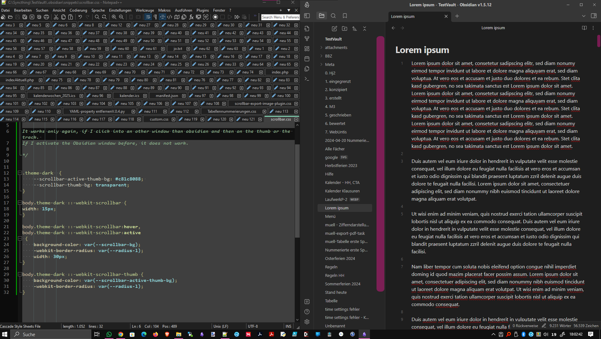
The left scrollbar works like the right one, but only the first time after changing and saving my CSS code and when I click on it next. The width is reset to 15px when I click in another window of another application (in my case: notepad++).

It only works again when I click in a window other than Obsidian and then click on the thumb or track.

If I activate the Obsidian window beforehand, the width change does not work.

KI didn’t help, so I need some of your HI (human intelligence). :wink:

1 Like

Thanks for using MagicUser theme. If you need any help to configure this you can open an issue on its repository, so I can try to help more. Please find below the code and let me know if this is the type of effect you are looking for.

.theme-dark {
  --scrollbar-active-thumb-bg: #d300d382;
  --scrollbar-thumb-bg: #a300a382;
}

body:not(.native-scrollbars) div::-webkit-scrollbar {
  width: 15px;
}

body:not(.native-scrollbars) div:hover::-webkit-scrollbar {
  width: 30px;
}

body:not(.native-scrollbars) ::-webkit-scrollbar-thumb:hover,
body:not(.native-scrollbars) ::-webkit-scrollbar-thumb:active {
  background-color: var(--scrollbar-active-thumb-bg);
}

All the best

1 Like

Well, I am posting this here too, it is an update to the code above after reading your post (repository).

.theme-dark {
  --scrollbar-active-thumb-bg: #d300d382;
  --scrollbar-thumb-bg: #a300a382;
}

body:not(.native-scrollbars) ::-webkit-scrollbar {
  width: 15px;
}

body:not(.native-scrollbars) ::-webkit-scrollbar-thumb:hover,
body:not(.native-scrollbars) ::-webkit-scrollbar-thumb:active {
  background-color: var(--scrollbar-active-thumb-bg);
  border: 10px solid var(--scrollbar-active-thumb-bg);
  outline: 10px solid var(--scrollbar-active-thumb-bg);
}

I hope it helps. I can polish it more too.

EDIT: I updated the code.

All the best

1 Like

Here is a solution with 30px scrollbar width. I hope you find it easier to use.

.theme-dark {
  --scrollbar-active-thumb-bg: #d300d382;
  --scrollbar-thumb-bg: #a300a382;
}

body:not(.native-scrollbars) ::-webkit-scrollbar {
  width: 30px;
}

body:not(.native-scrollbars) ::-webkit-scrollbar-thumb {
  border: 8px solid transparent;
}

body:not(.native-scrollbars) ::-webkit-scrollbar-thumb:hover,
body:not(.native-scrollbars) ::-webkit-scrollbar-thumb:active {
  background-color: var(--scrollbar-active-thumb-bg);
  border: 8px solid var(--scrollbar-active-thumb-bg);
}

All the best

Now perfectly integrated and adjustable into MagicUser Theme.

Many thanks to Bernardo Pires drbap for implementing!

1 Like

This topic was automatically closed 7 days after the last reply. New replies are no longer allowed.