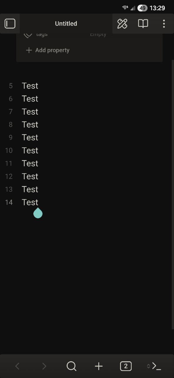
Here is some CSS for those like me who dislike the new mobile floating UI and the very aggressive radius/rounding. The header and navbar are now pinned to the top and bottom, and stretch across the screen. Unfortunately, Obsidian draws content underneath the Android status bar (I personally dislike when apps do this) so I had to use a safe area calculation for the top margin on the header.
For rounding, I tried targeting just specific elements but it was taking too much time in the dev console to locate every single radius var so I just nuclear. If you open the dev console and inspect elements, you can see the radius vars being applied and target specific ones if you want to keep some rounding. I personally like the more boxy look, but to each their own.
/* disable floating from mobile navbar and view header */
.mobile-navbar {
  border-radius: 0 !important;
  opacity: 1 !important;
  margin: 0 !important;
  position: fixed !important;
  bottom: 0 !important;
  max-width: none !important;
  width: 100% !important;
}

.view-header {
  background-color: var(--background-secondary) !important;
  opacity: 1 !important;
  margin: var(--safe-area-inset-top, 0) 0 0 0 !important;
  padding: 0 !important;
}

/* correct aggresive radius app wide */
* {
  border-radius: 3px !important;
}