Copying css examples on the web and importing them in obsidian. Without success so far
What I’m trying to do
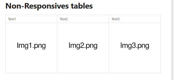
I’m using tables a lot with images and embeds, but when on mobile there is not enough horizontal space to display all of the columns and I have to do an horizontal scroll.
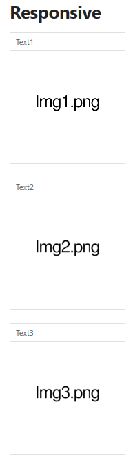
I’d like to make the columns stack on top of each others when there is not enough horizontal space so it is still readable. Preferably using only css but that’s not absolutely necessary.
Can u share that example? I feel like slicing table by column likely not possible with css only. Btw r u using table just for layout purposes? Perhaps using obsidian columns plugin can help with that and be responsive. If u don’t want plugin, use callout with custom css as layout hack n make it responsive
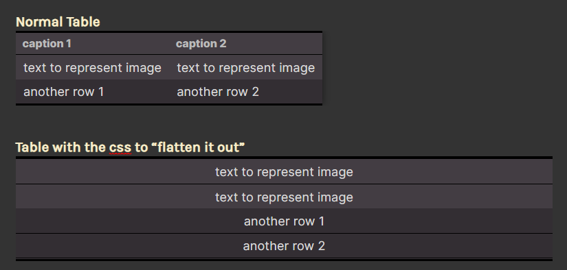
Edit fiddle - JSFiddle - Code Playground (pure css, in this one it is the row that transform into column and stack on top of each other, this is not exactly what I want)
yeah. what i mentioned earlier is that u r expecting it to “slice” the columns but the css can only “slice” the rows. see screenshot below. without js to rearrange the table structure and then only css able to make that. if it ever possible with css alone, potentially will be very extensive in my opinion
slice here referring to making the columns stays as column just separated (like your screenshot). the css example u give turns every row into a block which then sort of behave like a column