I have replaced plugins using notes pinned to sidebars. For instance, I decided to replace the Dangling links panel plugin with a pinned note that would do the job. The plugin works fine, but it has not been updated in 2 years, and I wanted to stop depending on it.
The pinned note even has its own custom icon.
I started with a custom note (which uses the Obsidian Dataview plugin:
---
title: Dangling Links
cssclasses: dangle-dashboard
---
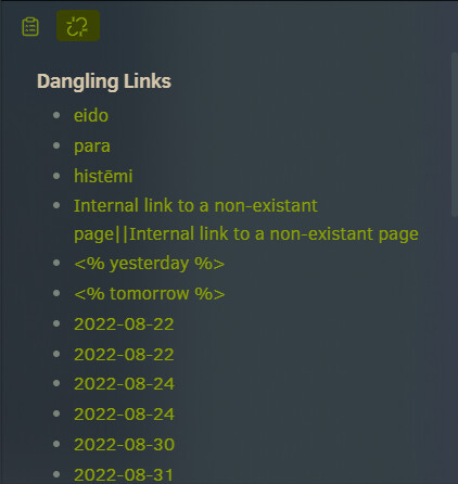
# Dangling Links
```dataviewjs
let r = Object.entries(dv.app.metadataCache.unresolvedLinks).filter(([k,v])=>Object.keys(v).length) .flatMap(([k,v]) => Object.keys(v).map(x=>dv.fileLink(x)));
dv.list([...new Set(r)]);
```
I opened the note in ‘Reading’ mode and dragged its tab to place it on a sidebar.
Next, I styled the sidebar panel using a custom CSS snippet:
/* Dangling Links Panel */

/* Remove extra whitespace */
.mod-right-split .markdown-preview-view.markdown-rendered.dangle-dashboard {
  padding-top: 0;
}

.mod-right-split .markdown-preview-view.markdown-rendered.dangle-dashboard h1 {
  margin-top: 0;
  margin-bottom: 6px;
}

.mod-right-split .markdown-preview-view.markdown-rendered.dangle-dashboard ul {
  margin-block-start: 0;
  margin-block-end: 0;
}

/* Expand lines to full width (requires Contextual Typography plugin) */
.contextual-typography .markdown-preview-view.is-readable-line-width.dangle-dashboard .markdown-preview-sizer>div
{
  --max-width: 100%
}

/* Add a custom icon to the tab */
.workspace-tab-header[aria-label="Dashboard - Dangling Links"] .workspace-tab-header-inner-icon {
  content: "";
  height: 20px;
  width: 20px;
  background-repeat: no-repeat;
  background-position-y: 2px;
  background-image: url("data:image/svg+xml,%3Csvg xmlns='http://www.w3.org/2000/svg' width='24' height='24' viewBox='0 0 24 24' fill='none' stroke='%23879a09' stroke-width='2' stroke-linecap='round' stroke-linejoin='round'%3E%3Cpath d='m18.84 12.25 1.72-1.71h-.02a5.004 5.004 0 0 0-.12-7.07 5.006 5.006 0 0 0-6.95 0l-1.72 1.71'%3E%3C/path%3E%3Cpath d='m5.17 11.75-1.71 1.71a5.004 5.004 0 0 0 .12 7.07 5.006 5.006 0 0 0 6.95 0l1.71-1.71'%3E%3C/path%3E%3Cline x1='8' y1='2' x2='8' y2='5'%3E%3C/line%3E%3Cline x1='2' y1='8' x2='5' y2='8'%3E%3C/line%3E%3Cline x1='16' y1='19' x2='16' y2='22'%3E%3C/line%3E%3Cline x1='19' y1='16' x2='22' y2='16'%3E%3C/line%3E%3C/svg%3E");
  background-size: 18px 18px;
}

/* Remove the pin and the native file icon */
.workspace-tab-header[aria-label="Dashboard - Dangling Links"] .workspace-tab-header-status-container,
.workspace-tab-header[aria-label="Dashboard - Dangling Links"] .workspace-tab-header-inner-icon svg {
  display: none;
}
A few notes about the snippet:
- The aria-label in the icon section is the filename of the pinned note.
- The icon is SVG image (I use icons from Lucide to be consistent with Obsidian native icons). You must URL encode the SVG (I use this encoder.)
- In the last section, the first line (ending in “status-container”) hides the
Pinnedindicator. - In the encoded SVG the “stroke=” value is the render color of the icon. The last six characters inside the quotes is the HEX color code. So, to render the icon black (
#000000) it would bestroke="%23000000"
Activate the snippet and enjoy.