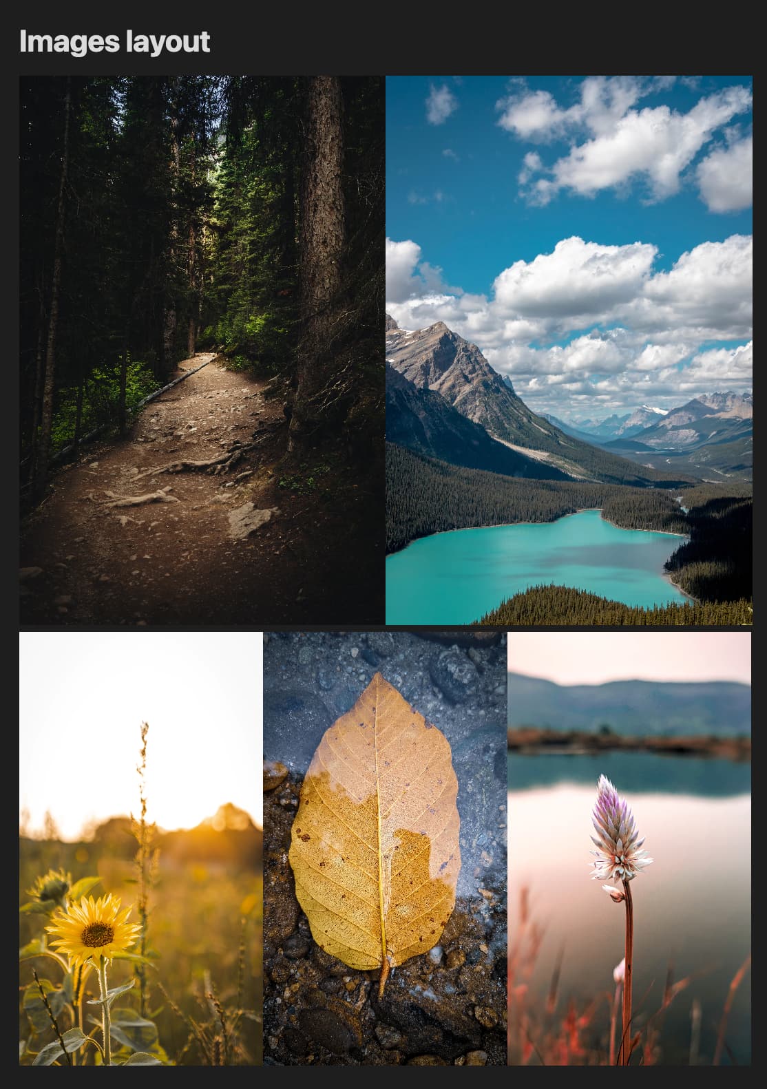
Embedded images can be scaled using the ![[image.png|100x100]] syntax.
It would be useful to also be able to use a percentage or [0,1] number in order to specify a relative size.
It’s easier for me to immediately realize that I need to resize an image to about half its width, while I usually have to try&err in order to find a good px size.
Proposed solution
![[image.png|50%]]
![[image.png|0.5]]
![[image.png|100%x50%]]
The question arises of relative to what? Window width? Or original image size? I would say the second one, since it’s more predictable.
When you import photos of any type, you can set the size in pixles.
That is a static measurement and does not take into account the width of the frame.
Proposed solution
Instead of a fixed size in px units,
![[Pasted image 20230217023409.png|250]]
add functionality to support a % of the images original size.
![[Pasted image 20230217023409.png|50%]]
Can be done with CSS currently.
I don’t think modifying the aspect ratio will apply to many users, so probably ok to skim over the need for a (width x height) field.
Set the width to a % and the height to auto.
Current workaround (optional)
Set the image size in px to a “workable” size, and just suck it up.
I actually would understand this as generating an image 50% of the text width, like in CSS. This would actually be great to create some cool layouts for pictures.
This is not very elegant because it assumes the user knows the text width. Furthermore, this text width is not constant across devices. So the layout is broken on smartphones.
I’m using a Macbook Pro, which has a 2x scaling for its built-in Retina display monitor. When I capture a screenshot and paste it into Obsidian, the image dimensions displayed in Obsidian would be significantly larger. For example:
It would indeed be nice if one could have a relative reduction in figure size, such that an image scales properly within the column irrespective of the display width and resolution.
A better workaround is to add some whitespace yourself to the sides of the image, using a graphics editor. Then the image will display consistently on displays with different resolution.