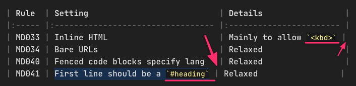
I use JetBrains-Mono as my Obsidian editor font. One thing that’s nagging me is when lines have a mix of styles due to backticks, it throws off the vertical alignment (see image below for example).
I’m assuming this is a case of “it is what it is” but I’m really not very skilled at CSS. I was hoping one of the gurus here might know if this can be remedied by some CSS wizardry.
Being a monospaced typeface, all characters should have equal widths at the same font size, even the back ticks. But the tag seems to be smaller than the rest, and that would be a reason for the misalignment.
Try this one
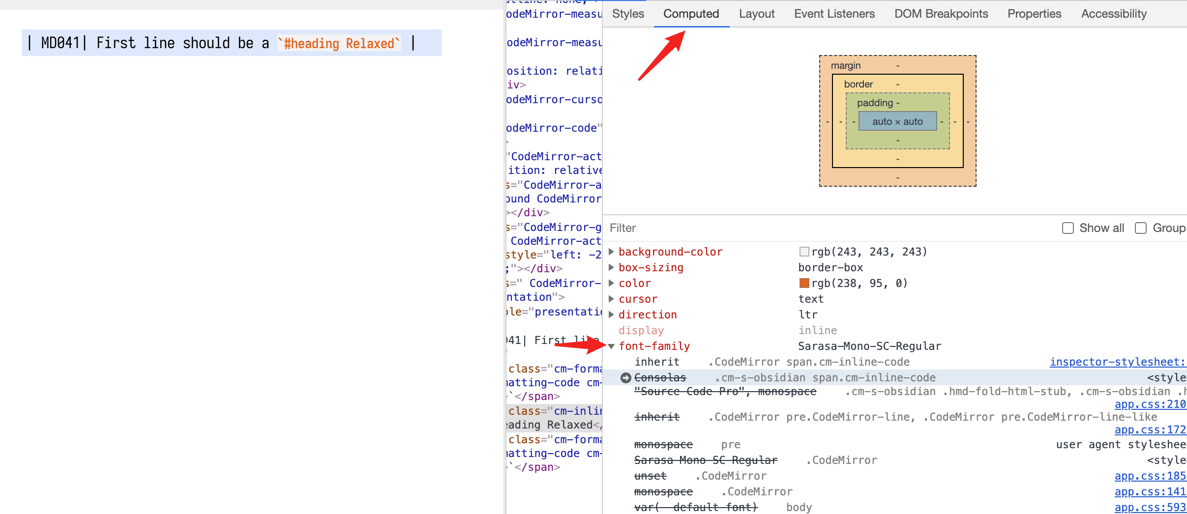
.CodeMirror span.cm-inline-code {
    font-family: inherit;
}
You can always use DevTools (option+command+i in macOS) to check which line in CSS codes is causing the problem.