Just going to play out what I think would be cool:
I’d like:
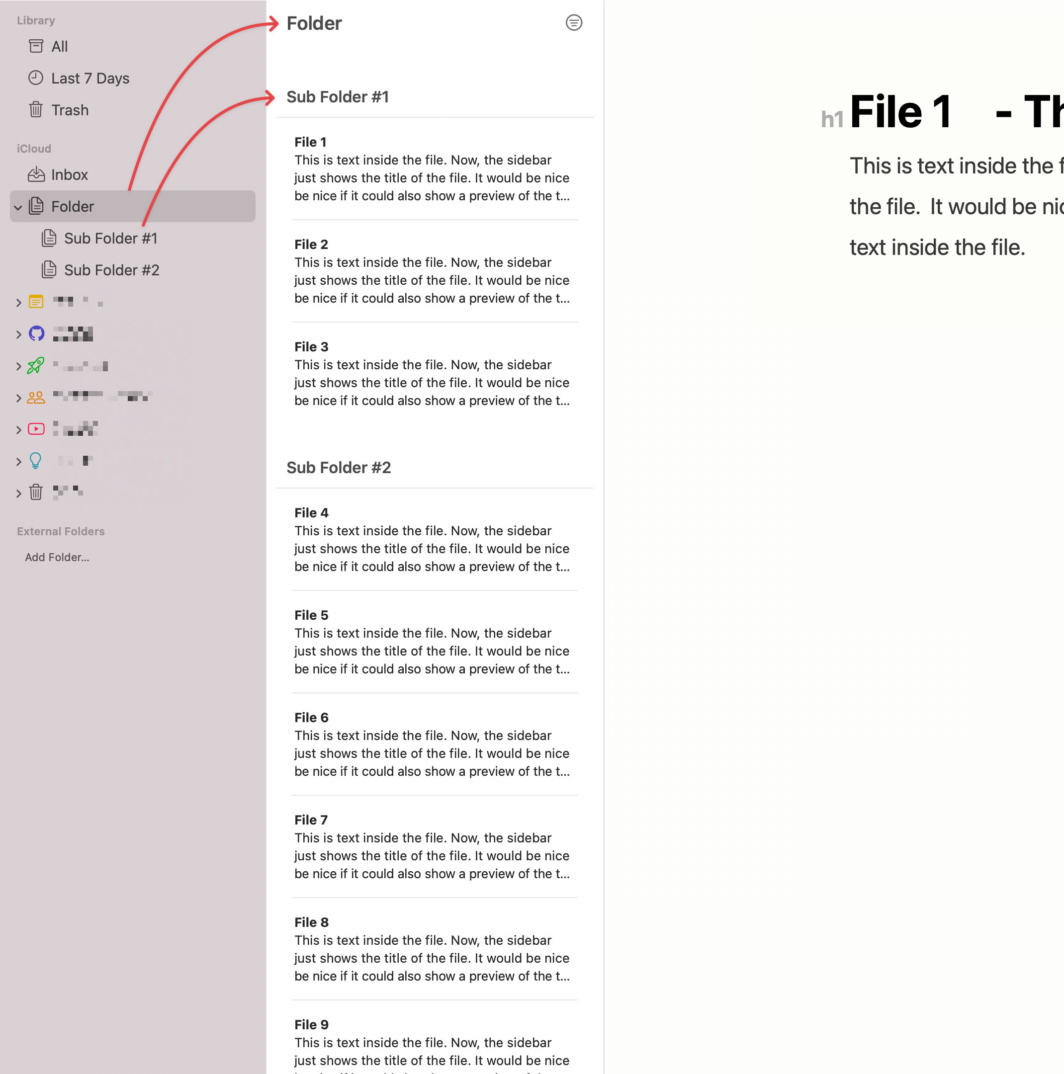
- A “Folder Sidebar” — on far left.
- that shows all top-level folders in vault.
- A “Folder Contents Sidebar” — next to the Folder Sidebar.
- that shows all folders & files inside the top-level folder…
- when you
- select a folder in the far-left Folder Sidebar.
In the “Folder Contents Sidebar”, I’d like:
- “File Thumbnails” to display:
- A File’s Title.
- A File’s Body Content (maybe 100-200 characters).
What do you think?
Can this be done?