Everytime you click on different nodes on the graphview it re-renders & re-arrange the nodes on each click. I find this re-arrangment action disorienting. It makes it extremely difficult to use GraphView as a navigate tool.
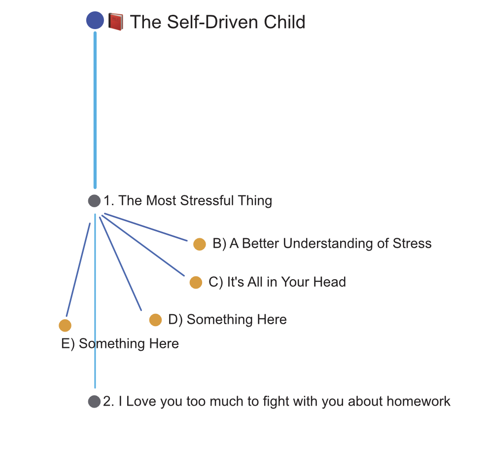
Take this book notes for example. I start off with main Book node where its located by its self at the top. This clearly tells me the information starts here.

As I move through chapter 1, 2. GraphView gets realigned and now the main Book node gets bunched up with other child nodes. Which in my opion loses the infomation hierarchy. Now all suddenly the graph suggest that information sprung from chapter 1 rather than the main book…

Is your feature request related to a problem? Please describe.
I wish GraphView can be used as an navigation and also provid visual representation of information structure. Imagin on a more expanded subject, the GraphView just becomes circular blob of nodes that I often get lost and confused.
Evertime it refreshes, you have to put extra effor to find where you come from and where you want to go. Whats even more frustrating is often after GraphView refreshes your nodes gets barried behind other nodes, you have to maually swril the nodes around to see everything…
Describe the solution you’d like
Give a ![]() pin option so we can lock the view and have it not re-arrange. This way we can clearly see informations structure and navigate from it
pin option so we can lock the view and have it not re-arrange. This way we can clearly see informations structure and navigate from it
Alternative solution
Or adjust GraphView where it can identify parent & child relationships between docs. And have it render nodes more closely to that relationship.
This is what it looks like default when I click on main book page. Does provide much insight how information is structured.

IMO, the following clearly shows the parent child and siblings documents.
Thank you