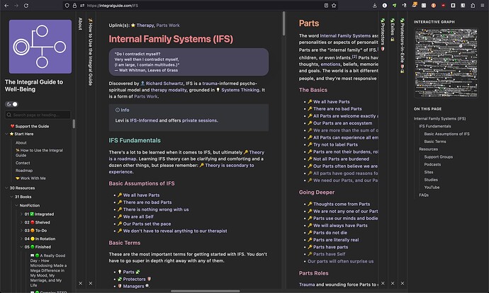
Sliding panes currently look like dis:
Use case or problem
Vertical Title Bars
The active (most recently interacted with) pane in this screenshot is the “Internal Family Systems (IFS)” note, but you’ll notice the vertical title bar is completely absent. At first glance even I thought the title bar for “![]() How to Use the Integral Guide” was the title bar for the “Internal Family Systems (IFS)” note. The bar is also missing from the “Parts” note to the right of the “Internal Family Systems (IFS)” note, which is causing even more confusion.
How to Use the Integral Guide” was the title bar for the “Internal Family Systems (IFS)” note. The bar is also missing from the “Parts” note to the right of the “Internal Family Systems (IFS)” note, which is causing even more confusion.
Not only is the bar missing, but so too is the small x near the bottom that one might click to close a pane. So if someone were to click the x in the “![]() How to Use the Integral Guide” title bar thinking they were closing the “Internal Family Systems (IFS)” note, they would close the wrong pane, making things more confusing, and not even remember what the other pane was. Yet, eve though the x is missing from those two panes, it still works if you click the spot where it ought to be.
How to Use the Integral Guide” title bar thinking they were closing the “Internal Family Systems (IFS)” note, they would close the wrong pane, making things more confusing, and not even remember what the other pane was. Yet, eve though the x is missing from those two panes, it still works if you click the spot where it ought to be.
Distinct Active Panes
A reader has told me it’s difficult to tell which of the sliding panes is the current active pane.
Proposed solution
Vertical Title Bars
I request an update that adds these vertical bars to both the active and adjacent panes, including the x, to bring more visual consistency and clarity to Publish.
Distinct Active Panes
The same reader has suggested that the active pane be somehow distinct. Perhaps given a brighter or distinctly colored border.
![]()
