Obsidian October 2021 daily progress and learnings

Post your daily progress and learning here to share with your peers!

If you want to encourage a participant, please use the Like button (heart icon) instead of posting a reply. Let’s keep this thread clutter-free and reserve replies only for participants.

Event details: Obsidian October 2021: make plugins and themes together and win awards!

26 Likes

I’ll kick things off then!

Material Obsidian

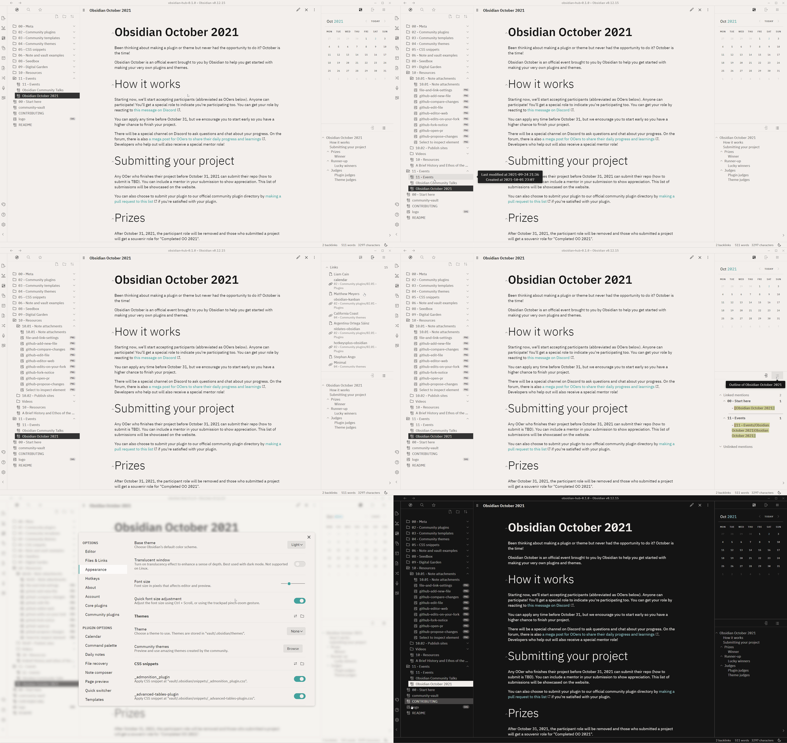
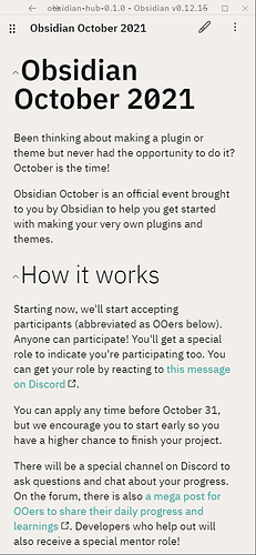
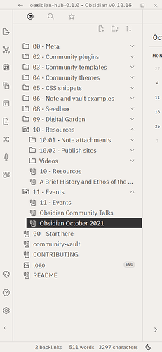
I’ve been meaning to create a theme for a bit and just couldn’t find one that worked well for me on mobile. Obsidian October is the perfect incentive to build an Obsidian theme from scratch for the first time!

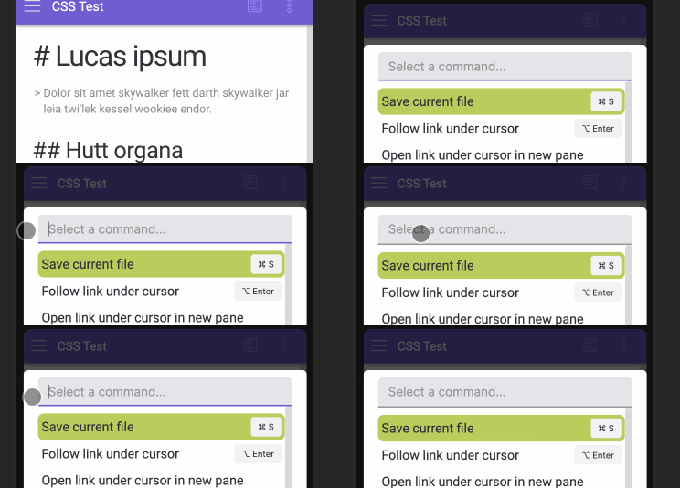
I’ll keep sharing the full documentation of my process on my digital garden: Building an Obsidian Mobile theme in public. But here is a sneak peek of the skeleton 0.0.1 so far:

I want to create a theme that reflects Google’s Material Design Guidelines to feel native on Android, and beautiful anywhere else. :sparkles:

Here’s an excerpt on my notes on building 0.0.1:

:+1: What I like

I spend hours on a simple animation when opening a text field. I think it turned out alright and showed me that details are worth focussing on.

I use the theme as a daily driver on my phone to keep thinking about ways to improve.

:thinking: To improve

I want to improve the use of colour. To keep it simple, I stuck with Obsidian’s default shade of purple. I used the Color Tool - Material Design to generate a lighter and darker shade that I used throughout the design. I want to add some more accents, so far the scheme feels quite plain.

I am also not sure about the typography. I stuck with roboto and the specified weights, but they seem boring and corporate to me. Both sidebars also need significant improvement.

Then there are all the details: tag pills, settings, links.

Conclusion

0.0.1 is a workable start to feel out the theme. I want to add more playfulness to it and need to improve the core styling of different elements. In this stage, gathering inspiration is key. Then I can steal from my favourites and create something unique.

Main questions going forward

  • Is roboto the right choice of font?
  • Which weight should the headers have?
  • How do I incorporate a feeling of layer and surfaces?
  • How can I redesign the icons to make them feel more ‘material’?
  • Which tool can I use to gather all the design inspiration?

Main action items

  • Share my progress with others
  • Find a tool to gather design inspiration (Recommendations anyone?)
  • Create a git repo
  • Design the different elements of the body
28 Likes

What I am building is a new Calendar plugin based on react big calendar module. I named it Obsidian Big Calendar. It has some features like:

  • Month View (v1)
  • Week View (v1)
  • Day View (v1)
  • Agenda View (v1)

for tasks OR text with time.

Here is a prototype video for it:

To improve

I want to scan/preload the content data of all Dailynotes from the previous month, this month and the next month from today, so that when the user switches between the previous month or the next month, the plug-in page can quickly display the tasks of the corresponding month.(Trying to use dataview api to do this)

And use dataview to index all the blocks link to Dailynotes. But maybe this is impossible now :thinking:

Conclusion

Just coding.

39 Likes

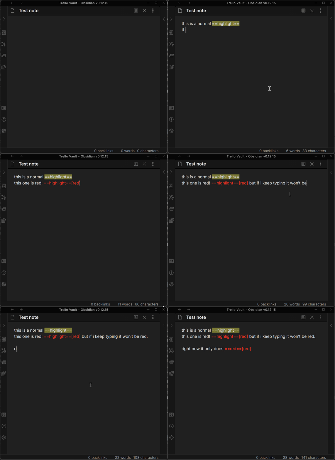
None of my plugins so far have touched the editor so I knew I wanted to make something that affecting the actual Obsidian editing experience. I settled on extending the built in ==highlight== sytnax to support other colors.

My thought is that using the normal ==highlight== syntax should continue to highlight as before, but I can add an optional ==highlight==[color] to it. That way if you leave obsidian or disable the plugin, you’ll only end up with that extra [color] part, not an unusable syntax.

So far, my efforts have been focused on styling text in edit mode; in preview mode, I’m expecting to just apply whatever color styling to the <mark> element rendered by the highlight.

I have zero previous experience with CodeMirror, so it’s been a learning experience for sure. There was a lot of trial and error in regards to what events to hook into, how to figure out what lines changed and how to style lines. This is what I’ve settled on so far:

Hook into the CodeMirror change event, which returns an object with to and from properties.

  • perfect! I can just update the lines based on that… except the from and to properties don’t make a whole lot of sense.
  • As far as I can tell, the from.line property is consistently the first line that was touched. The to.line property only seems concerned with removed text.
  • Looking at the CodeMirror docs, this tracks, seems like the from and to properties are concerned with the state of the text BEFORE the modification.
  • But the good news is that by doing a bit of math I can figure out the range of lines affected:
  private handleChange(instance: CodeMirror.Editor, changeObj: CodeMirror.EditorChangeLinkedList): void {
    const startRange = changeObj.from.line; // this is the starting line
    const endRemoveRange = changeObj.to.line + 1; // Add 1 since when looping over, I'll do while i < endRange
    const endAddRange = startRange + changeObj.text.length; // start + number of lines changed
    const endRange = Math.max(endRemoveRange, endAddRange); // figure out which is larger
    // ...
}

That seems to work, but needs more testing to figure out how it behaves if you cut/paste from the middle of a file. But assuming it does work, the next step was to actually modify the styling in edit mode. I came up with:

  1. Keep a map of line numbers to CodeMirror.TextMarker arrays
  2. Clear all marks on affected lines
  3. Look for the right syntax pattern using a regex
  4. Mark any matches, and save the TextMarker objects for each line.

This seems to work pretty consistently, here’s the current state:

TextHighlight

I’ve got high hopes for this and I’ve got tons of ideas on how to make this user friendly so people don’t have to know HTML/CSS to make their notes look nice.

10 Likes

Enhanced Editing Plugin

A plugin with multitude of hotkeys and shortcuts to make quick editing like these possible:
ezgif.com-gif-maker (3)
ezgif.com-gif-maker (4)

Wishes

  • Make a plugin to speed up format and syntax editing by replacing multiple mouse clicks with faster shortcuts and hotkeys

What to improve

Questions

  • Can we have options to turn on and off each of the hotkeys and shortcuts?
  • Can we map the hotkeys to our liking?

Actions

  • Try to make our wishes come to life by learning and applying

Project page

Obsidian-ZH-Enhanced-editing

2 Likes

I actually made two Plugins, one is just to learn something new and I probably won’t publish it in the Plugin Browser.

Hot Notes

I am creating Plugins pretty much since the Release of the experimental API. I haven’t touched the metadata-cache before though and I felt like this is a perfect opportunity to create something with it.

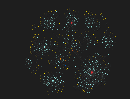
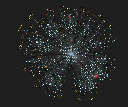
I made the Hot Notes Plugin which shows a temperature of every Note in the Graph. If you frequently open a Note it gets warmer and if you don’t open it often it cools down:

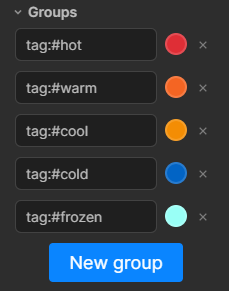
How does this work? It is super hacky and not very reliable… The Plugin keeps track of how often you open a Note and assigns Tags based on that:

image

This also means it looks bad when Tags are shown in the Graph:

It was still fun to fiddle with the metadata-cache though!

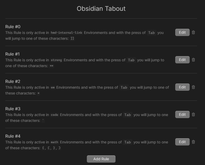
Obsidian Tabout

There is a Plugin for VS Code, which is named Tabout and it enables you to simply press Tab to set your Cursor after any ", ' or braces.

I remade this Plugin for Obsidian to easily get out of any Markdown or MathJax Syntax.

14 Likes

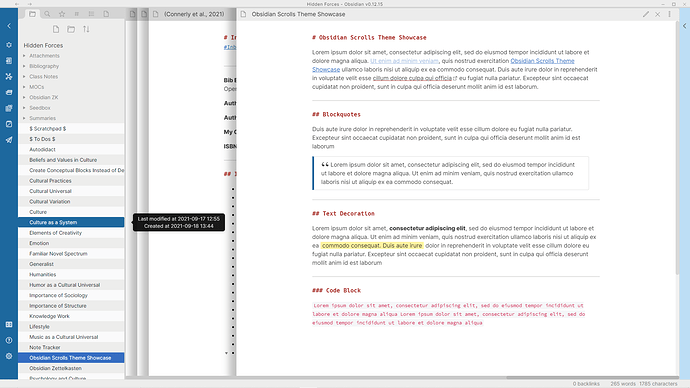
Zettelkasten Scrolls Theme

Because I can’t seem to settle on a theme, I went ahead and created another one… Some of the differences with this one

  • Trying to make it minimal to a degree, oftentimes I won’t have the right side panel
  • Very Wide Note Sizes that stack on each other, trying to keep the focus on one note at a time for this theme
  • All headers will look the same instead of changing size

What I’m trying to figure out:

  • When the file explorer populates, it has this weird occurrence where the alternating color of the filenames change
  • Having trouble properly styling the graph view settings panel
  • What I want the note width to be. I like it really wide like this, but it doesn’t work particularly well when I want to make Obsidian half the size to have something else up on the second half of the screen
6 Likes

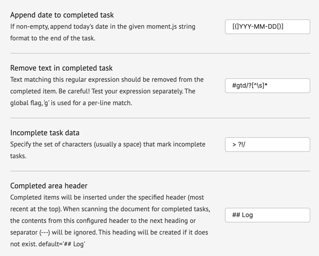
First plugin, a variant on the completed area plugin: GitHub - ebullient/obsidian-task-collector

This allows you to set a few things:

  • characters that count for incomplete tasks (e.g. do you use > or ? … )
  • a regular expression for text that should be removed from a string (e.g. strip tag)
  • a moment date format indicating that the date should be appended to the task in that format
  • A header to contain completed items.

It has two commands:

  • one “completes” the task under the cursor if it isn’t already complete (which could include removing text from the task and/or appending the date)
  • one gathers all completed tasks in the document and moves them underneath the configured header along with associated/nested notes (you may have some list indenting to repair, in that case).

It works better (for me) than the others I’ve tried. I need to add automated tests.

Went better than I expected. =)

Edit: Changed plugin name and added right click edit menu options.

6 Likes

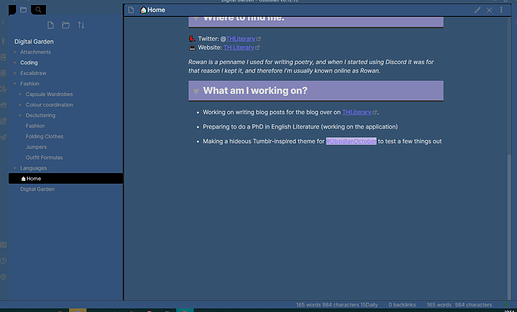
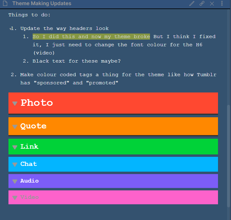
This is my first attempt at a theme! I decided to play about with the Tumblr colours and see if I can use something based on that for a first attempt/ bit of fun.

GitHub for the Theme

So far I’ve learned:

  • How to change the colours of the bar at the side with the file names
  • Change the colours of the main workspace area
  • Change the colour of the bar at the top
  • Change fonts
  • Make it less time consuming by creating variables for the different colours and then using their name - E.g - “Blue” and “darkerBlue”

Next steps:

  • Actually change the fonts
  • Tidy it up a bit - improve how the colours look together

Edit: I’m putting the “how I did the thing” on my publish site: Obsidian Publish - along with updates of what I’m changing, how I’m getting on

3 Likes

For O_O, I’m super excited to be working on a plugin for Obsidian.

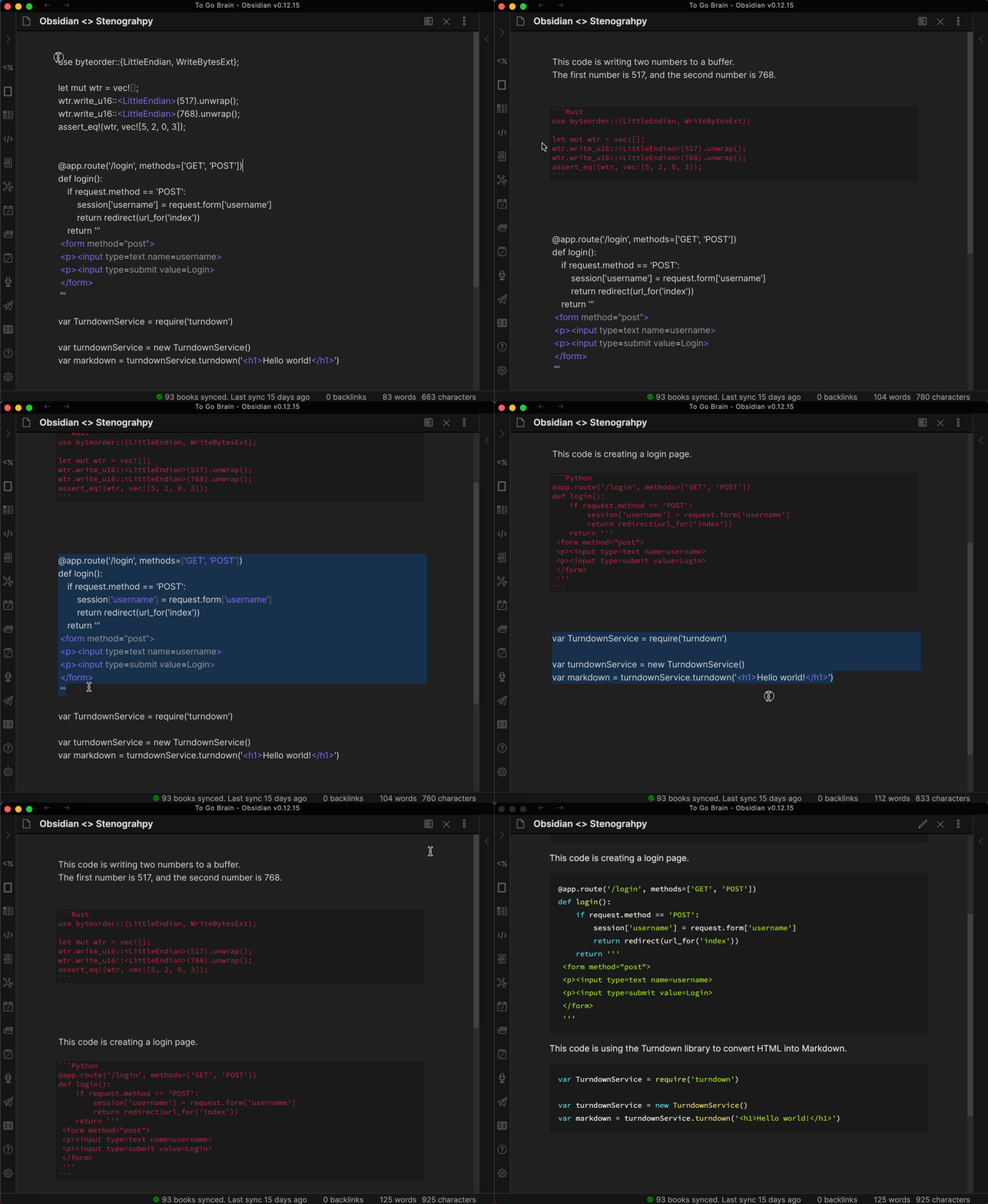
My plugin is called Stenography-Obsidian, and it basically links the Stenography API with Obsidian.

Features:

  • highlight any code in Obsidian
  • press the Stenography button
  • the API will replace the code block with a simple English explanation/docstring of what the code does and it guesses the language the code block is written in as well (see demo below)

Learnings:

  • the plugin starter boilerplate is awesome
  • getting selected text from the Obsidian editor is a breeze!
const editor = this.app.workspace.getActiveViewOfType(MarkdownView)?.editor; 
const selectedText = editor.getSelection(); // Get selected text
  • fetch is built in (I got stuck in an axios hole for a while, but @shabegom helped me get unstuck, thank you!)

obsidian-steno

Github:

3 Likes

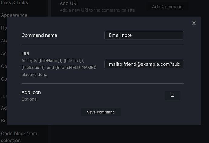
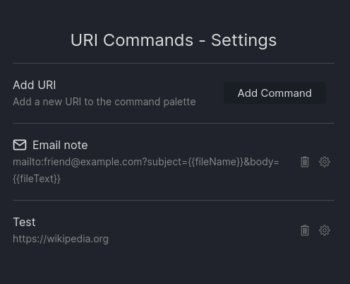
I made URI Commands, a plugin which allows you to create commands using custom URI links which can then be executed from the command palette, have hotkeys assigned to them, etc.
Screenshot from 2021-10-01 14-20-37

Includes full command editing:

I started from this feature request, but got pretty into expending it with extra functionality. I got really excited when I realized that adding {{fileName}} and {{fileText}} placeholders meant I could use the mailto: URI scheme to send emails from Obsidian.

I think this plugin has a lot of potential on mobile, especially iOS, which does a lot of inter-app communication via URIs, but I’m not an iPhone user so I can’t play with it there.

Todo:

  • I’m hoping to handle metadata with multiple values more intelligently: currently it just copies them all as a comma separated list, which is very rarely what someone wants. My current plan is to implement some syntax like {{meta:FIELD_NAME[0]}}, but I’m worried this will conflict with valid field names.
  • I would like to be able to set hotkeys straight from the command editing page, but my attempts to implement it so far haven’t been very successful. One place I could go with this is have the hotkeys added as plain text rather than the convenient “just press the right keys” UI.

I learned some interesting things about how to make custom input modals and how to work with other plugin’s APIs (very easy, thank you MetaEdit, but it would be even nicer if there was some official support/standardization for this), but my favorite bug was completely unrelated.

At some point, in the process of making some seemingly-unrelated edits, I noticed that the icon picker had suddenly stopped displaying the icon and icon name on one line, and instead had them each one separate lines, which was much uglier. I went back and undid the likeliest culprits: no change. Went line by line through the changes undoing everything that had any possibility of making a functional change: no change. Went back to the previous commit: no change, and also now I had somehow managed to get myself into a horrible git tangle. Gave up, nuked the entire directory, cloned a fresh copy from the remote which I had tested and definitely remembered having a pretty icon picker: no change.

At this point I am thoroughly sick of this bug and conclude that it’s probably best to move on to something else until the thought of further debugging doesn’t make me want to do a murder. Decide to implement icons actually displaying next to their command in the settings made. Go to phibr0’s Customizable Sidebar plugin, which I had already borrowed a lot of the UI code from, and copy some of the relevant code.

…icons display on separate lines.

After a brief round of swearing, it hits me. The icon display code, both here and in the icon picker, declares a CSS class. I had never changed the name of the class from when I had copied it from Customizable Sidebar, so while I had Customizable Sidebar enabled, the CSS from that plugin was also styling my URI Commands settings. Somewhere in the process of writing URI Commands, I had gone through my plugins and disabled a bunch of plugins I wasn’t using, including URI commands, and the pretty styling which had been freeloading off Customizable Sidebar disappeared.

I added my own CSS file, changed the name of the classes, and the icons went back to their old side-by-side view.


I am going to consider that adventure a rather cheap lesson in making sure I understand what exactly code I am copying actually does.
7 Likes

So many exciting additions already early in this contest. I am throwing a plugin into “ring”.

My plugin is called the Beta Reviewers Auto-update Tester or BRAT for short. It is a plugin that makes it easier for you to assist other developers with reviewing and testing their plugins.

Simply add the GitHub repository path for the beta Obsidian plugin to the list for testing and now you can just check for updates. Updates are downloaded and the plugin is reloaded. No more having to create folders, download files, copy them to right place and so on. This plugin takes care of all that for you.

Just starting beta testing. Feedback warmly welcome:

5 Likes

This will be my submission to O_O, as well as my first obsidian theme. I present to you

Sanctum

Sanctum’s a minimalist theme with the aim of creating a serene space of retreat, for thought and uninterrupted work.


IYCz8ZP6gz

This theme follows a set of predetermined variables, in order to keep the project consistent throughout. It features customized icons, animations, task checkboxes, highlighting, responsive typography, sidenotes, and more.

It’s aim is to be simple, clear and honest. To achieve this, the theme has only 1 main color which covers the entire screen, yet still maintaining hierarchy through the rules of gestalt. This one color was the first step in ensuring consistency, and the one by which the rest of the greyscale spectrum is based on. When switching to dark mode, the spectrum simply flips.

Responsiveness is still maintained, by having a consistent language (icons change color when hovered, and when activated; responsive resize handles enlarge when hovered, etc), custom animations which, in time, will be customizable, in order to switch between a “productive”, and an “expressive” mode.
Further customization options will be explained and made available in due time.

The theme already has compatibility with the following plugins:

  • Advanced Tables
  • Breadcrumbs
  • Calendar
  • Changelogs
  • Charts
  • Checklist
  • Contextual Typography (which is recommended)
  • Copy Code Button
  • Excalidraw
  • Gallery
  • Kanban
  • Quick Explorer
  • Sliding Panes (Andy’s Mode)
  • Templater (although with the new update, it might need some reviewing)

Some of these features can go from simple icon replacements to more extensive changes.
Mobile development is under way, and in a few days I hope to make it available for testing and further improvement based on people’s feedback. :slight_smile:

16 Likes

Working on a new plugin, Cross-reference Navigation.

It’s a live demonstration of a concept laid out in my lab notes exploring ideas for the future of the OS / personal computing.

This plugin surfaces commonly cross-referenced tags as you browse through your things, and it makes great use of nested tags (e.g. #status/inprogress).

Here’s a video showing it in action

With the tag structure I use in my personal notes vault, this plugin effectively gives me a handful of useful interfaces. Some examples:

  • “In Progress” shows me my current workspace: all of the things I’m learning and working on right now.
  • “Up Next” is filled with new and interesting things to explore.
  • “Done” is a nicely organized archive.
  • “Reading” brings up things I’ve read, things I’m in the middle of, and what I’d like to read next.
  • “Writing” brings up the things I’ve written recently, am currently writing, and might work on next.

And of course, I can dive deeper from there: I might pull up just the things I’m reading in the topic of music, or specifically the things I’m currently writing on personal computing, or the things I’d like to read next by Doug Engelbart.

For more information, see my page on this experiment.

Hope you enjoy it. Here’s the repo:

9 Likes

I didn’t make a plugin, but I did write some special user scripts for Templater. One fetches the day’s quote from dailyzen.com and one retrieves a YouTube transcript, given a URL. I blogged about how they were made here: Templater Treats for Obsidian October - DEV Community

I’ve got some bigger stuff I’m thinking about submitting too, but it was nice to do something small. Templater is really powerful.

Looking forward to seeing what everyone came up with.

5 Likes

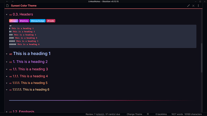
My first theme Sunset (only dark)


Main Feature:

  • Pseudo WYSIWYG
  • Outline for list, file-folder, outliner
  • Beautiful Design (Highly Motivated by the themes of tridimond)

More To do

  • Make compatible with the popular plugin
  • Make Mobile Compatible
9 Likes

Hey Folks :wave: first time caller, long time listener!
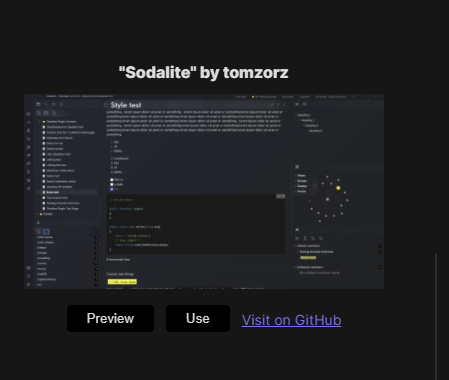
I’ve just submitted a PR to the community repo for my theme Sodalite. Relatively opinionated, and inspired by some of the Windows 10 and 11 design ideas - available here: GitHub - tomzorz/Sodalite: Sodalite Obsidian theme

5 Likes

2 little updates:

v0.2 is out, fixing the sliding panes / andy mode :slight_smile:

The PR was merged, the theme is now available to download from within the app:

image

5 Likes

I’ve created a plugin that allows you to run arbitrary JavaScript on Obsidian startup (and at any other time).

My motivation was when someone asked if they could start my ‘Focus Mode’ plugin on startup, and I could have added that functionality directly to the plugin, but I wanted something more generically useful. Lots of programs have startup style processes, so this felt like a natural extension.

6 Likes