Obsidian Nord Theme - different colour/checkbox option?

Absolutely love the above theme but I hate the way the checkbox style is!

Is there a way for the style of the checkboxes to be changed? I’m not a coder by any means, so please breakdown if there is a way to.

Also my other question is, when I use ** to make text bold, it automatically makes it a yellow colour, is there a way for me to be able to change this colour at all?

Thanks in advance! :slight_smile:

The checklist style can be changed, but there are heaps of different stylings you can go with. Maybe have a look at a few different themes and point to / describe something you’d like? It will make it easier for folks to offer suggestions.


The **bold** color is an easy adjustment. The theme defines the bold color for light and dark modes. You could use this snippet to change them as you like.

.theme-light {
    --bold-color: var(--color-orange);
}

.theme-dark {
    --bold-color: var(--color-green);
}

The value here can be a variable, e.g., var(--color-pink). It can can also be written as green, a hex ( #008040 ), rbg, etc. https://www.colorhexa.com/008040


https://help.obsidian.md/Extending+Obsidian/CSS+snippets

Ahhh, great that worked perfectly! Thanks so much for that :slight_smile: I assume if I just change the bold part to heading or something it would work the same way?

In terms of the check box, something like this, where it is just a regular plain box with a coloured outline, it darkens when you hover over it and then once you click it to be checked for it change to green with a tick in the middle like the below:

Screenshot 2023-11-07 at 23.13.55
Screenshot 2023-11-07 at 23.14.02

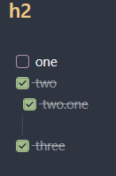
This is something that is very subjective, and will need some playing around on your end to get it how you’d like.

So this is just a copied from the Nord theme with some things changed and some things cancelled out (to let some of the default theme come through).

body.theme-dark {
    --checkbox-color:                var(--green);
    --checkbox-color-hover:          var(--color-green);
    --checkbox-border-color:         var(--frost0);
    --checkbox-border-color-hover:   salmon;
    --checklist-done-color:          rgba(var(--light2_x), 0.5);

    --checkbox-radius: var(--radius-s);
}

input[type=checkbox] {
    border: 1px solid var(--color-purple);
}

input[type=checkbox]:checked {
    background-color: var(--checkbox-color);
    box-shadow: inset 0 0 0 0.25px var(--background-primary);
}

input[type=checkbox]:checked:after {
    display: unset;
}

Screenshot 2023-11-08 092455


If you’re interested in this stuff and changing other things (headings, spacing, etc.), I’d have a look the custom properties / variables:

and this great guide:

Have fun! :skier:

I actually figured it out by changing some stuff around - thanks for your help :smiley:

I have another question tho - I use the Kanban plugin and would like to change the colour of the boards/lanes - would you have any idea how to do that or some CSS and I can try play around with it?

I’ve tried googling it but not come up with much :confused:

This topic was automatically closed 7 days after the last reply. New replies are no longer allowed.