What I’m trying to do
As part of my annual review process, I want to look back on my inputs from the year and discover any recurring topics or themes I haven’t been consciously aware of. This can help guide my reading and writing for the coming year.
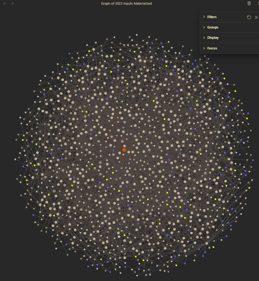
Things I have tried
My idea was to materialize the links generated by a dataview query of all the inputs I reviewed in the year. I did that part successfully. Where I’m stuck now is visualizing the graph of the results in a way that’s meaningful. I’ve made a group of my moc notes and colored them yellow. My two problems now are: 1) I only tag topics as moc when I’m aware that I’ve been linking to them a lot, so that doesn’t help with serendipity; and 2) the graph is so massive and the node size differential so minimal, I can’t tell visually where things are clumping.
So…is there a graph setting I’m missing that will help me with this? Or does someone have a suggestion for a better approach to my problem?