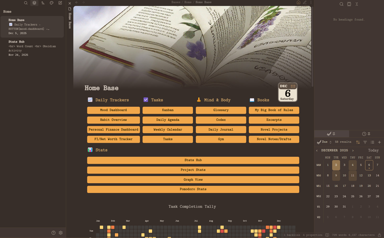
Obsidian Home Base – Notes, Plugins, and Extras
This Home Base is built in Obsidian and is heavily inspired by
Ranebell129’s “Obsidian-Homepage”.
The screenshots/video I shared use the Ykiyo! theme, but the Coffee theme also works with this setup.
Other themes should work too, but these two have been tested and do not break the button layout or overall structure.
Plugins Used in My Obsidian Home Base
1. TaskNotes
This is the backbone of most of the interactive features on the Home Base.
It provides:
- Mini-calendar (bottom-right)
- Pomodoro timer (bottom-right)
- Task dashboards:
- Kanban
- Daily Agenda
- Weekly Calendar
- Tasks list
- Stats pages like Pomodoro Stats and Project Stats
Several of the subsections on the Home Base are built directly from TaskNotes bases.
2. Meta Bind
I use Meta Bind for all buttons across the Home Base.
- Daily tracker buttons
- Quick navigation buttons
- Buttons that open external files (e.g., Excel spreadsheets)
- Buttons bound to Obsidian commands
A lot of the tracking views (for example, daily trackers) look dynamic because of Meta Bind powered buttons, even when they link out to external documents such as Excel spreadsheets.
3. Contribution Graph
Responsible for the GitHub-style contribution heatmap on the Home Base.
Nothing special is required here: install the plugin and configure it to your liking, then embed it in the Home Base.
4. Pretty Properties
Used to display the banner and icon on notes.
My configuration:
- Property names (must match exactly):
bannericonbanner_position
- Banner appearance:
- Banner height: 350
- Gap after Banner with Icon: −54
- Icon size: 100
- Icon top margin with Banner: 280
Most of the visual polish is handled by a CSS snippet, but Pretty Properties controls the positioning and rendering.
One of my TaskNotes bases (the one that shows progress bars) relies on Pretty Properties for the % progress data.
5. Notebook Navigator
Used for notebook-style navigation, tab shortcuts, and fast switching.
You will mainly notice it in general vault navigation rather than as a visible element on the Home Base itself.
6. Stats Hub (Custom Dataview Script)
This is not a plugin itself, but a note powered by the Dataview plugin.
It generates:
- Word counts per folder
- Total counts for notes and words
- Other vault-level statistics
This note is then embedded into the Home Base.
7. Graph View
This is just the built-in Obsidian graph.
I bind the Graph View command to a Meta Bind button so that the graph opens directly when you click the button.
8. CSS Snippets & Toolbars
I use several CSS snippets for:
- Banner and icon positioning
- Progress bar visuals
- Button appearance and layout
- Some small UI tweaks (toolbars, word count table, etc.)
The Home Base relies on these snippets to look clean and consistent.
8.1 Bases Tables CSS
/* === 1. HIDES HEADER ICONS === */
.bases-table-header-icon {
    display: none;
}

/* === 2. REMOVES DIVIDERS FOR FIRST THREE NOTE COLUMNS === */
.bases-view [data-property="note.1"],
.bases-view [data-property="note.2"],
.bases-view [data-property="note.3"] {
  box-shadow: none !important;
  border-inline-end: none !important;
}

/* === 3. CENTRES CHECKBOXES IN BODY CELLS === */
.bases-view input[type="checkbox"] {
  display: inline-block !important;
  margin: 0 auto !important;
  vertical-align: middle !important;
}

/* === 4. ADDS LEFT MARGIN TO THIRD CHECKBOX COLUMN (Stabalises it a lot better, fits perfectly if the first two column widths are 20px and the last is 23px, ) === */
.bases-view [data-property="note.3"] .bases-table-cell input[type="checkbox"] {
  margin-left: 1px !important; /* adjust as needed */
}

/* === 5. CENTREs HEADERS OF THE THREE CHECKBOX COLUMNS === */
.bases-view .bases-thead .bases-td:has(.bases-table-header-icon .lucide-check-square) .bases-table-header {
  justify-content: center !important;
}
.bases-view .bases-thead .bases-td:has(.bases-table-header-icon .lucide-check-square) .bases-table-header-name {
  text-align: center !important;
  margin: 0 auto !important;
}

/* === 6. GLOBAL TABLE CONFIGURATION (COLUMN MIN-WIDTH) === */
.bases-view {
  --bases-table-column-min-width: 20px !important;
}

/* Remove black outline / border from Bases progress bars */
.bases-view progress.metadata-progress {
    border: none !important;
    outline: none !important;
    -webkit-appearance: none !important;
    appearance: none !important;
}

/* Remove default WebKit inner shadow */
.bases-view progress.metadata-progress::-webkit-progress-bar {
    border: none !important;
    background-color: transparent !important;
}

/* Remove default filled bar bevel */
.bases-view progress.metadata-progress::-webkit-progress-value {
    border: none !important;
}
8.2 General UI Tweaks CSS
body {
  font-size: 1.15em !important;
}

.nn-parent-folder-label,
.nn-parent-folder-label[data-has-color="false"],
.nn-parent-folder-content,
.nn-parent-folder *,
.nn-parent-folder-content *,
.nn-file-second-line .nn-parent-folder *,
.nn-file .nn-parent-folder * {
    font-size: 0.85rem !important;
    transform: none !important;
}

/* Prevent the folder section from expanding to the edge */
.nn-parent-folder {
    min-width: 0 !important; /* REQUIRED for text-overflow inside flex/grid */
}

/* Apply truncation correctly */
.nn-parent-folder-label {
    display: block;
    white-space: nowrap;
    overflow: hidden;
    text-overflow: ellipsis;
    max-width: 100%;
}

/* Prevent Ukiyo's zoom and allow banner to handle right-click */
.banner-image img {
    cursor: default !important;
    pointer-events: none !important; /* disables left-click on the <img> itself */
}

.banner-image {
    pointer-events: auto; /* right-click still works on the container */
}


.banner-image {
    -webkit-user-select: none !important;
    -moz-user-select: none !important;
    user-select: none !important;
}

/* Disable all interaction ONLY on the image inside nn-virtual-nav-item */
.nn-virtual-nav-item .nn-nav-banner-image {
    pointer-events: none !important;
    user-select: none !important;
    -webkit-user-select: none !important;
    -moz-user-select: none !important;
    -ms-user-select: none !important;
}

/* Optional: disable clicks on the banner wrapper but NOT the entire nav item */
.nn-virtual-nav-item .nn-nav-banner,
.nn-virtual-nav-item .nn-nav-banner * {
    pointer-events: none !important;
}

/* Keep the pin icon visible but make it unclickable */
.workspace-tab-header-status-container .workspace-tab-header-status-icon.mod-pinned,
.workspace-tab-header-status-container .workspace-tab-header-status-icon.mod-pinned * {
    pointer-events: none !important;   /* nothing can be clicked */
    user-select: none !important;      /* no text/element highlight */
    cursor: default !important;        /* no hover cursor */
}

/* Prevent double-click selection highlight on the wrapper */
.workspace-tab-header-status-container {
    -webkit-user-select: none !important;
    -moz-user-select: none !important;
    user-select: none !important;
}
8.3 Word Count Table CSS
/* Apply only to this table */
.wc-table-container .table-view-table {
  font-size: 0.9rem;
  border-collapse: collapse;
  line-height: 1.25;
}

/* Header – flat, minimal, no zebra, no background stripe */
.wc-table-container .table-view-table thead tr {
  background-color: var(--background-primary); /* SAME as page */
}

.wc-table-container .table-view-table thead th {
  padding: 3px 10px !important;
  border-bottom: 1px solid var(--background-modifier-border);
  font-weight: 700;
  text-transform: none;
}

/* Rows – flat, same colour for every row */
.wc-table-container .table-view-table tbody td {
  padding: 3px 10px !important;
  border-bottom: 1px solid var(--background-modifier-border);
  background-color: var(--background-primary) !important; /* force flat */
}

/* Remove zebra — Dataview sometimes injects it, this kills it */
.wc-table-container .table-view-table tbody tr:nth-child(even) td,
.wc-table-container .table-view-table tbody tr:nth-child(odd) td {
  background-color: var(--background-primary) !important;
}

/* Prevent bullets on TOTAL rows */
.wc-table-container .table-view-table td {
  list-style-type: none !important;
}


/* Removes the default paragraph spacing immediately before a DataviewJS block
   by collapsing the margin of any <p> that is directly followed by
   an .el-pre > .block-language-dataviewjs embed */
:has(+ .el-pre > .block-language-dataviewjs) > p {
	margin-block-end: 0;
}
8.4 Home Page Buttons and Layout CSS
/* Properties */

/* Show Properties in reading mode by default.
Use "myhome" in `css_classes` property to hide them.
source: https://forum.obsidian.md/t/hide-show-properties-and-add-property-button-in-reading-mode/66209
============================================================= */
.workspace-leaf-content[data-mode="preview"]
.markdown-preview-view.myhome
.metadata-container{
    display: none;
}

/* 处理 ob1.0 鸟库顶部导航多出来的点 */
.myhome .list-bullet{
  display: none !important;
}

/* banner icon as date – NEW plugin (with <img>) */

.myhome .icon-wrapper .icon-image img.pp-icon {
  content: url("https://calendericon.aa-rn-shn.workers.dev/");
}

/* Make the icon align to the right edge of the text wrapper */
.myhome .icon-sizer {
  position: relative;
}

.myhome .icon-image {
  position: absolute;
  right: 0;
}

/* Gets rid of indent line */
.markdown-rendered.show-indentation-guide li > ul::before, .markdown-rendered.show-indentation-guide li > ol::before {
  content: unset;
}


/* cssclass: myhome 看板设置*/
/* adapted from spectrum theme, thanks to @Braweria. https://github.com/Braweria/Spectrum */
/* a kind of css-based pseudo-myhome feature */

/* =============================================== */
/*  HOMEPAGE BUTTONS — GOLD–ORANGE (NO BORDER)     */
/* =============================================== */

/* PC */
.myhome ul {
  display: flex;
  flex-direction: row;
  border: 0px solid var(--p-myhome-border-color);
  padding: 0rem;
  border-radius: var(--radius-m);
  flex-wrap: wrap;
}

.myhome ul>li:not(.task-list-item) {
  flex: 1 1 20%;
  padding: 0.1em 0em 0.1em 0.5em;
  margin: 0 0.1em 0.3em 0  !important;
  list-style: none;
  border: 1px solid var(--p-myhome-border-color);
  border-left: px solid var(--p-myhome-border-color) !important;

  border-radius: 5pt;
  word-wrap: break-word;
  word-break: break-word;
  justify-content: center;
  align-items: center;
}

/* LI-style buttons (homepage items) */
.myhome ul ul li:not(.task-list-item) {
  display: block;
  width: 100%;
  padding: 0;                    /* no outer gap */
  margin: 0;
  text-align: center;
  font-weight: 600;              /* bold-ish */
  font-size: 1rem;               /* larger text */
}

/* Kill hover background on the <li> itself so it
   doesn't create a coloured strip around the button */
.myhome ul ul li:not(.task-list-item):hover {
  background: transparent !important;
  border-color: transparent !important;
  border-left: 0 !important;
}

/* Make the MetaBind wrappers fill the row */
.myhome .mb-button-group-inline,
.myhome .mb-button-inline {
  display: block;
  width: 100%;
  margin: 0;
  padding: 5;
}

/* MetaBind inner <button> */
.myhome .mb-button-inner.mod-plain {
  display: block;
  width: 100%;
  padding: 0.25em 0.4em;         /* controls height now */
  border-radius: 5pt;

  background-color: #f2a74a !important;
  color: #3a2a00 !important;

  border: none !important;
  cursor: pointer;
  text-align: center;

  font-weight: 600 !important;   /* bold */
  font-size: 0.80rem !important;
  line-height: 1;
}

/* Hover – only the button changes now */
.myhome .mb-button-inner.mod-plain:hover {
  background-color: #BC732F !important;
  color: #D9C3A1 !important;              /* soft cream (not bright white) */
  border: none !important;
}

.myhome ul ul {
  display: flex;
  flex-direction: column;
  justify-content: center;
  padding: 0rem;
  margin-top: 0.5rem;
  border-radius: 0;
  border: 0;
  background: none;
}


/* Removes the default paragraph spacing immediately before a Base code block
   by collapsing the margin of any <p> that is directly followed by
   an .el-pre > .block-language-base embed */
:has(+ .el-pre > .block-language-base) > p {
	margin-block-end: 0;
}
Bases Used in the Home Base
All of the “bases” mentioned above are standard TaskNotes bases. They are simply opened via Meta Bind buttons from the Home Base.
Below is an explanation of two example bases, so you can see how they are structured conceptually.
1. Note Checklist
This base is used to keep track of work on individual notes for one project.
Conceptually, it does the following:
- Scope / Filter
- Only shows markdown files from a specific folder in the vault.
- Columns
- Three checkbox-style properties (labelled
1,2, and3in my vault) that represent stages or subtasks for each note. - The note name, tags, due date, and links/backlinks/embeds.
- A calculated “tick count” and an “Overdue” indicator.
- Three checkbox-style properties (labelled
- Formulas
TickCount: counts how many of the three checkbox properties are ticked for each note.Overdue: shows"Overdue"when the note’sdueDateis earlier than today, otherwise an empty string.
- Summary
- Sorts notes by due date, then by how many subtasks are ticked (TickCount), and then by file name.
summaries:
  Filled: values.filter(!value.isType("null")).length
formulas:
  TickCount: |
    if(note["1"].isTruthy(), 1, 0) +
    if(note["2"].isTruthy(), 1, 0) +
    if(note["3"].isTruthy(), 1, 0)
  Overdue: |-
    if(
      date(dueDate) < today(),
      "Overdue",
      ""
    )
properties:
  note.tags:
    displayName: Tags
  note.Due Date:
    displayName: DueDate
  note.dueDate:
    displayName: Due date
  file.name:
    displayName: Name
  file.tags:
    displayName: File tags
  file.links:
    displayName: File links
  file.backlinks:
    displayName: File backlinks
  file.embeds:
    displayName: File embeds
views:
  - type: table
    name: Table
    filters:
      and:
        - file.inFolder("")
        - file.ext == "md"
    order:
      - "1"
      - "2"
      - "3"
      - file.name
      - file.tags
      - dueDate
      - formula.Overdue
      - file.links
      - file.backlinks
      - file.embeds
      - formula.TickCount
    sort:
      - property: formula.TickCount
        direction: ASC
      - property: file.name
        direction: ASC
    limit: 10
    columnSize:
      note.1: -5
      note.2: 13
      note.3: 22
      file.name: 277
      file.tags: 759
      note.dueDate: 116
      file.links: 83
      file.backlinks: 72
      file.embeds: 105
      formula.TickCount: 30
2. Projects & Exams Base – Progress and Priority
This base is used to track tasks related to projects and exams in one place.
Conceptually, it does the following:
- Scope / Filter
- Only shows notes that have certain tags (for example, tagged as “projects”, “exam”, and “task”) so the table focuses on project/exam-related tasks.
- Columns
- Status (e.g.
todo,in progress,done). - Name of the tasknote.
- A visual progress bar.
- Due date, links, tags, and priority.
- Status (e.g.
- Formulas
progressBar:- Uses numeric properties like
toDoanddone(or aggregatedallTasksToDoandallTasksDone) to draw an HTML<progress>element. - The
maxof the bar is the total number of tasks; thevalueis how many are completed. - Also calculates a percentage and puts it into the
aria-label/tooltip so you can see an exact number when hovering.
- Uses numeric properties like
priOrder:- Converts textual priorities into numeric values so they can be sorted.
- Example mapping:
noneor anything withstatus == "done"→0low→1normal→2high→3
- Sorting
- First sorts by
priOrderso higher priority tasks float to the top. - Then sorts by due date (earlier deadlines first).
- First sorts by
model:
  version: 1
  kind: Table
  columns: []
pluginVersion: 1.0.0
formulas:
  progressBar: |
    if(
      toDo,
      html(
        "<progress class='metadata-progress' max='" +
          toDo + "' value='" +
          if(done, done, 0) +
          "' aria-label='" +
          if(
            done,
            (if(done, done, 0) / toDo * 100).round(),
            " "
          ) + " %" +
          "' data-tooltip-position='top' data-tooltip-delay='500'>"
      ),
      if(
        allTasksToDo,
        html(
          "<progress class='metadata-progress' max='" +
            allTasksToDo + "' value='" +
            if(allTasksDone, allTasksDone, 0) +
            "' aria-label='" +
            if(
              allTasksDone,
              (if(allTasksDone, allTasksDone, 0) / allTasksToDo * 100).round(),
              " "
            ) + " %" +
            "' data-tooltip-position='top' data-tooltip-delay='500'>"
        ),
        ""
      )
    )
  priOrder: |-
    if(priority == "none" || status == "done", 0,
    if(priority == "low", 1,
    if(priority == "normal", 2,
    if(priority == "high", 3))))
properties:
  note.status:
    displayName: Status
  file.name:
    displayName: Name
  file.backlinks:
    displayName: Backlinks
  formula.progressBar:
    displayName: Progress
  note.priority:
    displayName: Priority
  note.tags:
    displayName: Tags
  note.dueDate:
    displayName: Due Date
  file.links:
    displayName: Links
views:
  - type: table
    name: Table
    filters:
      and:
        - file.tags.containsAny("projects", "exam")
        - file.tags.containsAny("task")
    order:
      - status
      - file.name
      - formula.progressBar
      - dueDate
      - file.links
      - tags
      - priority
      - formula.priOrder
    sort:
      - property: formula.priOrder
        direction: DESC
      - property: dueDate
        direction: ASC
    limit: 10
    columnSize:
      file.name: 259
      formula.progressBar: 140
      note.dueDate: 200
      file.links: 107
      note.tags: 592
Please do let me know how you find it.