Once you are done reading, please delete the above notes
Use case or problem
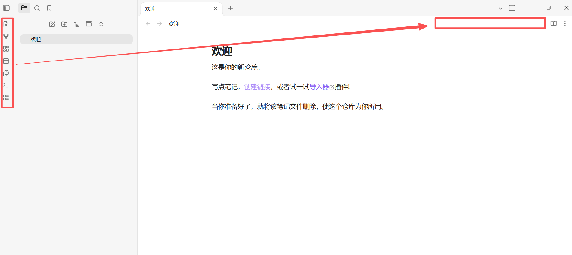
- While Obsidian is a complex management tool that requires surfacing various features to accommodate diverse user needs, I believe that minimizing distractions is equally crucial when it comes to the notes themselves. The ribbon bar on the left can easily draw the eye away, hindering one’s ability to focus on the content—which is precisely why “focus mode” plugins exist.
- Recent updates now keep the ribbon hidden by default when opening a new vault, and many community themes incorporate designs that allow it to be collapsed or set to appear only upon hovering. This suggests a clear, underlying demand for hiding this otherwise intrusive sidebar.
- The current official solution—making the ribbon collapsible—comes with a trade-off: it becomes less convenient to access. Clearly, the ribbon still serves a valid purpose.
Proposed solution
Relocate it from the left side to the top-right, near the tab bar—much like how extensions are displayed in the Chrome browser.