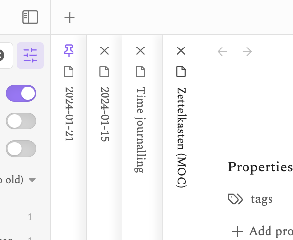
I don’t know the name of the exact thing I’m trying to reference in the interface, so here’s a screenshot:
My problem is how difficult it is to tell which pane is selected, with the Zettelkasten file (the selected one) being only slightly darker than the other titles.
I figured this would be a theme issue, but I’ve tried 4 different themes that all have this issue.
How can I make it more obvious which pane/tab is selected?
This doesn’t seem to be working for me on macOS or Linux. I switched back to the default theme to make sure that wasn’t preventing it from working, but everything still looks the same.
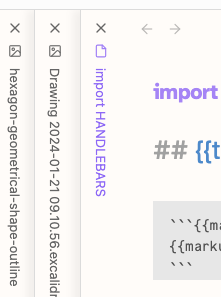
When I select the window of another application I see that the active Obsidian tab does highlight like in your screenshot. But when I click the Obsidian window the purple tab goes back to bolded black.
I’ll keep poking at it and see what’s up.
Edit:
This is what got it working as expected for me:
body .workspace-tabs {
  --tab-text-color-focused-active-current: var(--interactive-accent);
}
I’m not sure why mine might be working differently.