I solved my own problem.
-
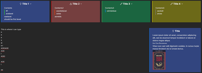
In order to go back up a level, I had to insert an empty text column (“>>”) which makes sense considering doing the same (“>”) when starting a new column.

-
This code did the trick. It reduces the amount of space for all the content, but then I had to add some below the title.
.callout .callout-content > * {
    margin-top: 2px !important;
    margin-bottom: 2px !important;
}

/* Add space below the callout title */
.callout .callout-title {
    margin-bottom: 8px !important;
}
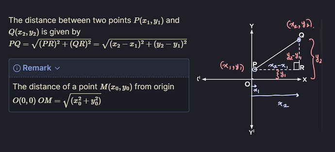
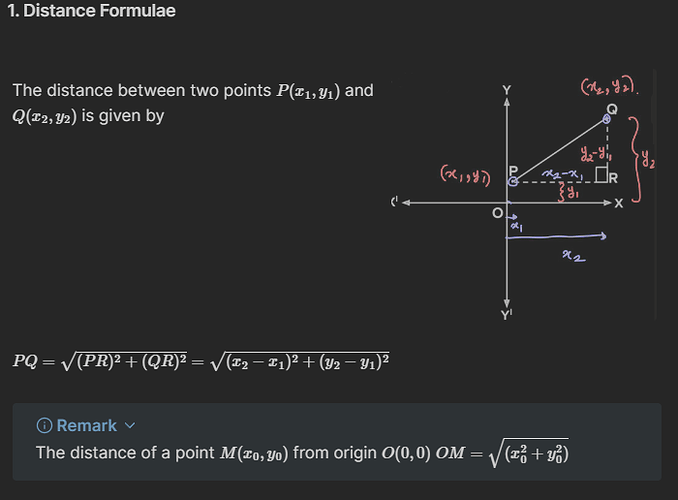
Attached the final result.
Best,
LFT


