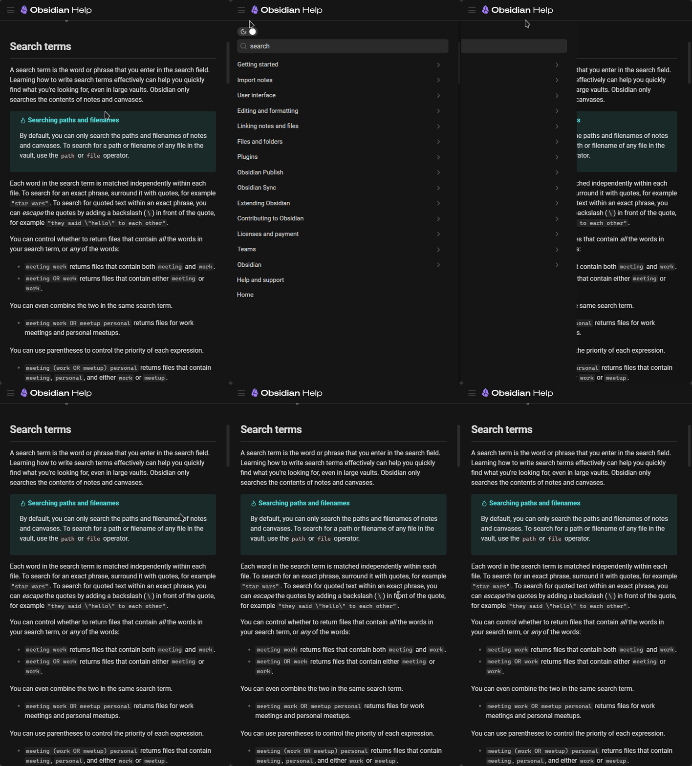
Publish sites only support a ToC on desktop, not mobile. Would like to have this. Perhaps put a hamburger menu in the top right or left corner, which expands to reveal the Toc?
+1 to this FR ![]()
ToC would be greatly helpful for some long articles i have on my site. ![]()
I’m a little surprised this isn’t more popular. I feel like this feature is pretty important, and there’s no reason it’s on the desktop site but not mobile.
Me too. In the meantime, I used the Table of Contents plugin to generate a text/link-based toc at the top of each page of my publish site. That appears on mobile, of course.
Hi, which plugin is this? i tried to do this but couldn’t get it to make a toc. the plugin keeps saying that there are no headers (but there are many).
Any help appreciated
thanks
It’s been a while but IIRC I had a similar problem with it not finding headers. I think the solution was to move the cursor position either to the beginning or the end of the file before running the plugin (can’t remember which).
Thanks!!
Did it work?
Yes! The issue was that it does headlines from the cursor to the next instance of h1. But if it’s all h2 it’s fine. Thanks again
Adding my ![]() and vote to this.
and vote to this.
Yeah, no outline for publish sites on mobile is super not ideal as you have no idea where exactly you are in a note nor can you easily traverse a long note without it.
A button on the top like the File Explorer would be the way I’d understand where to look for and open the Outline view myself.

Yeah, it was important to me so I just moved the ToC above the left-sided hamburger menu with javascript and some css media queries. It looks like crap but I realized I was procrastinating and it is “good enough” so I just left it until the next time I procrastinate.
var toc = document.querySelector(".outline-view-outer");
var nav = document.querySelector(".nav-view");
var sidebar = document.querySelector(".published-container");

var div = document.createElement('div');
div.innerText = "Table of Contents:";
div.style.background = "#FFF";
div.style.paddingTop = "12px";


if (window.matchMedia("(max-width: 750px)").matches) {
    document.querySelector(".clickable-icon").addEventListener("click", () => {

        nav.prepend(toc);

        document.querySelector(".outline-view").addEventListener("click", () => {
            sidebar.classList.remove("is-left-column-open");
        });

    });


} else if (window.matchMedia("(max-width: 1000px)").matches){

    nav.prepend(toc);


}
I dunno why i can’t edit my typo in te post above, I left out a line. I think this was the publish.js snippet:
I don’t love using querySelector for a class like .clickable-icon, but it’s a hack to get the job done, not art. Feel free to improve it and we can all become better 2gether
var toc = document.querySelector(".outline-view-outer");
var nav = document.querySelector(".nav-view");
var sidebar = document.querySelector(".published-container");

var div = document.createElement('div');
div.innerText = "Table of Contents:";
div.style.background = "#FFF";
div.style.paddingTop = "12px";


if (window.matchMedia("(max-width: 750px)").matches) {
    document.querySelector(".clickable-icon").addEventListener("click", () => {

        nav.prepend(toc);

        document.querySelector(".outline-view").addEventListener("click", () => {
            sidebar.classList.remove("is-left-column-open");
        });

    });


} else if (window.matchMedia("(max-width: 1000px)").matches){

    nav.prepend(toc);
    toc.appendChild(div).classList.add("list-item", "published-section-header");


}
Hi all! Any news on this? I would really like to get the outline on mobile. Its hard to navigate the site without a map. Could it be set up so that the outline emerged when the phone was turned sideways?