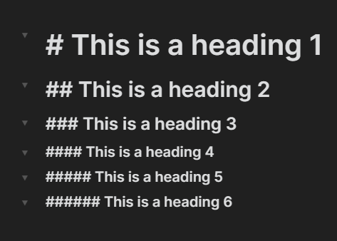
Once you see it, it’s hard to un-see. Sorry 
No matter which theme, the folding arrows are misaligned. They are low on the small headings and high on the big headings. This is a low-priority item, but it would feel much cleaner if they were either centered on the heading or all bottom aligned with the heading.