Meta Post - Common CSS Hacks

Hi, Thank you for this code. Its great. Just have a query:
In the editor mode, when I write long sentences, I couldn’t get continuous lines after the text wrap (please see the following image):
obsidianquestion
However, there is no such issue in preview mode. Is there a way get continuous lines in editor mode?
Thank you in advance.

1 Like

@ramana: I don’t what code you got, but could this be what you need?

/* Long bullet list: connect the same levels of bullets with vertical "lines" */
.cm-hmd-list-indent .cm-tab, ul ul { position: relative; }
.cm-hmd-list-indent .cm-tab::before, ul ul::before {
 content:'';
 border-left: 1px solid rgba(0, 122, 255, 0.25);
 position: absolute;
}

.cm-hmd-list-indent .cm-tab::before { left: 0; top: -5px; bottom: -4px; 
}

ul ul::before { left: -11px; top: 0; bottom: 0; /* change "left:" value for align of vert. line */
}

/* Edit mode unordered list dash rendered as dot for WYSIWYG */
/* I prefer "Turn -lists into bullets as you type as per Typora */
div:not(.CodeMirror-activeline)>.CodeMirror-line span.cm-formatting-list-ul {
    color: transparent;
    max-width: 10px;
}
  
div:not(.CodeMirror-activeline)>.CodeMirror-line span.cm-formatting-list-ul:after {
    content: "•";
    position: absolute;
    top: 6px;
    left: 4px;
    color: var(--text-normal);
}

I have a file with many useful snippets: you can download it here.

2 Likes

@Klaas Thank you for the reply and the code. However even with this code, I see the same gaps in the bullet lines after text wraps (please see the following image).

I don’t what code you got, but could this be what you need?

The code posted by @lizardmenfromspace earlier.

I have a file with many useful snippets: you can download it here

I am new to CSS and this will be very helpful. Thank you very much.

I’m going to add an answer to “How to change font styles/sizes in Obsidian?” for referencing in other threads. The contents of this snippet are from the Minimal Theme by @kepano , and can be found here.

 /*----------------------------------------------------------------
  Font styles
  Preview mode and UI */

  --text:-apple-system,BlinkMacSystemFont,"Segoe UI",Roboto,Oxygen-Sans,Ubuntu,Cantarell,"Helvetica Neue",sans-serif;
  
  /* Editor mode */

  --text-editor:-apple-system,BlinkMacSystemFont,"Segoe UI",Roboto,Oxygen-Sans,Ubuntu,Cantarell,"Helvetica Neue",sans-serif;
  
  /* Code */

  --font-monospace:Menlo,SFMono-Regular,Consolas,"Roboto Mono",monospace;

  /* Sizes, weights, padding */

  --font-normal:16px;
  --font-small:13px;
  --font-smaller:11px;
  --font-smallest:10px;
  --normal-weight:400;   /* Switch to 300 if you want thinner default text */
  --bold-weight:600;     /* Switch to 700 if you want thicker bold text */
  --line-width:40rem;    /* Maximum characters per line */
  --line-height:1.5;
  --max-width:87%;       /* Amount of padding around the text, use 90% for narrower padding */
  --nested-padding:3.5%; /* Amount of padding for quotes and transclusions */
  --icon-muted:0.4;
  --border-width:1px;
  --border-width-alt:1px;

  /*----------------------------------------------------------------
9 Likes

If I am not mistaken, your snippet breaks the ![[image.jpg|30]] resizing notation.
For instance:

![[image.jpg|30]]
![[image.jpg|100]]
![[image.jpg|200]]

are all rendered as identical figure sizes (when not hovering with the mouse). Without your snippet, the same figured is instead rendered three times with distinct sizes.

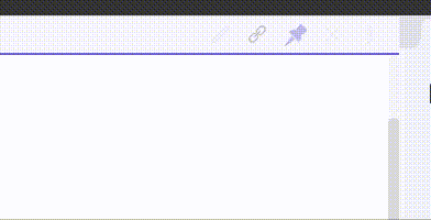
Regarding the visibility of the pane header icons, I use this. Keeps a tiny bit of visibility of the icons, but also keeps the pin/link items more visible even when not hovered (I find that useful). Also has a snazzy ripple of visibility in/out on hover because I was bored when I wrote it so why not? :slight_smile:

Untitled

/*
    Fade the pane header controls unless hovered (just to reduce/minimise distraction) 
    does this per individual control to easily leave link and pin slightly more visible even if not hovered, and 
    as an easy way to do a snazzy transition delay stagger in and out ;)    
*/

/* not hovered ie. on cursor exit from the header */
.view-header:not(:hover) a.view-action[aria-label*="Preview"],
.view-header:not(:hover) a.view-action[aria-label*="Edit"]  { 
  opacity: 0.1;
  transition: opacity .25s ease-in-out;
  transition-delay: 0ms;
}

.view-header:not(:hover) a.view-action[aria-label*="link"] { 
  opacity: 0.55;
  transition: opacity .25s ease-in-out;
  transition-delay: 20ms;
}

.view-header:not(:hover) a.view-action[aria-label*="Pin"] { 
  opacity: 0.35;
  transition: opacity .25s ease-in-out;
  transition-delay: 40ms;
}

.view-header:not(:hover) a.view-action[aria-label*="Close"] { 
  opacity: 0.1;
  transition: opacity .25s ease-in-out;
  transition-delay: 60ms;
}

.view-header:not(:hover) a.view-action[aria-label*="More"] { 
  opacity: 0.1;
  transition: opacity .25s ease-in-out;
  transition-delay: 80ms;
}

/*  hovered ie. on cursor entry to the header */
.view-header:hover a.view-action[aria-label*="Preview"],
.view-header:hover a.view-action[aria-label*="Edit"]  { 
  opacity: 1;
  transition: opacity .25s ease-in-out;
  transition-delay: 0ms;
}

.view-header:hover a.view-action[aria-label*="link"] { 
  opacity: 1;
  transition: opacity .25s ease-in-out;
  transition-delay: 20ms;
}

.view-header:hover a.view-action[aria-label*="Pin"] { 
  opacity: 1;
  transition: opacity .25s ease-in-out;
  transition-delay: 40ms;
}

.view-header:hover a.view-action[aria-label*="Close"] { 
  opacity: 1;
  transition: opacity .25s ease-in-out;
  transition-delay: 60ms;
}

.view-header:hover a.view-action[aria-label*="More"] { 
  opacity: 1;
  transition: opacity .25s ease-in-out;
  transition-delay: 80ms;
}
3 Likes

when i toggle this snippet, my gruvbox theme color revert back to default theme color…

@GreenChocho That’s very odd, there’s no part of it that changes colours or affects anything like that - it should be completely theme-proof. I’ve just installed gruvbox and tested it, and I can’t recreate your issue at all. The only thing I can suggest is switching to another theme and checking that the hover behavior works, and then switching back to gruvbox (turn it off, turn it back on…)

Or maybe try pasting the code above into your snippet file again. If you didn’t get all of it (missing brace or something) then I guess it could interfere with the theme loading (can’t really see how, but you never know).

1 Like

I recheck according to your comment and It was my mistake. I missed the last brace…
I am sorry for the trouble.
It work great now! :smiley:. Thank you!

No trouble, that’s what communities are for :grinning:

1 Like

Can someone suggest a way to change the colour and properties of italicised or bold texts? I intend to use it as an alternative to highlighting of sorts.

@DummyME
In the preview portion those are called by their standard html elements. <strong> for bold and <em> for italics. On the edit side they are called by classes “cm-strong” and “cm-em” respectively. For the preview mode you can also have different changes based on the class of the document.
As an example the below code with change emphasized words to green in edit mode, red in preview mode unless it has the css class of “test” in which case it would be blue:

em {
    color: red;
}

.cm-em{
    color: green;
}

div.test em{
    color: blue;
}

This is what it would look like (edit mode on the left and preview on the right):

2 Likes

Thanks a lot.
Is there a way I can get away with the tilt as well. I vaguely remember it to be called decoration?
Thanks!

Responsive font :sunglasses:

same document but the smaller is the window, the smaller is the font!


Here is the code

:root
{
--font-size-normal: clamp(12px, 5vh, 20px);
--font-size-code: clamp(12px, 5vh, 18px);
--font-size-side-dock: clamp(12px, 5vh, 16px);
--font-size-side-dock-title: clamp(12px, 5vh, 18px);
--font-size-blockquote: clamp(16px, 5vh, 22px);
--font-size-status-bar: clamp(16px, 5vh, 16px);
--font-small: clamp(16px, 5vh, 18px);
--font-medium: clamp(16px, 5vh, 21px);
}

PS: You can do that with header too :slightly_smiling_face:! with the clamp() property. But I am too lazy

3 Likes

I am unable to apply it as a snippet in v0.9.22. Can someone help?

As I explored CSS snippets and customization, I made a short video walk through to get started:

https://youtu.be/iCRmtNmGA9k

Hope it’s helpful!

Regarding this wonderful explanation, is there a way to display the src page of a header/block embed - as is presented with standard page embed ![[page ref]]? It would be nice to display not only the embedded header at the top of the transclusion, but also the file in which it resides.

What to do if I would like to have relative path in my edit mode (in md files) but don’t really want them to render as such? While in preview, I would like them to be stripped of path and just the filename.

This is link to a file : [[Vault/Folder/New File Name]]

to be displayed as in preview

This is link to a file : New File Name

^ with clickable link ofcourse

Outliner for the outliners (Improved version)


  .collapsible-item-collapse {
    padding: 2px 15px 2px 15px;
    left:1.5px;
  }
   div.collapsible-item-inner{
    position:relative;
    padding-left: 15px;

   }
  .outline .collapsible-item-children {
    margin-left: 20px;
    border-left: 1px solid rgba(118,158,165,0.2);
    border-radius: 4px;
    transition:all 0.5s ease-in-out;
  }
  .outline .collapsible-item-children:hover {
    border-left-color: rgba(118,158,165,0.4);
  }

1 Like

I’ve got a snippet. It could do with something to make it look a lot nicer than just the default text, but it’s the key starting point.
The alt attribute of an internal-embed div contains text of the form “File name > header”, so this works well.

.internal-embed::before{
  content: attr(alt);
}
1 Like