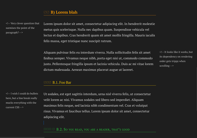
The idea is simple but I like it.
- The ability to turn html comments at the top of a text block into marginalia, without the “<!–…” noise.
- It would be able to react to the size of the pane, jumping back atop the paragraph if needed,
- and it would alternate sides if vertical space was needed.
This is the very not-what-I-want CSS I managed to come up with as a non-coder myself (hi, I don’t code). I believe we need some JS wizardy to make it cool and useful:
/* Because I don't know how to target HTML comments only via
CSS, I'm forced to include all exceptions to the .cm-comment class */
.cm-line
  > .cm-comment:not(.cm-hmd-frontmatter):not(.cm-comment.cm-comment-start):not(.cm-comment.cm-comment-start
    + *):not(.cm-comment.cm-comment-end) {
  position: absolute;
  width: 190px;
  color: inherit;
  font-size: 0.8em;
  opacity: 0.9;
}

.cm-line:nth-child(odd) > .cm-comment {
  left: -210px;
}

.cm-line:nth-child(even) > .cm-comment {
  right: -210px;
}
I always leave a margin on paper notes for review and for getting good SRS prompts for my index cards, be it paper or Anki.
That’s it. Thank your for stopping by! ![]()
