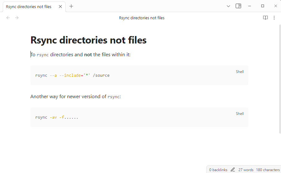
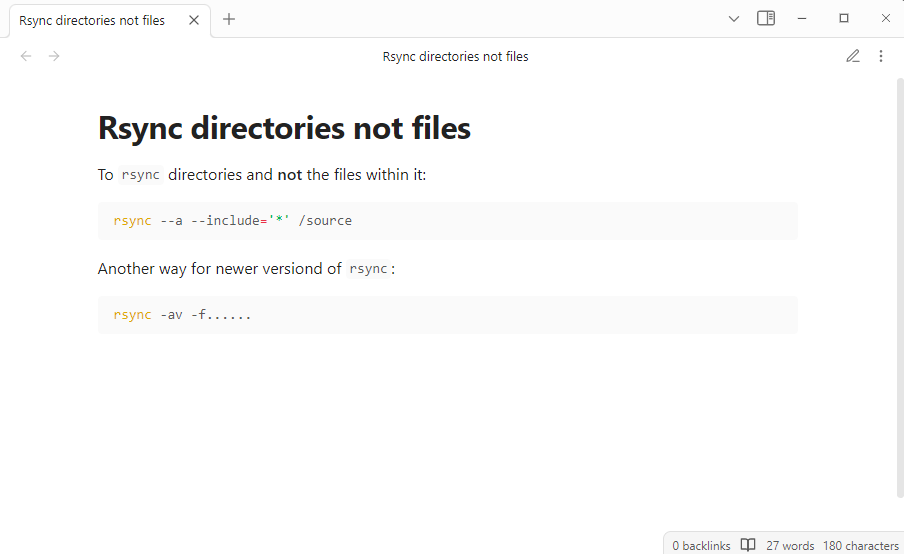
How can I make the editing view, and the reading view, look the same? Right now the editing view looks bigger, nice to read, but the reading view make fonts, and the screen real estate, smaller.
I am using everything vanilla, no custom themes, no community plugins.
While some spacing differences between Live Preview and Reading views is expected, that seems excessive. Also, iirc, Obsidian uses CodeMirror for code syntax highlighting in live preview and PrismJS for reading view, so you’ll see differences there as well.
A new vault with no settings changed in live preview mode: