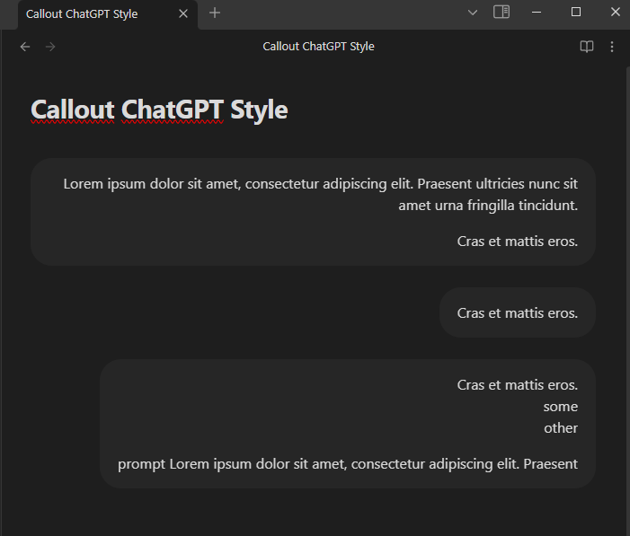
This custom callout doesn’t properly support multiple paragraphs of varying widths. How do I make it so that that shorter paragraphs match the width of the longest paragraph rather than having their width reduced to fit their content?
]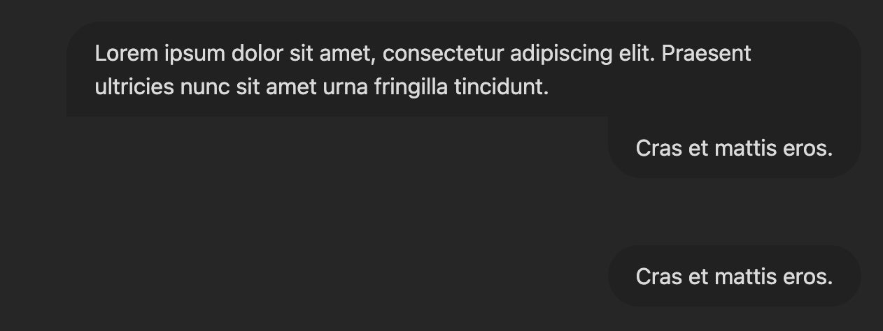
I want it to look like:

I tried to use width: 85% instead of max-width: 85% but this made all paragraphs equal width, which breaks smaller callouts:
.callout[data-callout|="chatgpt"] {
    margin: var(--size-4-8) 0;
    background-color: unset;
    --callout-prompt-padding: 10px 20px;
}
.callout[data-callout|="chatgpt"] .callout-content {
    padding: unset;
    background-color: unset;
    box-shadow: none;
}
.callout[data-callout="chatgpt-prompt"] .callout-title {
    display: none;
}
.callout[data-callout="chatgpt-prompt"] .callout-content {
    display: flex;
    flex-direction: column;
}
.callout[data-callout="chatgpt-prompt"] .callout-content > * {
    display: inline-block;
    max-width: 85%;
    margin-block-start: unset;
    margin-block-end: unset;
    margin-left: auto;
    padding: var(--callout-prompt-padding);
    text-align: left;
    background-color: var(--background-secondary);
    border-radius: 1.5rem;

    &:nth-child(n + 2) {
        border-top-left-radius: 0;
        border-top-right-radius: 0;

        margin-top: 0;
    }

    &:nth-last-child(n + 2) {
        border-bottom-left-radius: 0;
        border-bottom-right-radius: 0;
    }
}
.callout[data-callout="chatgpt-prompt"] .callout-content > * + * {
    margin-top: 1rem;
}
> [!chatgpt-prompt]
> Lorem ipsum dolor sit amet, consectetur adipiscing elit. Praesent ultricies nunc sit amet urna fringilla tincidunt.
>
> Cras et mattis eros.