Use case or problem
Now the settings window looks like something between Linux and Windows. It doesn’t look native on macOS.
Proposed solution
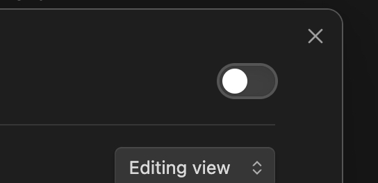
The button should be located on the left, not the right, and be red dot, not just a cross.
Now the settings window looks like something between Linux and Windows. It doesn’t look native on macOS.
The button should be located on the left, not the right, and be red dot, not just a cross.
I’d go further than this: The preferences window on MacOS doesn’t use the native window format. It can’t be dragged, for example. It moves along with the main window (that is, it isn’t a “real” window at all.) Worst of all the close button (an “x”) is on the wrong side which completely messes with all my muscle memory, and it doesn’t respond to a cmd-W to close (again, because it isn’t really a window).
It really should use the native preferences window like every other MacOS app.
As of sometime before 1.9.14 (maybe 1.9.10?) the settings window now has no close button at all. I don’t know if that’s intentional, but I miss having a button, even the non-native one.
I don’t anything relevant in the changelog back to May (which is well before I noticed the change).
I still have a close button. Obsidian version: v1.10.2 Installer version: v1.9.10, and just tried Installer version: 1.9.14, same thing.
(Still on MacOS 14.4.1 if that maybe is the factor.)
And the settings window is more of a modal, so it seems more consistent with things like the command palette, or quick switcher. It doesn’t have it’s own OS window, such that you could Cmd-~ between them.
(Just explaining what it seems to be, not discounting the feature request.)
Hm, my installer version is a bit vintage. I wouldn’t expect that to matter, but maybe it does. I don’t see a close button in the Sandbox vault either.
I notice my screenshot has scroll bars and yours doesn’t. Switching off the MacOS setting to always show scroll bars didn’t make a difference.
And I’m on MacOS 26.1, so maybe that’s a difference. I just recently updated that; the button disappeared while I was still on 15.whatever.