z1x
1
func
This css can make the button area in the ribbon display floating, just like a toolbar.
Share if there are suggestions for improvement.
/* Adjust ribbon position to hide */
.workspace-ribbon.mod-left {
    margin-left: -48px;
}

/* Hide other elements in ribbon except side-dock-actions */
.sidebar-toggle-button.mod-left,
.side-dock-settings {
    display: none;
}

/* Position the side-dock-actions to the top center */
.side-dock-actions {
    position: fixed;
    top: 45px;
    left: 50%;
    transform: translateX(-50%);
    width: fit-content;
    max-width: 90%;
    padding: 8px 12px;
    background-color: var(--background-secondary, #f5f5f5);
    border-radius: var(--radius-m, 4px);
    display: flex;
    flex-direction: row;
    align-items: center;
    gap: var(--size-4-1, 4px);
    opacity: 0;
    transition: opacity 0.3s ease 0.2s;
    z-index: 100;
}

/* Displayed when hovering or focusing */
.side-dock-actions:hover,
.side-dock-actions:focus-within {
    opacity: 1;
    transition-delay: 0s;
}
.side-dock-actions::before {
    content: '';
    position: absolute;
    top: 0;
    left: 0;
    right: 0;
    bottom: 0;
    z-index: -1;
}

/* Button Style */
.side-dock-actions .clickable-icon {
    background-color: transparent;
    font-size: 20px;
    width: 24px;
    height: 24px;
    transition: transform 0.1s ease;
}

/* Button Hover Feedback */
.side-dock-actions .clickable-icon:hover {
    transform: scale(1.1);
}
Adjust to fit your vault
- adjust margin-left to hide original ribbon area.
- adjust the position of the side-dock-actions to suit your needs.
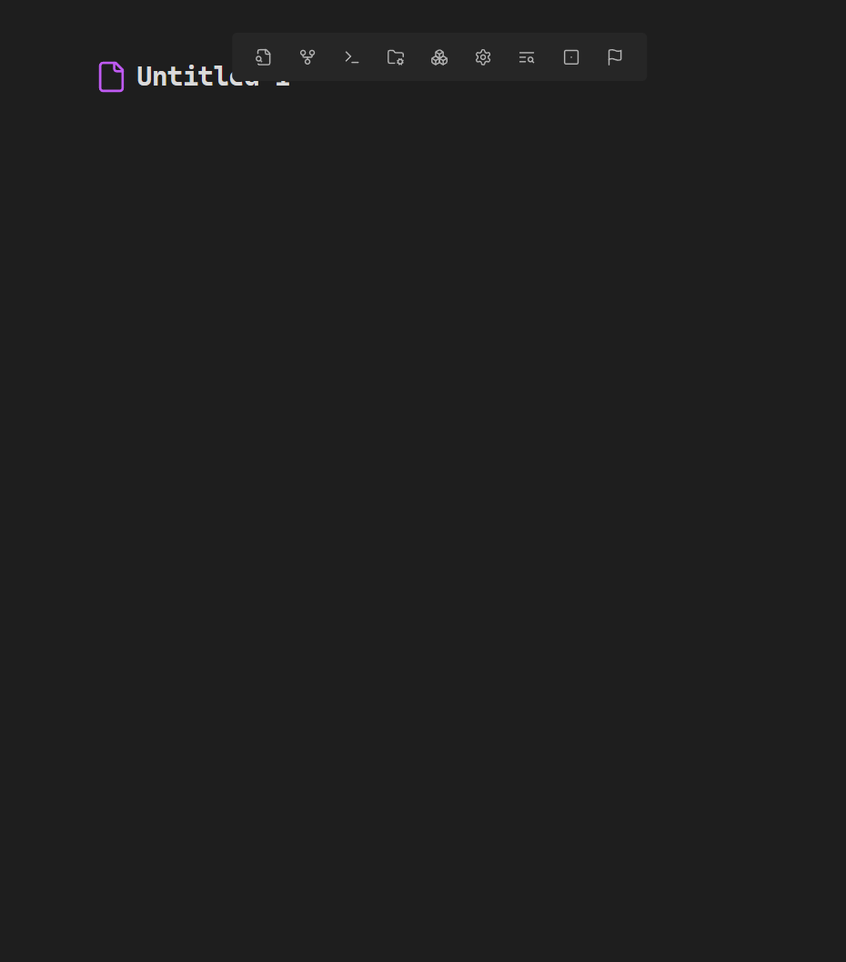
preview
1 Like
z1x
2
A modified version is recommended:
/* Adjust ribbon position to hide */
.workspace-ribbon.mod-left {
    margin-left: -48px;
}

/* Position the side-dock-actions to the top center */
.side-dock-actions {
    position: fixed;
    top: 45px;
    left: 50%;
    transform: translateX(-50%);
    width: fit-content;
    max-width: 90%;
    padding: 8px 12px;
    background-color: var(--background-secondary, #f5f5f5);
    border-radius: var(--radius-m, 4px);
    display: flex;
    flex-direction: row;
    align-items: center;
    gap: var(--size-4-1, 4px);
    opacity: 0;
    transition: opacity 0.3s ease 0.2s;
    z-index: 100;
}
/* Displayed when hovering or focusing */
.side-dock-actions:hover,
.side-dock-actions:focus-within {
    opacity: 1;
    transition-delay: 0s;
}
.side-dock-actions::before {
    content: '';
    position: absolute;
    top: 0;
    left: 0;
    right: 0;
    bottom: 0;
    z-index: -1;
}

/* Button Style */
.side-dock-actions .clickable-icon {
    background-color: transparent;
    font-size: 20px;
    width: 24px;
    height: 24px;
    transition: transform 0.1s ease;
}

/* Button Hover Feedback */
.side-dock-actions .clickable-icon:hover {
    transform: scale(1.1);
}
1 Like
z1x
3
New Verison:Add a delay to avoid unintentionally triggering the display. Now it doesn’t show up when the mouse accidentally slides by
/* Adjust ribbon position to hide */
.workspace-ribbon.mod-left {
    margin-left: -48px;
}

/* Position the side-dock-actions to the top center */
.side-dock-actions {
    position: fixed;
    top: 85px;
    left: 50%;
    transform: translateX(-50%);
    width: fit-content;
    max-width: 90%;
    padding: 8px 12px;
    background-color: var(--background-secondary, #f5f5f5);
    border-radius: var(--radius-m, 4px);
    display: flex;
    flex-direction: row;
    align-items: center;
    gap: var(--size-4-1, 4px);
    opacity: 0;
    z-index: 100;
}
/* Displayed when hovering or focusing */
.side-dock-actions:hover,
.side-dock-actions:focus-within {
    opacity: 1;
    transition-delay: 0.3s;
}

/* Button Style */
.side-dock-actions > .clickable-icon {
    background-color: transparent;
    font-size: 20px;
    width: 24px;
    height: 24px;
    transition: transform 0.1s ease;
}

/* Button Hover Feedback */
.side-dock-actions > .clickable-icon:hover {
    transform: scale(1.1);
}
1 Like
system
Closed
4
This topic was automatically closed 7 days after the last reply. New replies are no longer allowed.