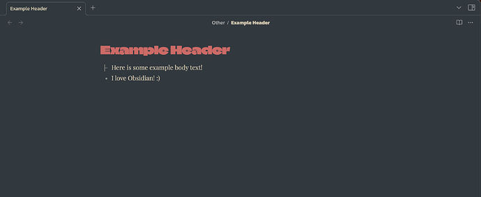
Hello! Newbie Obsidian fan here – started using the program in March of this year. Here’s the issue: I have been trying and failing to change the kerning of header text in Obsidian. I have a custom font that I really like, but the letters are a bit too close to one another to be comfortably legible, as seen here:
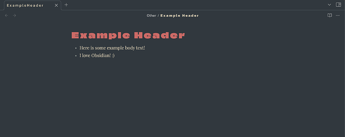
I’d love it if there was a bit of space, at least one or two pixels, between each letter in the header text (in this example, I’ve simply put spaces in between each letter, and then three in between each word; I dislike this solution, which is why I’m trying to solve it with a CSS snippet):
I am using the Nord theme, if that information is relevant here.
I’ll preface with the fact that I am a humanities student, and the closest thing to “coding” I’ve ever done was making a custom HUD in Team Fortress 2, back in the day. With that being said, here’s what I’ve tried:
h1 {
    letter-spacing: 2px;
}
body {
    --h1-letter-spacing: 1px;
}
Neither of these poorly-written, ill-educated solutions worked. If someone knows how I might go about this, please let me know! If it’s explicitly not possible to do this exact thing with CSS snippets, the same goes – I’ll just be a bit bummed.
I checked the Typography page of the CSS variables page, and didn’t see anything relevant to changing the kerning of header text. If I’ve missed something, please let me know! (“–h1-letter-spacing” was a hopeful but obviously misinformed guess, made based on my experience changing the header font to begin with.)


