Here’s one workaround. I can’t find a way to pass information to the template to be used, so I had to rely on a templater system prompt to get the meeting name filled out as an example. This will need the JS Engine plugin that is mentioned on the meta-bind page.
Here’s my template demo note called demo-template-replace:
<%*
const meetingName = await tp.system.prompt("Meeting")
const date=new Date();
const today=date.getFullYear() + "-" + (date.getMonth() + 1).toString().padStart(2,"0") + "-" + date.getDate().toString().padStart(2,"0");
-%>
# Metadata
meetingName:: <% meetingName + " - " + today %>
type:: standup
attendees::
All it does is ask for the meeting name, then will create note contents with the header and the inline fields, with meetingName filled out. You can add other fields like date, etc as needed.
In my daily note, I have the following:
meta-bind-js-view
{frontmatter^meetingTemplate} as fmMeetingTemplate
---

let meetingTemplate="90 - Templates/10 - Notes/demo-template-replace.md";
if(context.bound.fmMeetingName != undefined) {
	meetingTemplate=context.bound.fmMeetingTemplate;
}

lastLine=app.workspace.activeEditor.editor.lineCount()

const buttonString = `
~~~meta-bind-button
label: Create Meeting at line ${lastLine}
hidden: false
title: "Create Meeting"
class: "button-43"
tooltip: "Create Meeting"
id: ""
style: primary
action:
  type: insertIntoNote
  line: ${lastLine}
  value: ${meetingTemplate}
  templater: true
~~~
`
return engine.markdown.create(buttonString);
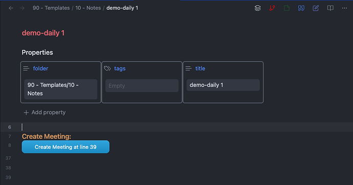
This renders like this:
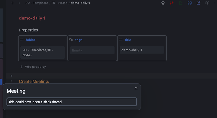
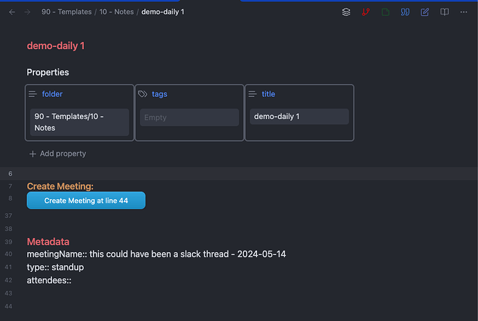
If you click the button, it will insert the template at the last line of the file, determined programmatically. When it does this, you’ll get a popup asking you to input the meeting name, and then the text appears at the bottom as desired.
Prompt:
Result:
My meta-bind-js code by default uses a hardcoded template file, but allows for a frontmatter property meetingTemplate to override it if you want to choose a different template at any point without modifying the code.
If you want the style I’m using for the class property, the CSS for it comes from here. This is the style I added to my CSS snippets to style my buttons:
.button-43 button {
  background-image: linear-gradient(-180deg, #37AEE2 0%, #1E96C8 100%);
  border-radius: .5rem;
  box-sizing: border-box;
  color: #FFFFFF;
  display: inline-flex;

  justify-content: center;
  padding: 1rem 1.75rem;
  text-decoration: none;
  width: auto;
  border: 0;
  cursor: pointer;
  user-select: none;
  -webkit-user-select: none;
  touch-action: manipulation;
}

.button-43 button:hover {
  background-image: linear-gradient(-180deg, #1D95C9 0%, #17759C 100%);
}


