Hi everyone,
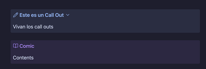
I’m noticing that the horizontal margins inside callouts (especially in changelog sections) seem too narrow or don’t behave as expected. The text appears too close to the edges, making it harder to read and visually unbalanced.
Has anyone encountered this issue or found a reliable way to increase the spacing between the text and the callout borders?
I’m using Obsidian v1.9.2 , the Callout-Manager plugin, and the AnuPpuccin theme on a MacBook Pro with MacOS Sequoia 15.5
Any help or guidance would be greatly appreciated!
Thanks!
