Steps to reproduce
- Open a note
- Change to reading/live mode, notice the icon at the top-right and bottom-right
- Change source/editing mode, notice the icon at the top-right and bottom-right
Expected result
When I’m in READING mode, the icon on the top right shows what I can change INTO (editing mode), and vice-versa.
But on the bottom-right, it’s the opposite: the icon shows what I’m seeing. So, if I’m in Live Preview mode, it shows the icon for Live Preview Mode. If Source, icon for Source mode and so on.
Actual result
- I believe it should be consistent with one another.
- I much prefer that the icon to show me where I’m at, and not what I can change into (specially because if you have more than two options, then this makes much more sense.
You can even notice that the icon on the top is the opposite of what is shown at the bottom for reading and live preview mode.
Screenshots
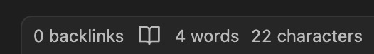
Bottom-right (what I see is where I’m at)
When I’m at Live Preview mode:

When I’m Source mode:

When I’m at Reading mode:
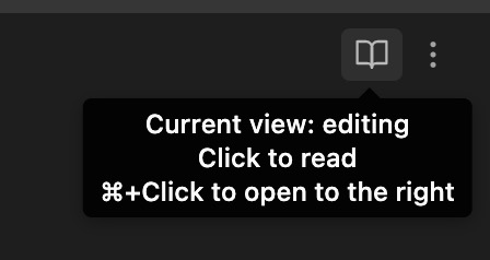
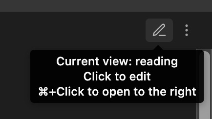
Top-right (what I see is NOT where I’m at, but rather what to change to)
When I’m at EDITING mode:
When I’m at READING mode:
PS: I was posting at the bug forum, but maybe it belongs here?