Improved Visibility for Files and Folders at the Same Level in Obsidian's File Explorer

Use case or problem

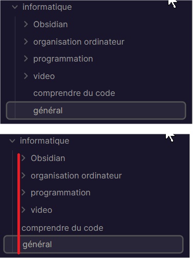
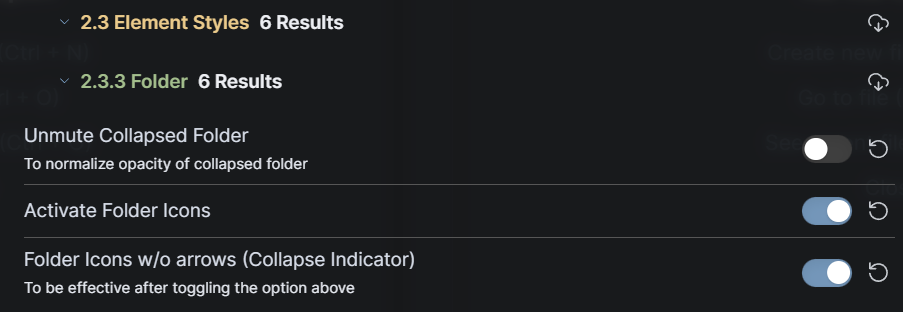
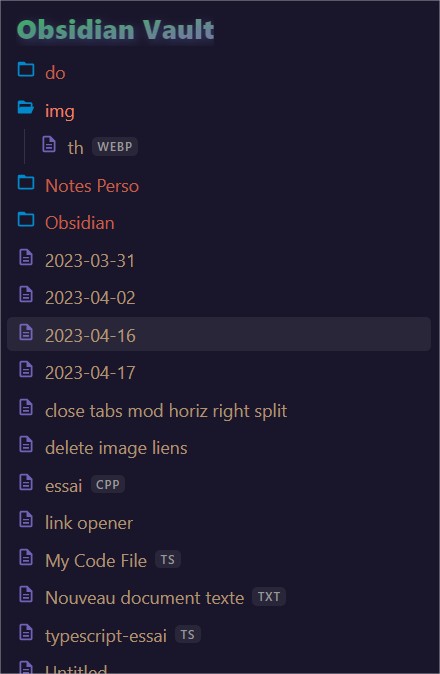
Currently, in Obsidian’s file explorer, folders are displayed with an expandable arrow to signify their expandability. However, this creates a visual offset. The file names, positioned vertically at the same level as the folder names, give the impression that they are located inside the folders.

Proposed solution

Current workaround (optional)

Remove the visual offset created by the expandable arrow for folders.

2 Likes

A css snippet will do the job:

.nav-file-title-content {
  margin-left: -17px;
}
1 Like

Thank you.
I’ve just modified it to:

.nav-file-title-content {
  margin-left: -1rem;
}

edit: 0.9 is better
But let’s be clear, I’m asking for a default native change.

Result is much better, isn’t it ?

1 Like

We are not gonna do this. And we believe the opposite about visibility.

Moved to plugin ideas.

3 Likes

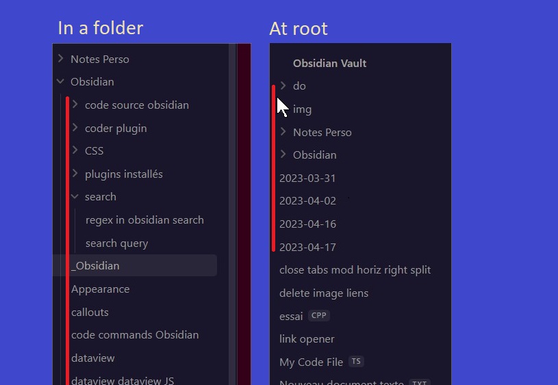
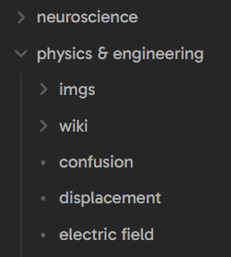
I think what would be better than your solution is to keep the text where it is but add an icon to the left of non-folder notes, aligned with the chevrons for folders. That way text remains aligned and you don’t get confused about containment.
Even a simple dot would suffice

3 Likes

“we” sure? Honestly this is just more logical. No preference there. But I’m good with this now

Possible to have an image of what will be the result ? I did the first one just using paint

Yes, we sure. This was an intentional change after a lot of thinking, not just for the file explorer. Feel free to customize the look with css.

Honestly, esthetically, the actual solution creates something less homogeneous and boring. But functionally, that’s confusing. So maybe there is an alternative to it, considering both facts.
I can’t tell directly now, but a smaller space, icon…

or


with

.nav-file-title-content:before {
  content: "-";
  padding-right: 0.5rem
}

.nav-file-title-content {
  margin-left: -.9rem
}
1 Like

Check how other apps, like Finder and Windows Explorer handle indentation in the same situation — they do it the way Obsidian does it now. I don’t know of any common app that does it the way you’re suggesting. What’s intuitive is influenced by what people are used to, so people are likely to find the current way less confusing. Also the folding indicators are faded secondary elements, so people are less likely to factor them into their sense of the hierarchy.

Other apps do tend to include icons, so maybe adding those would make it less weird to you.

Until recently Obsidian did it the way you suggested and I found it very confusing.

3 Likes

I checked VSC, but I’m still not convinced by this choice
For the moment,

I will go like this. And I understand it’s not shared by others, apparently. So I will let this topic open until tomorrow and close it.
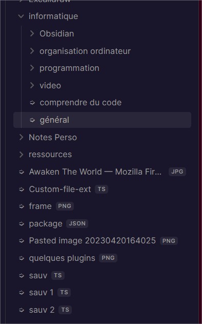
Looking again at the result, it seems really not bad to me this last one.

1 Like

You can leave it open as long as you want — a plugin (or I guess a snippet in this case) is a fine way to handle a niche desire, and you may not be the only one who wants it (at the very least, someone on the Obsidian team was at least OK with the prior version).
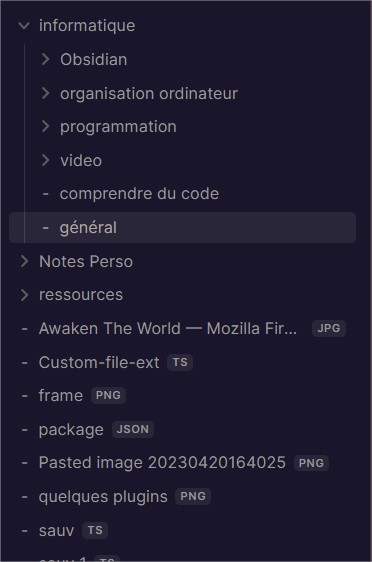
Of course, that’s the advantage of plugins or customizable CSS. But anyway, I have to see in time the result.

The Blue Topaz theme solved this.

Steps:

  1. Grab Blue Topaz theme and Style settings plugin.

  2. Toggle these

  3. Result
    image

I found these both beautiful and intuitive. Hope you do too!

2 Likes

There is also file-tree-alternative using some icons. I put the link to remember it later if needed…

finally after many edits

.nav-folder-title-content:first-child {
  /* color: #7ea2a3; */
  background: linear-gradient(to bottom right, #34bd4b, #867ea3);
  -webkit-background-clip: text;
  -webkit-text-fill-color: transparent;
  font-weight: 900;
  font-size: 1.25rem;
  text-shadow: 2px 2px 8px rgba(86, 100, 167, 0.5);
  /* font-family: "Bangers"; */
}

.nav-folder-title-content:first-child::before {
  display: none;
}

/* files */
.nav-file-title-content:before {
  content: "";
  background-image: url("https://www.w3.org/2000/svg");
  display: inline-block;
  width: 0.9rem;
  height: 0.9rem;
  margin-right: 0.4rem;

  background-color: #8172d4d7;
  -webkit-mask-image: url('data:image/svg+xml;utf8,<svg xmlns="http://www.w3.org/2000/svg" viewBox="0 0 24 24" fill=""><path d="M0 0h24v24H0V0z" fill="none"/><path d="M8 16h8v2H8zm0-4h8v2H8zm6-10H6c-1.1 0-2 .9-2 2v16c0 1.1.89 2 1.99 2H18c1.1 0 2-.9 2-2V8l-6-6zm4 18H6V4h7v5h5v11z"/></svg>');
}

.nav-file-title-content {
  margin-left: -1.1rem;
  color: #d4b583c9;
}

/* > icons */
.nav-folder-collapse-indicator svg {
  display: none;
}

/* folders */

.nav-folder-title-content {
  margin-left: -1.1rem;
  color: #ec8462fa;
}

.is-collapsed .nav-folder-title-content {
  color: #e87751c9;
}

.nav-folder-title-content::before {
  content: "";
  position: relative;
  background-image: url("https://www.w3.org/2000/svg");
  display: inline-block;
  width: 0.9rem;
  height: 0.9rem;
  margin-right: 0.4rem;
  background-color: #0992d7f1;
  -webkit-mask-image: url('data:image/svg+xml;utf8,<svg xmlns="http://www.w3.org/2000/svg" viewBox="0 0 24 24"><path d="M2.165 19.551c.186.28.499.449.835.449h15c.4 0 .762-.238.919-.606l3-7A.998.998 0 0 0 21 11h-1V8c0-1.103-.897-2-2-2h-6.655L8.789 4H4c-1.103 0-2 .897-2 2v13h.007a1 1 0 0 0 .158.551zM18 8v3H6c-.4 0-.762.238-.919.606L4 14.129V8h14z"></path></svg>');
}

.is-collapsed .nav-folder-title-content::before {
  -webkit-mask-image: url('data:image/svg+xml;utf8,<svg xmlns="http://www.w3.org/2000/svg" viewBox="0 0 24 24"><path d="M20 5h-8.586L9.707 3.293A.997.997 0 0 0 9 3H4c-1.103 0-2 .897-2 2v14c0 1.103.897 2 2 2h16c1.103 0 2-.897 2-2V7c0-1.103-.897-2-2-2zM4 19V7h16l.002 12H4z"></path></svg>');
}
3 Likes

hey, i just wanted to share my little spin on the short .css snipped that got posted earlier

.nav-file-title-content:before {
    content: "•";
    padding-right: 0.6rem;
    /* opacity: 0.5; */
    color: #626262
  }
  
  .nav-file-title-content {
    margin-left: -0.91rem;
  }

sorry for the weird looking -0.91rem … this value turned out after carefully lining up the dot-symbol with the visual center of the folder-“triangle”-symbol (in closed state) as well as the texts of the folder names with the texts of the file names

Screenshot 2023-10-25 143410

2 Likes