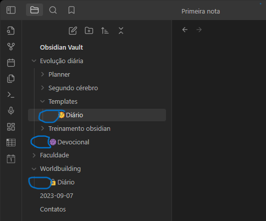
So I’m trying to remove or reduce this spaces between title note and the vertical line of folders. I’m not using any themes and I’m just using plugins that shouldn’t affect this (admonition, periodic notes, advanced tables, calendar, cmenu, emoji magic), it seems when I downloaded the app it came like this. I’d like the note title to be aligned with the folder title
And just to show you some of the flexible things you can do with CSS. I added a snippet that makes a folder icon, which makes it easier to see what is a folder and what is a note.
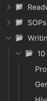
And, to maybe solve your problem. I don’t know if this is the best way. You could add negative margin to the nav-file element. -10px or -1em or something like that.