I work on a laptop with fairly limited vertical screen space; with the update to 1.0, obsidian has added new top and bottom margins to my window which take up about 10% of my total vertical screen space that would otherwise be used to display text. I’m just wondering how I could disable the new margins on the top and bottom of the obsidian window. Additionally, is there any way for me to remove the bezeled edges?
(Also, the update to 1.0 has ruined my visual set up for obsidian in general, so if anyone has a way for me to just revert to the old obsidian look without simultaneously having to watch all of my plugins slowly grow outdated, that would be fantastic.)
Not the OP but I too am having a heck of a time with the giant headers in edit mode. I have this snippet enabled.
/* make all headers the same size */

h1, h2, h3, h4, h5, h6 {
    font-size:  18px !important;
}

/* make all headers in preview the same size */

.markdown-preview-view h1,
.markdown-preview-view h2,
.markdown-preview-view h3,
.markdown-preview-view h4,
.markdown-preview-view h5,
.markdown-preview-view h6 {
    font-size: 1em;
}


/* editor headers */

.cm-header {
    font-size: 1em;
}
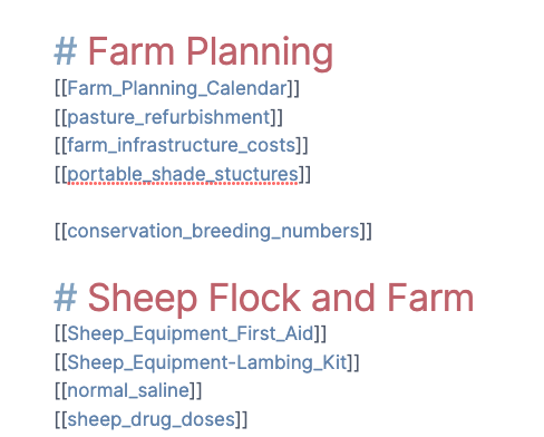
What used to happen is that in both edit and readermode things were all the same size, just different colors.
Now this is what it’s like in edit mode
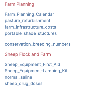
And this is what it looks like in reader mode
I want to get it back to the same size no matter what mode I am in.
Related is that I can change the font size of the notes using appearance font size but the sidebar font seems to stay the same and it’s way too small. How do I increase the sidebar font size?
Control and mouse wheel zooms my entire screen in and out but does not change the font size in editor. It also makes all the operating system stuff on the edges disappear off the sides.
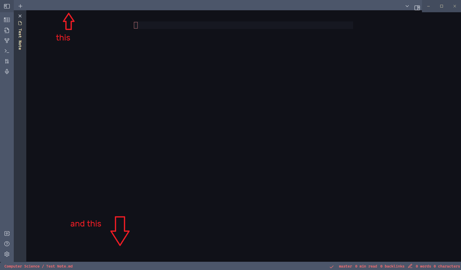
Here’s an image of my vault currently, both the top bar and the bottom bar used to be much smaller, I’ve tested a variety of minimal themes and nothing seems to change, in fact, most minimal themes actually make the bar larger to fit in with the window handling buttons in the top right.
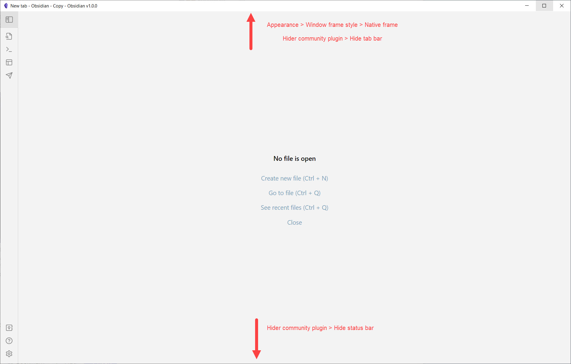
I’m able to improve the top part (fyi looks like “native frame”, at least on Win10, is actually smaller than “hidden”), as well as totally hide the bottom part.
Yeah, I’ve tried the windows native frame but it’s still significantly larger (and significantly uglier) than what used to be the default in obsidian, which I have attached an example of from the blue topaz repository, whose theme I use.
I’ve enabled the ‘hider’ plugin which seems to work as a temporary fix, but it’s still far from preferable to just being able to enable the old obsidian look.