What I’m trying to do
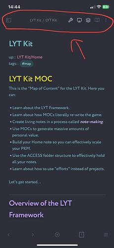
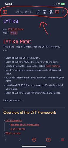
I’m trying to reduce the size of top icons on my Mobile Obsidian(iOS).
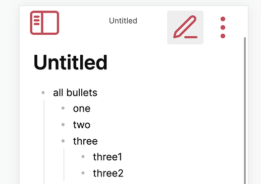
The ones at the top of the screen: more options(3 dots), view switcher and overall that header.
Here are screenshots so you know what I’m talking about.
The way they look in the LYT theme is what I want. Compact and convenient.
But the other themes including default don’t have that luxury. The buttons are big, and with the addition of other commands from Commander, everything becomes too cumbersome.
Things I have tried
I’m a novice in CSS. However I dug through all the possible options in the Developer Tool(Ctrl+Shift+I), but couldn’t find the right ones to change the size of the icons.
When I changed these settings bellow(using "select an element in the page in Devel Tool) I thought I got what I needed. But this snippet has no effect on the display of icons in the MOBILE version.
.view-actions {
    gap: 0;
    align-items: center;
    --icon-size: 15px;
}
I’m desperate ![]()
Other snippets work fine in Mobile version so I think the problem with the size of the icons can also be solved. ![]()
I would be very grateful for your help.


