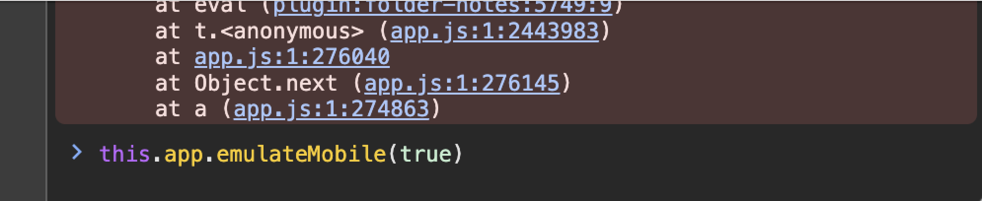
Since I used the Lazy Plugin Loader plugin to delay the startup of some plugins, the order of commands in the ribbon of my Obsidian app has changed, and I can’t adjust it through the ribbon sorting in the settings. So I wrote a CSS code to sort the commands in the mobile ribbon and hide some of them. However, this code doesn’t work on mobile phones but works on tablets. I guess it’s because the layout of Obsidian on tablets is the same as on desktop, while the layout on mobile phones is different. But I don’t know how to modify the code to make it work on mobile phones. I hope to get some help from everyone. The code is as follows:
/*====================================================
Obsidian Mobile Sidebar Ribbon Icon Sorting & Display Control
Purpose: Customize display order and visibility of toolbar buttons in mobile sidebar
Compatible: Obsidian Mobile Application
==================================================== */
/* === Basic Ribbon Container Styles === */
/* Desktop ribbon */
.workspace-ribbon.mod-left {
display: flex;
flex-direction: column;
}
.side-dock-actions {
display: flex;
flex-direction: column;
}
/* Mobile drawer ribbon */
.is-mobile .workspace-drawer-ribbon {
display: flex;
flex-direction: column;
}
.is-mobile .workspace-drawer-ribbon .side-dock-actions {
display: flex;
flex-direction: column;
}
/* === Sidebar Icon Display Order Adjustment === */
/* Rearrange sidebar icon display order using CSS order property, smaller values appear first */
/* 1st Position: Daily Notes - Daily note functionality */
.side-dock-ribbon-action[aria-label*="打开/创建今天的日记"],
.side-dock-ribbon-action[data-tooltip*="打开/创建今天的日记"] {
order: 1 !important;
}
/* 2nd Position: Command Palette - Quick command execution */
.side-dock-ribbon-action[aria-label*="打开命令面板"],
.side-dock-ribbon-action[data-tooltip*="打开命令面板"] {
order: 2 !important;
}
/* 3rd Position: Remote Sync - Data backup and synchronization */
.side-dock-ribbon-action[aria-label*="Remotely Save"],
.side-dock-ribbon-action[data-tooltip*="Remotely Save"] {
order: 3 !important;
}
/* 4th Position: Thino - Mind notes plugin */
.side-dock-ribbon-action[aria-label*="Thino"],
.side-dock-ribbon-action[data-tooltip*="Thino"] {
order: 4 !important;
}
/* 5th Position: Timeline View - View notes by time */
.side-dock-ribbon-action[aria-label*="Open Timeline"],
.side-dock-ribbon-action[data-tooltip*="Open Timeline"] {
order: 5 !important;
}
/* 6th Position: Multi-Day View - Calendar multi-day display */
.side-dock-ribbon-action[aria-label*="Open Multi-Day View"],
.side-dock-ribbon-action[data-tooltip*="Open Multi-Day View"] {
order: 6 !important;
}
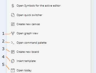
/* === Hide Unwanted Sidebar Icons === */
/* Completely hide the following features from sidebar to simplify interface */
/* Hide: Canvas functionality */
.side-dock-ribbon-action[aria-label*="新建白板"],
.side-dock-ribbon-action[data-tooltip*="新建白板"] {
display: none !important;
}
/* Hide: Graph view */
.side-dock-ribbon-action[aria-label*="查看关系图谱"],
.side-dock-ribbon-action[data-tooltip*="查看关系图谱"] {
display: none !important;
}
/* Hide: Quick switcher */
.side-dock-ribbon-action[aria-label*="打开快速切换"],
.side-dock-ribbon-action[data-tooltip*="打开快速切换"] {
display: none !important;
}
/* Hide: Template insertion */
.side-dock-ribbon-action[aria-label*="插入模板"],
.side-dock-ribbon-action[data-tooltip*="插入模板"] {
display: none !important;
}
/* Hide: Encryption note features */
.side-dock-ribbon-action[aria-label*="New encrypted note"],
.side-dock-ribbon-action[data-tooltip*="New encrypted note"],
.side-dock-ribbon-action[aria-label*="Encrypt/Decrypt In-place"],
.side-dock-ribbon-action[data-tooltip*="Encrypt/Decrypt In-place"],
.side-dock-ribbon-action[aria-label*="Convert to or form an Encrypted note"],
.side-dock-ribbon-action[data-tooltip*="Convert to or form an Encrypted note"] {
display: none !important;
}
/* === Mobile-Specific Styles === */
/* Ensure mobile drawer mode applies the same rules */
.is-mobile .workspace-drawer-ribbon .side-dock-ribbon-action[aria-label*="打开/创建今天的日记"] {
order: 1 !important;
}
.is-mobile .workspace-drawer-ribbon .side-dock-ribbon-action[aria-label*="打开命令面板"] {
order: 2 !important;
}
.is-mobile .workspace-drawer-ribbon .side-dock-ribbon-action[aria-label*="Remotely Save"] {
order: 3 !important;
}
.is-mobile .workspace-drawer-ribbon .side-dock-ribbon-action[aria-label*="Thino"] {
order: 4 !important;
}
.is-mobile .workspace-drawer-ribbon .side-dock-ribbon-action[aria-label*="Open Timeline"] {
order: 5 !important;
}
.is-mobile .workspace-drawer-ribbon .side-dock-ribbon-action[aria-label*="Open Multi-Day View"] {
order: 6 !important;
}
/* Mobile hidden features */
.is-mobile .workspace-drawer-ribbon .side-dock-ribbon-action[aria-label*="新建白板"],
.is-mobile .workspace-drawer-ribbon .side-dock-ribbon-action[aria-label*="查看关系图谱"],
.is-mobile .workspace-drawer-ribbon .side-dock-ribbon-action[aria-label*="打开快速切换"],
.is-mobile .workspace-drawer-ribbon .side-dock-ribbon-action[aria-label*="插入模板"],
.is-mobile .workspace-drawer-ribbon .side-dock-ribbon-action[aria-label*="New encrypted note"],
.is-mobile .workspace-drawer-ribbon .side-dock-ribbon-action[aria-label*="Encrypt/Decrypt In-place"],
.is-mobile .workspace-drawer-ribbon .side-dock-ribbon-action[aria-label*="Convert to or from an Encrypted note"] {
display: none !important;
}