Hi,
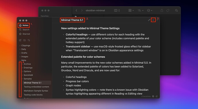
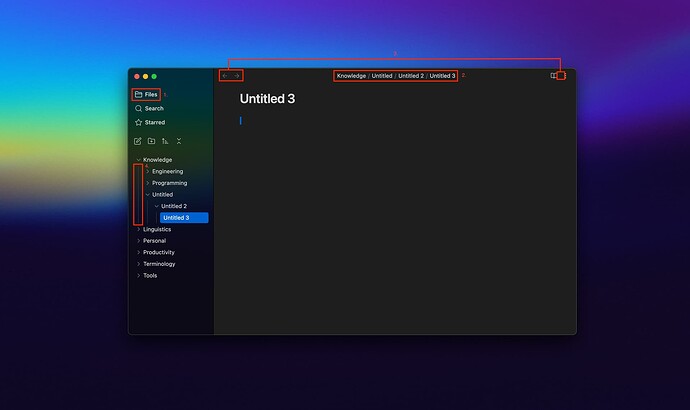
I’ve been figuring out how to customize the theme to match the one in kepano’s documentation as close as possible. But I stumbled upon the fact that no matter how I tried to change, my customization is still different from it. These followings are what I wanted to change.
- The home icon (and the text after it)
- Title tab bar (mine is a whole breadcrum instead of just a filename)
- A few icons on the title bar (e.g., arrows and a close
xicon) - The lines that indicate parent folders in the side bar in the left hand side (i don’t know what should I call it correctly)
- The collapse folder icon in the side bar, that looks like 2 caret symbols point each others vertically (I forgot to mention in the pictures)
kepano’s settings
Mine
I’ve read the documentation and tried tweaking the following app settings as below
- Core plugins
- Minimal theme settings
- Style settings
The closest result is as shown above, and still not the way I like. Yeah, I think I’m kind of OCD myself lol. I had asked this in the subreddit and someone mentioned that it had something to do with CSS stuff. If it’s the only way, could you guys provide me a brief guide on doing that to achieve the result?
Also, do you guys have any tips on how to adjust the font sizes of the headings to make it less off? (They’re not bad but I like the font size in the default theme more). I tried changing them in the Headings section below the Style Settings but I had no idea what font size would be optimal to match my use. I’m fairly new to all of this. And I know the questions I’m asking are kinda excessive and may irritate someone due to my ignorance but I’m excited to learn from you all here.
Thank you in advance and appreciate all the help!

