I would like to get a result similar to that presented in the Cinta Notes program, I highly prefer tag-based list management:
On the left is the tag bar,
On the right is a panel with a list of entries that are filtered from the general set thanks to the selected tags.
That’s it, you don’t need much more!
TRU
November 7, 2022, 8:13am
2
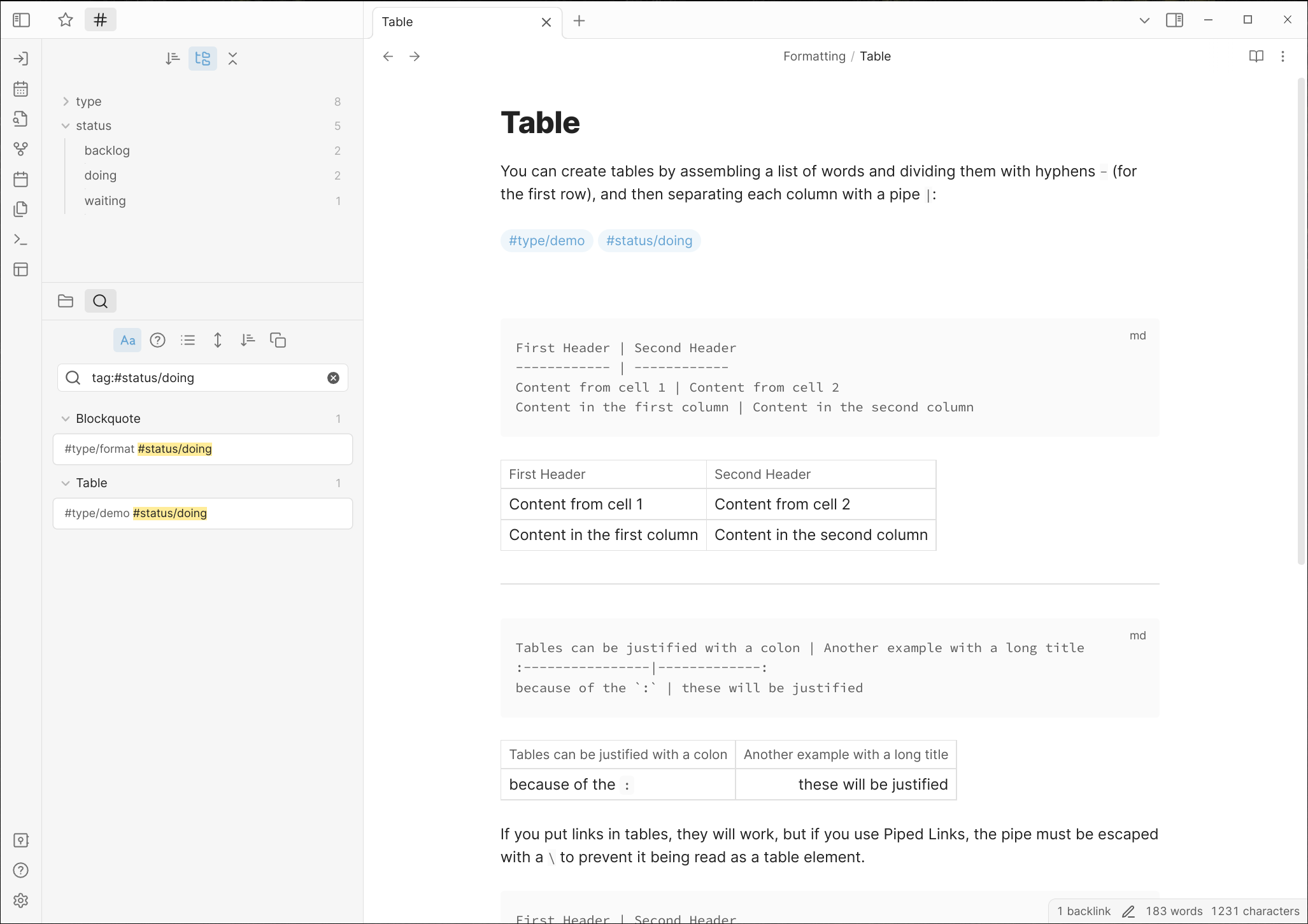
I didn’t like how clicking a tag on the right side required to move back the left side. It felt like the interface was jerky.
This is the sandbox vault, but to show how I arranged my sidebar.
Tags and Search results work well together in this arrangement.
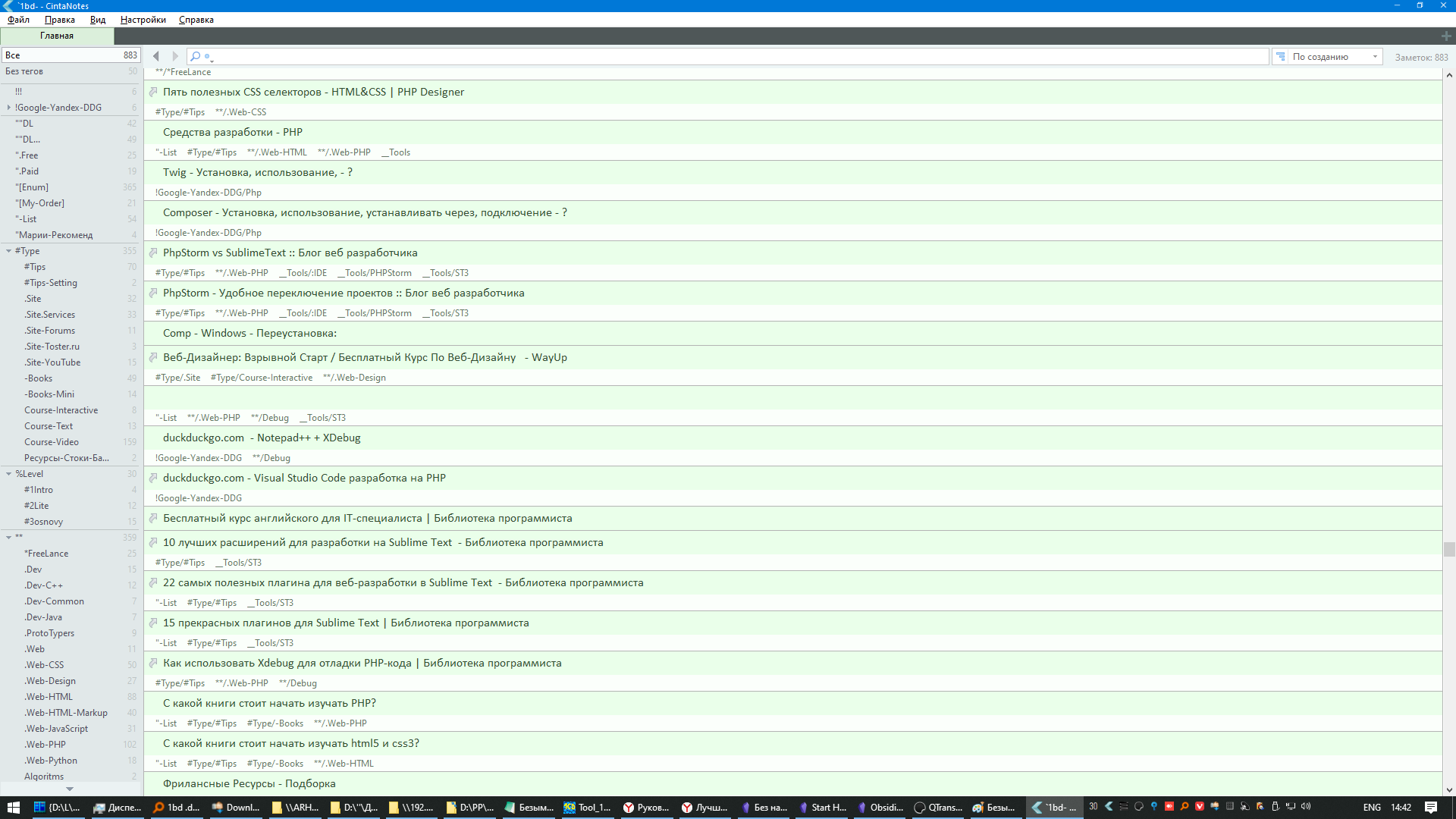
Here is an example of my window in Cinta Notes (this is from an old database, at that time I went to look for something better, but I still haven’t found it, if I find it better, then only in some part)
Here is a link to its native documentation, which describes succinctly what I liked about it
Managing Notes with Tags - CintaNotes help & support - Windows notes app for organizing thoughts and ideas .Руководство пользователя - CintaNotes .
system
February 5, 2023, 9:01am
4
This topic was automatically closed 90 days after the last reply. New replies are no longer allowed.