I’m adding a custom cssclass to achieve per note styling. This works fine, but how do I target dark or light themes (still in a ‘per note’ context)? TIA
Current example code (CSS snippet), which I then activate using cssclass: school
@govsat1 - If your intention is to have them different for dark mode than in light mode, you need to use css variables.
Define the variables for each mode class first, then use them in the css class you want to put in the file.
Dataview somewhat recently added a results count in tables and task lists that is nearly invisible for me on the default dark mode in Obsidian. Here’s a quick snippet that made it more visible in dark mode, but you could set anything. (Selector source: dataview developer in a GitHub discussion).
I am new to CSS but I think the !important is necessary here because the plugin snippet is the same level of specificity, also sets color and seems to be winning the tie-breaker - maybe it is included after the user snippet?
You’ll probably have to close and re-open Obsidian to see the results, or otherwise cause your dataview to re-render.
If anyone has other suggestions for what to put in this snippet, I’d love to learn more CSS.
First - Lithou is still alive and has not been taken over by an alien robot.
Second - I had a day off work last month and updated the image flags snippets to work with “live preview” in edit mode.
I’m pretty sure @Klaas or @kepano asked for this like 14 months ago. I’ve just been prioritizing other things in life since then or just plain forgot. So thanks everyone for your patience.
Link
Here is a link:
Here are some details:
I haven’t updated the documentation on my obsidian publish site yet.
I’ve tested this with v0.15.3 but let me know if you see any odd behaviour with this or any other versions.
I’ve only tested it with the default theme so if there are any odd interactions with themes or other snippets please let me know.
I changed most things to variables at the beginning of the snippet to make it easier to change colors, styles, and sizes. Each also lists a default value incase you want to revert something back to how it was without re-downloading everything
Bugs/Features
Grid Mode
Grid mode will not work in live preview mode due to the extra HTML elements added by obsidian. Works well in reading mode still.
Text Highlighting
I’ve noticed some odd behaviour when using the cursor to select text in “live preview” mode. It will work fine if you are going left/right but will have some odd skipping when going up/down line by line.
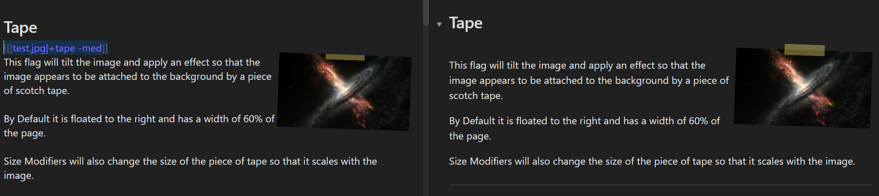
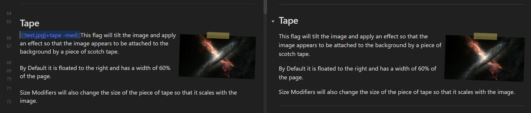
Placement of image oddities:
Images with the “+tape” and “+pin” flags need to be included in a paragraph with the text that goes next to it. Otherwise the “DIV” element which contains them won’t be large enough.
Compare the following two examples. Both have edit mode on the left with live preview engaged. Reading view is on the right.
The first one has the image in its own paragraph which causes clipping of the tape element:
There used to be a way to have icons for notes in the file explorer.
However, this is broken in the latest v0.16 insider version. Can someone help me out with this? Should that post be reopened / should I make a new post?
Sorry I worded my question badly, I already have hider (with the minimal theme) installed but I loose the min, max and restore buttons which I use all the time.
I wanted to move the buttons into the sidebar like in the picture. I’ve dipped my toes into css already and got this which only changed the position within the titlebar (which I have hidden).
Is there any css snippet for enabling collapsing app ribbon after the 1.0 update?
I know I can hide the left ribbon using the Hider plugin but I wanted to retain the option of accessing upon hovering.
I don’t know what you mean by “View mode”. There is Reading mode and Live Preview mode. I assume you mean the icon in the top right corner of a note. If so, try this:
/* Hide Edit/Preview icon in inactive panes only */
.workspace-leaf:not(.stayopen) .view-action[aria-label*="Preview"], .workspace-leaf:not(.stayopen) .view-action[aria-label*="Edit"] {
    display: none;
}


/* Hide Edit/Preview icon in all panes */
.view-action[aria-label*="Preview"], .view-action[aria-label*="Edit"] {
    display: none;
}
When a “pinned” tab is also “active”, the tab’s width reverts to it’s original. Removing the :not(.mod-active) section of the rule will keep the “pinned” width.