How I Format Keyboard Keys Text Using Templater and CSS

Many of my notes consist of technical guides that include keyboard shortcuts. for example:

Show Explorer/Toggle focus: Ctrl + Shift + E

Wrapping the keys with HTML tag <kbd> will render them initially to stand out and be more visually pleasing:

Show Explorer/Toggle focus: Ctrl + Shift + E

Now, typing <kbd>Ctrl</kbd> + <kbd>Shift</kbd> + <kbd>E</kbd> for each key is too much work, so I wrote a simple Templater script

<%*
const selectedKey = tp.file.selection();
if (selectedKey) {
	tR = `<kbd>${selectedKey}</kbd>`;
} else {
	tR = `<kbd></kbd>`;
}
%>

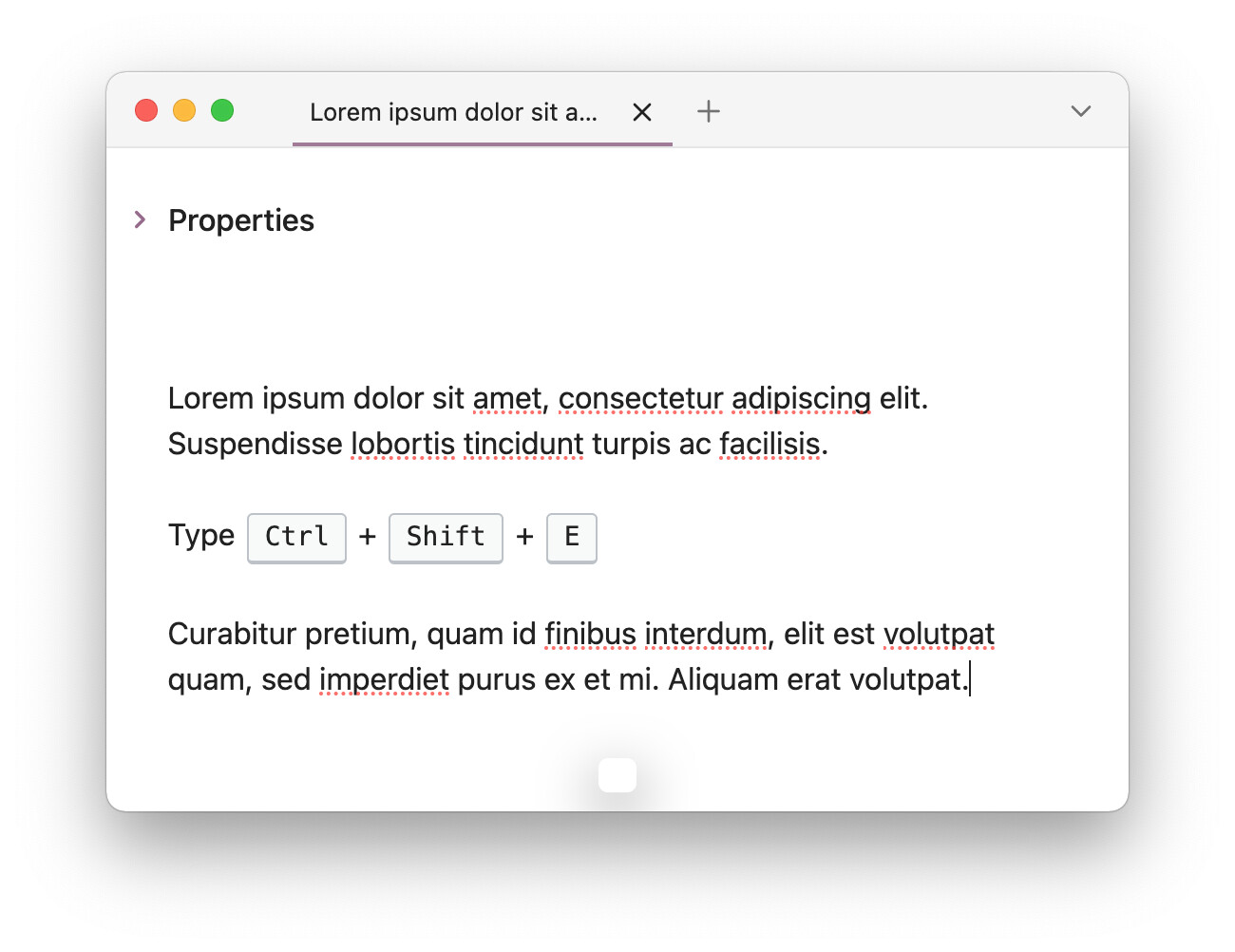
Running the template via Templater: Open Insert Template Modal will wrap the selected text in the note with <kbd> tag, or simply bind it to a hotkey (In my case Ctrl + K). If text is NOT selected, it will simply insert <kbd></kbd> into the cursor position.

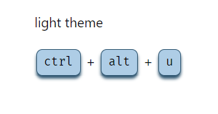
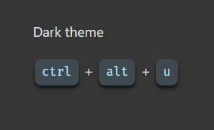
Since <kbd> is an HTML tag, it can be targeted with with a custom CSS snippet, as I wanted it to look more like a keyboard key. I created kbd.css file with the following and placed it in folder .obsidian/snippets/

kbd {
    /* Define custom properties for easy management */
    --key-text-color: #6d6f76;
    --key-shadow: inset 0 -2px 0 0 #cdcde6, 
                  inset 0 0 1px 1px #fff, 
                  0 1px 2px 1px rgba(30, 35, 90, 0.4);
    --key-gradient: linear-gradient(-225deg, #d5dbe4, #f8f8f8);
  
    /* Styling for <kbd> element */
    border: none;
    background: var(--key-gradient);
    border-radius: 3px;
    box-shadow: var(--key-shadow);
    color: var(--key-text-color);
    text-align: center;
    padding: 0.2em 0.6em;
    display: inline-block;
    font-weight: bold;
    font-size: 0.85em;
    min-width: 1em;
  }

Styling credits go to pipic1’s button

This will result in keys to look like this:

kbd-after

Note that the css snippt will style keyboard shortcuts in the command palette:

My editing flow of keys now is:

  • I select the text of the key (using Shift+ keyboard arrows)
  • Then use Ctrl + K to run the Templater’s template which will wrap the key text with <kbd> tags.
5 Likes

Any particular reason why you don’t split the text on space and add each word in a <kdb> tag? (Potentially with the addition of + between each word? )

Then you could select the entire Ctrl Shift Y and get it to display as: Ctrl Shift Y or Ctrl + Shift + Y

1 Like

No specific reason other than most of my notes have the shortcuts written formatted as Key + Key.

The way you suggested is practical and effeciant if your notes had shortcuts written in the way you mentioned CTRL Shift Y, it can be done using:

<%*
const selectedText = tp.file.selection();
if (selectedText) {
  const words = selectedText.split(' '); // Split the selection into words
  const wrappedWords = words.map(word => `<kbd>${word}</kbd>`); // Wrap each word in <kbd> tags
  tR = wrappedWords.join(' '); // Join the wrapped words back into a single string with spaces
} else {
  tR = "<kbd></kbd>";
}
%>

It will produce:
Ctrl Shift Y

If you want them to be seprated with + instead of space:

<%*
const selectedText = tp.file.selection();
if (selectedText) {
  const words = selectedText.split(' '); // Split the selection into words
  const wrappedWords = words.map(word => `<kbd>${word}</kbd>`); // Wrap each word in <kbd> tags
  tR = wrappedWords.join('+'); // Join the wrapped words back into a single string with "+" between them
} else {
  tR = "<kbd></kbd>";
}
%>

It will produce:
Ctrl+Shift+Y

2 Likes

I quite like the style that we have here on the forum so I copied it verbatim. It’s dark mode ready too!

kbd {
 align-items: center;
 border: 1px solid #bcc2c8;
 border-bottom-width: 2px;
 border-radius: 3px;
 box-sizing: border-box;
 display: inline-flex;
 gap: 0.5em;
 font-size: 0.87em;
 justify-content: center;
 line-height: 1.4;
 margin: 0 .15em;
 min-width: 24px;
 padding: .15em .6em;
}

.theme-light kbd {
 background: #f8f9f9;
}

.theme-dark kbd {
 background: #1c1e1f;
}

2 Likes

This Templater script ensures the keys are joined with +, regardless if + was already present or not.

For example:

Input Output
Cmd Tab Cmd + Tab
Ctrl + V Ctrl + V
<%*
const selectedText = tp.file.selection();
if (selectedText) {
  // Split by either spaces or plus signs and trim whitespace
  const keys = selectedText.split(/[\s+]+/).map(s => s.trim()).filter(Boolean);
  // Wrap each key in <kbd> tags and join with ' + '
  tR = keys.map(key => `<kbd>${key}</kbd>`).join(' + ');
} else {
  tR = "<kbd></kbd>";
}
%>
1 Like

Clean! I love it

And thank you for your addition to the script. I have adopted your change in my own script.

1 Like

A little improvement to set the cursor between <kbd>ꕯ</kbd> when there is no selection.

<%*
/* This adds <kbd> tag element around selection smartly.
  Add this snippet to a shortkey */
const selectedText = tp.file.selection();

if (selectedText) {
  // Split by either spaces or plus signs and trim whitespace
  const keys = selectedText.split(/[\s+]+/).map(s => s.trim()).filter(Boolean);
  // Wrap each key in <kbd> tags and join with ' + '
  tR = keys.map(key => `<kbd>${key}</kbd>`).join(' + ');
} else {
  // need to escape angle bracket: https://github.com/SilentVoid13/Templater/issues/1508#issuecomment-2614588285
  tR = `<kbd>\<% tp.file.cursor() %\></kbd>`;
  
  tp.hooks.on_all_templates_executed(async () => {
    app.commands.executeCommandById("templater-obsidian:jump-to-next-cursor-location");  
  });
}
-%>

My style

image
image

/* [KBD] style kbd html tag.css */

kbd {
  --kbd-offset: 4px;

  align-items: center;
  border: none;
  border-bottom-width: 2px;
  border-radius: 8px;
  box-sizing: border-box;
  display: inline-flex;
  gap: 0.5em;
  font-size: 0.87em;
  justify-content: center;
  line-height: 1.4;
  margin: 0 .15em;
  min-width: 24px;
  padding: 0.4em .6em;
}

.theme-light kbd {
  --kbd-border-color: hsl(205, 42%, 31%);
  border: solid var(--kbd-border-color) 1px;
  background: #aecde6;
  box-shadow: 0 var(--kbd-offset) var(--kbd-offset) var(--kbd-border-color);
  color: rgb(0, 0, 0);
}

.theme-dark kbd {
  --kbd-border-color: hsl(180, 5%, 7%);
  background: #3f4950;
  box-shadow: 0 var(--kbd-offset) var(--kbd-offset) var(--kbd-border-color);
  color: rgb(184, 228, 255);
}

3 Likes