This button:
It has no id or unique class to target it, as far as i understand from DevTools.
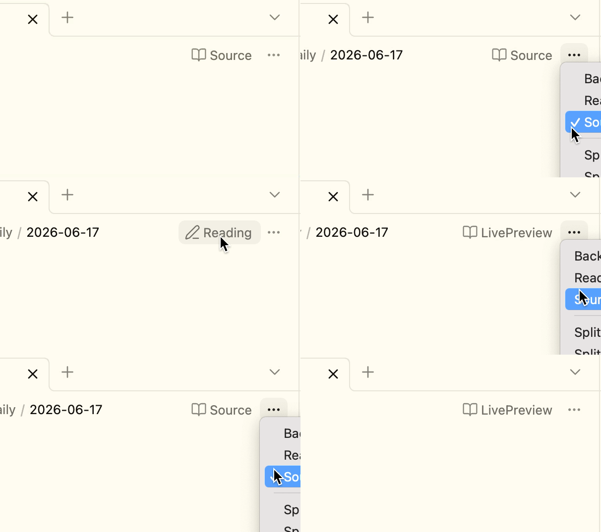
What i want: in my custom plugin, i want to add the ‘current View Mode’ (Source, Preview, ReadOnly) after the icon.
Something like this:
My plugin already has Ctrl E to cycle between the 3 view modes and it displays a notification, but i want to add the name in that icon too, for clarity.
Keybinds:
The notifications:
bumping this, in case someone could help me
Maybe something like this could work?
.workspace-leaf-content[data-mode='source'] .clickable-icon.view-action:nth-child(2)::after {
    content: 'Source';
    padding-inline: 3px;
}

.workspace-leaf-content[data-mode='source']:has(> .view-content > .is-live-preview) .clickable-icon.view-action:nth-child(2)::after {
    content: 'LivePreview';
    padding-inline: 3px;
}

.workspace-leaf-content[data-mode='preview'] .clickable-icon.view-action:nth-child(2)::after {
    content: 'Reading';
    padding-inline: 3px;
}
.view-action[aria-label^="Current view: editing"]::after {...}
.view-action[aria-label^="Current view: reading"]::after {...}
can work as well, but the aria-label can sometimes change depending on the language Obsidian is set to, so probably best not to use that in themes or plugins; in personal snippets it’s fine.
Thank you for your suggestion.
Unfortunately I used something similar, but i dislike the idea because it uses nth-child which seems brittle. What if a plugin, or obsidian, or a theme changes those icons in top right?
Agreed. FWIW, I’ve only ever seen Commander add icons to the left of those two icons, but there are thousands of setups out there.


