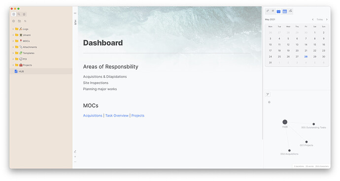
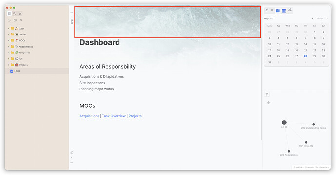
This CSS snippet allows you to create a header image by targeting the alt selector, which defaults to the file name. It will work with any image where the name starts with ‘masthead-fade’.
.view-content {
  z-index: 0;
}

img[alt^="masthead-fade"] {
  width: 100%;
  margin: 0px auto;
  position: absolute;
  top: 0;
  left: 0;
  -webkit-mask-image: -webkit-gradient(linear, left top, left bottom, from(rgba(0,0,0,1)), to(rgba(0,0,0,0)));
  mask-image: linear-gradient(to bottom, rgba(0,0,0,1), rgba(0,0,0,0));
  opacity: 0.4;
  z-index: -1;
}
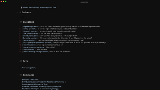
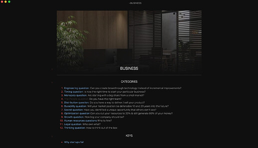
And looks like this.
Nice if you want to add a bit of colour to your pages. It’s a bit of a hack, so your mileage may vary.
17 Likes
Kuncy
May 29, 2021, 8:45pm
2
What a beautiful theme!! Can you share the CSS files ?
2 Likes
Outis
June 10, 2021, 9:30am
3
Thank you for sharing. Would also like to know about the theme you are using.
1 Like
Thanks for a real creative idea!
den
June 11, 2021, 1:43am
5
What a beautiful theme!
For flexibility I recommend to change
img[alt^="masthead-fade"]{...} >>> span[src$="background_fade"] img{...}
This will enable:
to make any image (regardless the file name) to be set as background
by just adding # and suffix [[example.jpg##background-fade]]
4 Likes
den
June 11, 2021, 2:07am
6
It will be amazing if we do not need to make the 16:9 images, but we can use any image in any ration and CSS will crop the image.
css, youtube-data-api
I tried to implement it, but I’m failing in Obsidian…
Just a thougt: You might be able to get at the the image’s data-href property, empty its content, use a :before and declare it a background image. Thus, you could use a background-size of cover or contain.
1 Like
Alex0
June 11, 2021, 1:20pm
8
Wow please let me know when the ratio stuff is fixed!
den
June 12, 2021, 10:13am
9
Editor
Preview
CSS
/* --------------- */
/* Page image background */

.view-content {
  z-index: 0;
}

span[src$="background_fade"] img{
  display:block;
  width: 100%;
  height: 50%;
  max-width: 800px;
  margin: 0px auto -80px auto;
  -webkit-mask-image: -webkit-gradient(linear, left top, left bottom, from(rgba(0,0,0,1)), to(rgba(0,0,0,0)));
  mask-image: linear-gradient(to bottom, rgba(0,0,0,1), rgba(0,0,0,0));
  opacity: 0.7;
  z-index: -1;
}

.markdown-preview-view img:not([width]) {
    max-width: 100% !important;
    outline: none;
}
1 Like
Fanshu
June 18, 2021, 11:49pm
12
Is it possible to support such  link images?
den
June 19, 2021, 2:39pm
13
Not sure… I’m not fan of this formatting in Obsidian.
Fanshu
June 19, 2021, 5:04pm
14
I would like to ask why the text is displayed directly after I use the code segment, instead of having blank lines like you.
2 Likes
Madjest
September 26, 2021, 9:03am
15
To my experience I haven’t found a way to modify it to be able to use the  format but I found an alternative which is this:
HTML
<span src="background_fade" class="internal-embed image-embed is-loaded">

			<img alt="Image not found." src="Put_link_here">
</span>
And for the display issue, it’s because of the margin: -50px auto 0px auto; in the css snippet, sequentially those 4 variables represent top, right, bottom, and left margins, So you just need to set the “bottom ” margin to something like 0px or even just auto works. Hope that helps!
ironhak
December 3, 2022, 7:21am
17
Hi, I did paste this snippet:
/* --------------- */
/* Page image background */

.view-content {
  z-index: 0;
}

span[src$="background_fade"] img{
  display:block;
  width: 100%;
  height: 50%;
  max-width: 800px;
  margin: 0px auto -80px auto;
  -webkit-mask-image: -webkit-gradient(linear, left top, left bottom, from(rgba(0,0,0,1)), to(rgba(0,0,0,0)));
  mask-image: linear-gradient(to bottom, rgba(0,0,0,1), rgba(0,0,0,0));
  opacity: 0.7;
  z-index: -1;
}

.markdown-preview-view img:not([width]) {
    max-width: 100% !important;
    outline: none;
}
On my folder and used your html but it does not work, it does not work either using ![[filename.jpg#background_fade]], some help?
den
December 3, 2022, 10:44am
18
Please use the Banner plugin! Much better solution.
ironhak
December 3, 2022, 11:41am
19
Nice but unfortunately it cover the note title
den
December 3, 2022, 3:27pm
20
For me all is good. Something else is messing with the banner plugin css. Try to disable all plugins or custom css and try banner plugin.
Thank you so much for sharing your thoughts everyone.
I use css
/* banner */
.view-content {
    z-index: 0;
}

span[src$="background_fade"] img,
div[src$="background_fade"] img {
    object-fit: cover;
    object-position: center;
    height: 250px;
    width: 100%;
    margin: 0px auto;
    /* ding wei */
    position: absolute;
    top: 0;
    left: 0;
    z-index: -1;
    /* jian bian */
    -webkit-mask-image: -webkit-gradient(
        linear,
        left top,
        left bottom,
        from(rgba(0, 0, 0, 1)),
        to(rgba(0, 0, 0, 0))
    );
    mask-image: linear-gradient(to bottom, rgba(0, 0, 0, 1), rgba(0, 0, 0, 0));
    opacity: 0.6;
}
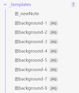
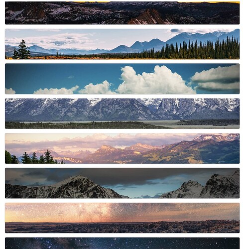
The background image is placed in the directory, which is ignored from the search
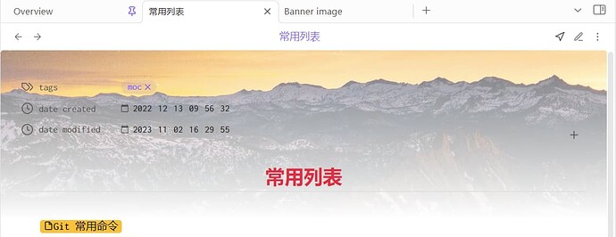
Then use the Templater to create a note, insert a banner in front of the H1, and randomize the background image number.
---
tags: [moc]
date created: 2022-12-13T09:56:32+08:00
date modified: 2023-11-02T16:29:55+08:00
---

# 常用列表
xxx
Effective display:
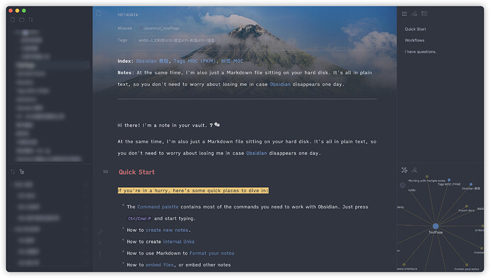
Thank you very much again.
Can get my resources here, welcome star:images & css
1 Like
Hi @Fanshu ,
hihihi
February 6, 2024, 1:03pm
23
Thanks for sharing! I really prefer to it ! So beauty!
