A few days back I played around with Tracker, but I had issues related to getting consistent result of it, so this time I decided to play around with Obsidian charts plugin, and the result of the (collapsed) note below:
Full example for bar chart
## Test data
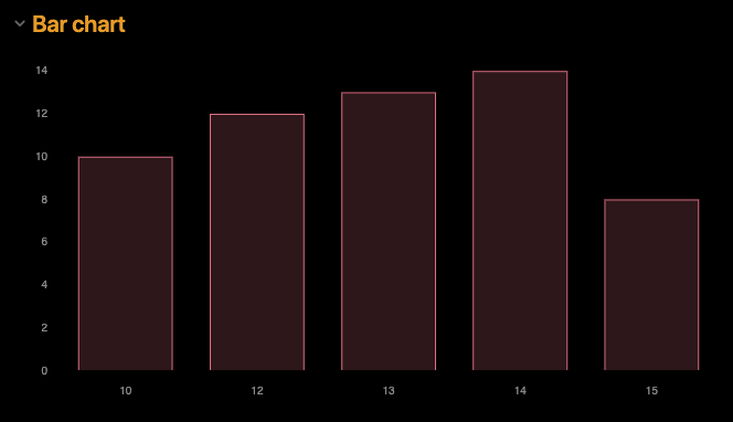
- [date:: 2023-01-10] [weight:: 10]
- [date:: 2023-01-12] [weight:: 12]
- [date:: 2023-01-13] [weight:: 13]
- [date:: 2023-01-14] [weight:: 14]
- [date:: 2023-01-15] [weight:: 8]
## Queried data
```dataview
TABLE WITHOUT ID item.date as date, item.weight as weight
FLATTEN file.lists as item
WHERE file.name = this.file.name
```
## Bar chart
```dataviewjs
const myData = await dv.tryQuery(`
TABLE WITHOUT ID item.date as date, item.weight as weight
FLATTEN file.lists as item
WHERE file.name = this.file.name
`)
const myDates = myData.values.map(d => d[0].day)
const myWeights = myData.values.map(d => d[1])
const chartData = {
type: 'bar',
data: {
labels: myDates,
datasets: [{
label: 'Weight',
data: myWeights,
backgroundColor: [
'rgba(255, 99, 132, 0.2)'
],
borderColor: [
'rgba(255, 99, 132, 1)'
],
borderWidth: 1
}]
}
}
window.renderChart(chartData, this.container)
```
I produced this output:
Hopefully my test file is enough for you to generate your own graphs. The workflow I suggest is like I’ve done in the test note:
- Find the query which generates the data you need in a table format
- Adapt the script which generates the diagrams according to the new query, and to match the new data