Gym workout log - diagrams shall filter for kind of exercise

What I’m trying to do

i am already logging my gym workouts to obsidian with the help of quickadd, dataview and buttons plugin.
now i want to evaluate some data with diagrams, for example with the tracker plugin.
but i wont’ mind to use another plugin.

I am struggling to filter my workout logs.
Each exercise execution gets a dedicated file to a folder.
Now i want to add diagrams that look into all these files and give me date+weight into a diagram.
In SQL that would be: SELECT date,weight WHERE exercise LIKE “%press%”

I couldnt find an option in tracker plugin to filter your datasets, have you got an idea how to accomplish that?

Things I have tried

I’m also interested in hearing others’ workflows for tracking fitness data. I’ve been logging activity related to strength training and just began logging post-workout blood pressure and heart rate at the start of the year.

I’m not sure how I would diagram this data yet but feels like a quick visual would be valuable.

I track my workout data in my daily notes (frontmatter): https://imgur.com/a/HiK3AcR

And create statistics in a dedicated note: https://imgur.com/a/Wpnbs6T
It’s done with Dataview, Obsidian Charts and Obsidian Heatmaps

(some text is in german and french, but i guess you get the point)

1 Like

To be able to answer your query, we need to see some base data. How do you write down date and weight in the exercise file. Are they defined within lists, or are they only present just once in each file?

Without anything to work with, we can’t really help you.

@holroy:
i am having a folder for the exercise logs, each file contains exactly one exercise per day.
So I do 6 exercises in one session, i got 6 files.
The files are frontmatter/yaml’d carrying data of weight, sets, reps and name of exercise.

I can change how the data is collected if that is rerquired, thatfor i didnt post it initially =)

---
date_of_workout: 2022-11-21
exercise: 'Bizepscurl'
weight: 10
reps1: 10
reps2: 7
reps3: 7
volume: 240
type: 'Pull/Core'
---
#workouts

Files are named {{DATE}}-$incrementnumber.

I’m close to midnight here, so if not anyone comes with a solution before me I’ll try to look at this tomorrow now that we’ve got some test data.

2 Likes

@holroy awesome, thank you :slight_smile:

A few days back I played around with Tracker, but I had issues related to getting consistent result of it, so this time I decided to play around with Obsidian charts plugin, and the result of the (collapsed) note below:

Full example for bar chart
## Test data

- [date:: 2023-01-10] [weight:: 10]
- [date:: 2023-01-12] [weight:: 12]
- [date:: 2023-01-13] [weight:: 13]
- [date:: 2023-01-14] [weight:: 14]
- [date:: 2023-01-15] [weight:: 8]

## Queried data

```dataview
TABLE WITHOUT ID item.date as date, item.weight as weight
FLATTEN file.lists as item
WHERE file.name = this.file.name
```

## Bar chart
```dataviewjs
const myData = await dv.tryQuery(`
TABLE WITHOUT ID item.date as date, item.weight as weight
FLATTEN file.lists as item
WHERE file.name = this.file.name
`)

const myDates = myData.values.map(d => d[0].day)
const myWeights = myData.values.map(d => d[1])

const chartData = {
  type: 'bar',
  data: {
    labels: myDates,
    datasets: [{
      label: 'Weight',
      data: myWeights,
      backgroundColor: [
        'rgba(255, 99, 132, 0.2)'
      ],
      borderColor: [
        'rgba(255, 99, 132, 1)'
      ],
      borderWidth: 1
    }]
  }
}
window.renderChart(chartData, this.container)
```

I produced this output:
image

Hopefully my test file is enough for you to generate your own graphs. The workflow I suggest is like I’ve done in the test note:

  • Find the query which generates the data you need in a table format
  • Adapt the script which generates the diagrams according to the new query, and to match the new data
3 Likes

yea works! thank you!
i found this solution for the tracker plugin today: Is there a way to track only file with certain frontmatter? · Issue #54 · pyrochlore/obsidian-tracker · GitHub

solution i refrain from
searchType: text
searchTarget: 'Kreuzheben\n.*\n.*\n.*\n.*\nvolume: (?<value>[0-9]+)'
dateFormat: YYYY-MM-DD
dateFormatSuffix: '-[0-9]+$'
folder: logs/workouts
line:
	title: Kreuzheben Volumen
	fillGap: true
    lineColor: "white"

But i prefer your way - thx a mill! :slight_smile:

1 Like

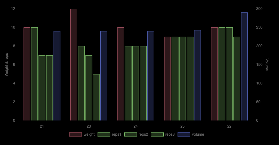
No problem, I wanted to investigate this for some projects of my own, and whilst at it, I created this monstrosity of a bar chart:

Full chart code to generate this chart

I used the same test data as in my previous reply, with the following chart code:

```dataviewjs
const result = await dv.tryQuery(`
TABLE WITHOUT ID
  exercise, date_of_workout, weight, reps1, reps2, reps3, volume
FROM #workouts 
`)

const myHeaders = result.headers
const myLabels = result.values.map(d => d[1].day)
const myData = result.values[0].map((_, colIndex) => result.values.map(row => row[colIndex]))
   
const chartData = {
  type: 'bar',
  data: {
    labels: myLabels,
    datasets: [{
      label: myHeaders[2], 
      data: myData[2],
      backgroundColor: 'rgba(255, 99, 132, 0.2)',
      borderColor:     'rgba(255, 99, 132, 0.9)',
      borderWidth: 1,
      yAxisID: 'left-y-axis'
    }, {
      label: myHeaders[3], 
      data: myData[3],
      backgroundColor: 'rgba(99, 255, 132, 0.2)',
      borderColor:     'rgba(99, 255, 132, 0.9)',
      borderWidth: 1,
      yAxisID: 'left-y-axis'
    }, {
      label: myHeaders[4], 
      data: myData[4],
      backgroundColor: 'rgba(99, 255, 132, 0.2)',
      borderColor:     'rgba(99, 255, 132, 0.9)',
      borderWidth: 1,
      yAxisID: 'left-y-axis'
    }, {
      label: myHeaders[5], 
      data: myData[5],
      backgroundColor: 'rgba(99, 255, 132, 0.2)',
      borderColor:     'rgba(99, 255, 132, 0.9)',
      borderWidth: 1,
      yAxisID: 'left-y-axis'
    }, {
      label: myHeaders[6], 
      data: myData[6],
      backgroundColor: 'rgba(99, 132, 255, 0.2)',
      borderColor:     'rgba(99, 132, 255, 0.9)',
      borderWidth: 1,
      yAxisID: 'right-y-axis'
    }]
  },
  options: {
    plugins: {
      legend: {
        position: 'bottom'
      }
    }, 
        scales: {
            'left-y-axis': {
                title: {
                  display: true,
                  text: "Weight & reps"
                },
                type: 'linear',
                position: 'left'
            },
            'right-y-axis': {
                title: {
                  display: true,
                  text: "Volume"
                },
                type: 'linear',
                position: 'right'
            }
        }
    }
}
// console.log(chartData)
window.renderChart(chartData, this.container)
```

Please don’t ask me to explain all the stuff going here. I’m not sure I really understand it myself. :smiley: But do know that it’s possible to do a lot with this plugin, which relies upon Chart.js | Chart.js.

1 Like

holy lord :slight_smile: giggle

This was a template posted on Reddit and shared thru @EleanorKonik’s Roundup newsletter.

I haven’t played around with it yet but pretty thorough

PWF

2 Likes

i’ve adapted the chart to display my current weight compared to my avg weight of last $x datasets to flatten the curve a little.

source
const result = await dv.tryQuery(`
TABLE WITHOUT ID
  weight, date_of_healthlog
FROM #weightlog and "logs/health"
`)
const myHeaders = result.headers
const myLabels = result.values.map(d => d[1].day + "." + d[1].month)
const myData = result.values[0].map((_, colIndex) => result.values.map(row => row[colIndex]))

let carousel = new Array()
let i = 0

const avg = result.values.map(row => { 
	carousel[i] = row[0]
	let sum = carousel.reduce((a, b) => a + b, 0)
	let avg = (sum / carousel.length).toFixed(2)
	if( i < 3 ) { i = ++i } else { i = 0 }
	return avg
})

const chartData = {
  type: 'line',
  data: {
    labels: myLabels,
    datasets: [{
      label: myHeaders[0], 
      data: myData[0],
      backgroundColor: 'rgba(255, 99, 132, 0.2)',
      borderColor:     'rgba(255, 99, 132, 0.9)',
      borderWidth: 1,
      yAxisID: 'left-y-axis'
    },{
      label: "avg weight", 
      data: avg,
      backgroundColor: 'rgba(120, 99, 132, 0.2)',
      borderColor:     'rgba(120, 99, 132, 0.9)',
      borderWidth: 1,
      yAxisID: 'left-y-axis'
    }]
  },
  options: {
    plugins: {
      legend: {
        position: 'bottom'
      }
    }, 
        scales: {
            'left-y-axis': {
                title: {
                  display: true,
                  text: "Kg"
                },
                type: 'linear',
                position: 'left'
            }
        }
    }
}
// console.log(chartData)
window.renderChart(chartData, this.container)

i will have a look :slight_smile:

This topic was automatically closed 7 days after the last reply. New replies are no longer allowed.