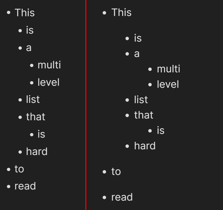
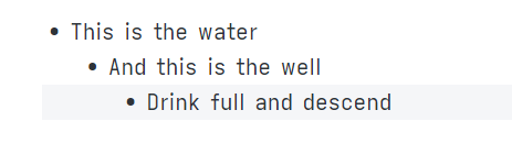
The formatting of lists and list items in live preview (in the old editor as well) looks sort of slobby, at least when you use a proportional font which I think is the logical scenario when you expect live preview readability. The problem is that Markdown defines a indention of 4 spaces for each list item level. With monospace font there is no problem, but with proportional font 4 spaces shrink in space significantly. This make it very hard to quickly get the structure of a multi-level list and makes a very uneasy impression. I suppose, this is also the reason why in standard preview mode the indention for each list item level is increased significantly, see comparision:
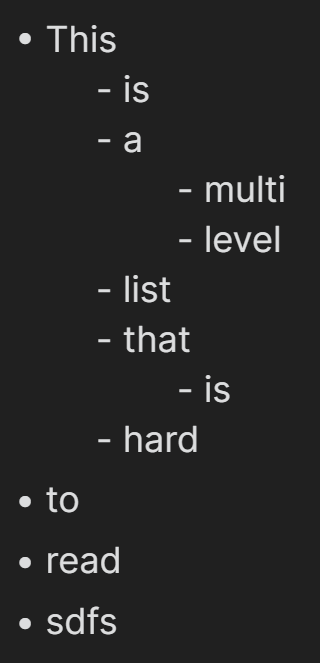
I know, that configuration has the option to increase the number of spaces, used for indention. This is not really a solution though, because 1st it breaks Markdown compliance and 2nd - more importantly - it breaks the live preview generation of bullet points instead of the list character from the 2nd level onwards:
The best solution would be to dynamically increase the indention of list item levels in live preview and draw indention lines for better orientation within a multi-level list.
Yes, I know the issue relates to using a proportional font:
However, the point of the whole preview/live editor is to render the content in a “readable” way, and that at this point means using the proportional font. Otherwise, I could just use a pure editor experience. Thus, I would argue that this is not really a solution to the described problem.
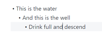
You misunderstood me. The snippet changes the font only for the indentation characters (spaces). Here is what the result looks like. Note that the indentation is longer, and the text font is Segoe UI:
I also tried the CSS for indent lines that was available for the legacy editor, but it did not work with the new live editor. Does a CSS snippet exist already for the new editor as well that I did not come about?
I’m not sure I understand your question. Could you elaborate? (Also, please reply to my messages directly, since clicking on “Reply” under a user’s message instead of replying to the thread as a whole sends the user a notification.)
I noticed some problems with the fix I described above: e.g. different font faces on the same line make text selection a bit ugly:
There is another solution: using a font with wider space glyphs, e.g. Iosevka Aile:
Compare this to Segoe UI:
Overall, it looks like indentation is computed through JavaScript, and there is no way to add a clean CSS fix. So we’ll have to wait for a fix from the devs.
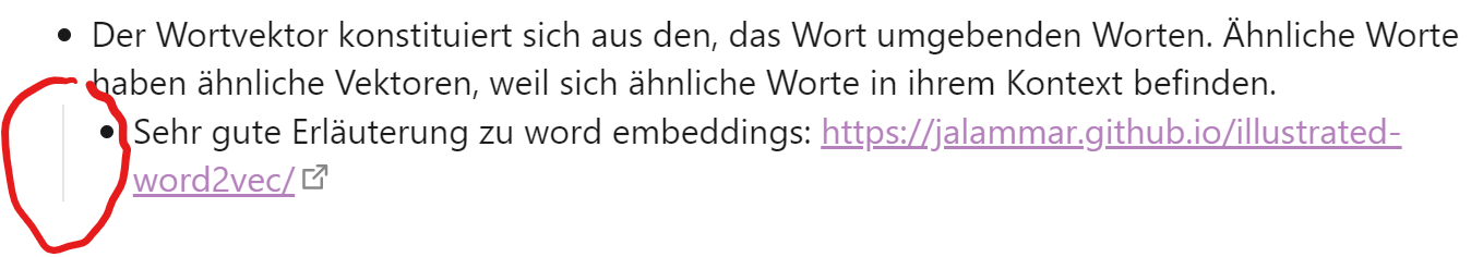
For the legacy editor an CSS snippet exists (for instance on kmaasrud/awesome-obsidian: Awesome stuff for Obsidian (github.com)) that drew vertical indention lines, like the one circled in the image below. In the live preview this snippet does not work any longer. The 2nd part of the question was meant to be about such visual idention lines.
Unfortunately, it breaks the hack for greater indention by @bishop1860 though. So it appears I have to decide between the one or the other.
An additional question: Is it possible to turn the rainbow colors into just gray? I am a big fan of low contrast and few distraction. I tried myself by changing the --rb-indent-X colors to #333333 and var(--background-secondary). Unfortunately both attempts made the lines disappear completely.
 Awesome stuff for Obsidian (github.com)