Hi everyone!
I’ve put together some ideas for the graph view!
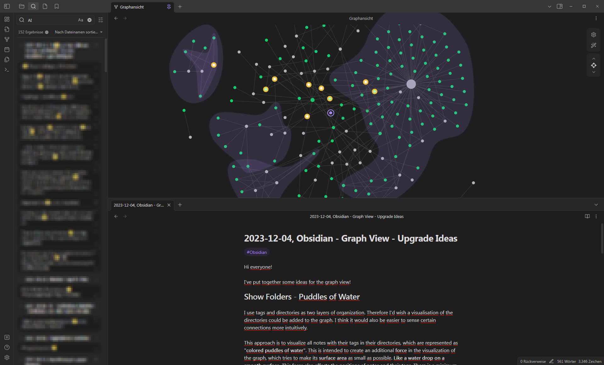
Show Folders - Puddles of Water
I use tags and directories as two layers of organization. Therefore I’d wish a visualisation of the directories could be added to the graph. I think it would also be easier to sense certain connections more intuitively.
This approach is to visualize all notes with their tags in their directories, which are represented as “colored puddles of water”. This is intended to create an additional force in the visualization of the graph, which tries to make its surface area as small as possible. Like a water drop on a smooth surface. This force also affects the positions of notes and their tags. There is a minimum distance between the edge line of a drop and a node. These puddles of water will overlap where notes share tags.
The color of the puddles is suggested somewhat transparent, which highlights the overlapping areas well. Subdirectories can also be displayed in this way. In order to be able to display any number of subdirectories, the most transparent color value with the most opaque color value would have to be gradually divided into the number of directory levels that occur.
I think the formation of the puddles would be a very nice effect.
Related post: Show folders as areas in the graph
Highlight Current Node
I think it would be comfortable if the current note would be visible better.
It is difficult for me to find the current note in the graph. I would therefore suggest a marker for the current note - a purple ring.

If there should subsequently be a button to center the view around the current note, you could animate the ring briefly immediately after centering to draw attention to it. The animation could be a brief increase and then decrease of the ring. The power-ups from Super Metroid (SNES) come to mind. ![]()
Highlight Search Results
It would be cool if you could also see the search results in the graph. Maybe then you could see a kind of train of thought. These are the orange marked nodes in the graph.

If the current note is also included in the search results, the purple ring turns orange and the node turns white.

Focus Button
I was “inspired” by Kumu, a tool for visualizing complex adaptive systems. There it is possible to determine the depth of the displayed linked nodes. When you click on the focus button you can use the arrows to set the level of visualization depth.
(Kumu only shows the focus button if a node is selected).

That’s really nice to get an overview of the surroundings for a certain node.
Geographic determination
I think it would be a great advantage if there was an option to display the nodes at fixed positions. Here is a related post:
https://forum.obsidian.md/t/graph-positional-locking/24505
Perhaps you could use a hash or even something like the Word2vec algorithm on the title of the note to calculate the coordinates, since the title rarely changes.
Ideally, when a new note is added, as few notes as possible should change their position as little as possible. If the user changes the position of a note manually, the position should be saved.
I’m looking forward to hearing what you think of these suggestions!
Best, Mutzu