Graph Update

Hello!

I started using Obsidian primarily because of the graph feature — it immediately caught my attention with its visual appeal and potential for mapping knowledge. However, after using it more extensively, I realized that the graph currently serves more as a visual toy than a truly powerful organizational tool. I’d like to share a few suggestions that I believe could significantly enhance its functionality.


1. Manual Control Over Graph Links

Currently, the graph is built entirely on internal links, which is convenient, but in some cases, it’s excessive. It would be extremely helpful to have:

  • The ability to manually create relationships between notes that appear in the graph, independently of whether those notes are linked in the content.
  • The option to hide specific internal links from appearing in the graph, to avoid clutter from secondary or less relevant connections.

This would give users more control over the structure of their graph and allow them to distinguish between logical relationships and simple technical links.


2. Clusters and Folder-Like Grouping in the Graph

For larger projects, the graph lacks a sense of hierarchy and abstraction. Here are some ideas that could help:

  • The ability to create cluster/folder nodes that group related notes inside the graph. For example:
    • A cluster called “Drawing”
    • Inside it — subclusters “Realism” and “Cartooning”
    • Inside those — individual tool notes
  • An option to automatically expand/collapse clusters, allowing users to control the level of detail shown in the graph.
  • The ability to visualize folder structure or custom groupings within the local graph view to better reflect how the notes are organized.

Example use case:

  • A central note: “Pixel Art”
  • It connects to two clusters: “Realism” and “Cartooning”
  • Inside “Realism” — only “Shading” and “Linework” have actual connections to “Pixel Art”
  • Inside “Cartooning” — only “Palettes” are linked
  • Other related notes remain grouped but unlinked to the center node

This allows users to isolate auxiliary content, maintain structure, and avoid overwhelming the graph.
Did you search the forum before posting? I believe there are existing requests for at least some and possibly all of these.

If any don’t have existing requests, please make a thread for each request. Lumping them together makes them harder to find, discuss, and track.

Thanks!

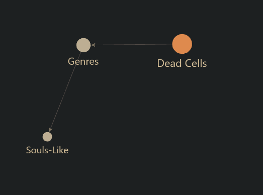
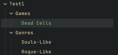
For example, now I have this structure


And this is what the connection looks like on the graph

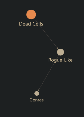
I would like it to look something like this, but so that it would be visually clear that “Ganres” is a folder

that is, the connection between notes must have a category, and after this category, connections to the necessary notes.

We can say that the connection must be sent to the category, and the category to the notes that are connected to the root note

P.S. How can i change topic name?

To achieve that I think you would need "Dead Cells to link to “Genres” and “Genres” to link to “Souls-Like”. To make it clear that “Genres” is a folder, you could indicate that in its name or you could make a Graph filter to change the color of folders (you might need to do something additional to make folder notes easy to identify, like giving them a tag).

Use the pencil icon at the end of the title. If there isn’t one or it doesn’t let you edit, post the new title in a comment and I or another moderator can change it for you. (New users have limited permissions.)

Hey there!

Your ideas are pretty well thought, so I’ll try to give you some feedback based on my experience so far, one by one.

1-1. Manually creating anything inside a graph would kind of break the purpose of itself as a whole: being a visualization of your vault. I’m not entirely sure what you want to create specifically, but again, doing so would be against its “ethos”.

1-2. Hiding stuff is already a thing! Open the options menu that’s located inside the Graph View and “filters” is the very first option you’re gonna see. -path:“Folder” and -file:“Note” are some of the filters that you can use. There might be others, but these are the one that work out for me. Be sure to read Obsidian’s documentation to learn more about the subjekt :slight_smile:


2-1. These are, again, up to you. Graphs cannot have anything else but notes, attachments and tags. A current workaround would be creating an index, in other words: a note that collects notes. I have a index for all my art related stuff, and it’s just a note that has a list of notes. It’s purely created to make the graph look prettier and less cluttered, as you said, and I think it’s the perfect solution for said issue.

2-2. IIRC there are plugins that let you visualize folders in graph view, but I think structure a feature. And, to be honest, I can’t even think of how would folder structure / hierarchy be displayed in a blank space full of nodes.


3-1. To make some stuff stand out from others, in the previously mentioned menu (where filters are located) there’s an option to colorize nodes that are located inside each folder. “Groups”, as they’re officially called, work like this: path:“/Folder”.

3-2. Said “categories” could be the “indexes” I told you about. Nodes are buttons; in fact, nodes are notes. You can’t have a node that leads nowhere, but you can create your own categories as .md files. If all this isn’t clear enough for you, just let me know and I’ll be more than happy to share some examples with you.


As our friend Cawlin said, therr are plenty of Graph-related posts in this forum. It’s always useful to do some research first, because who knows and maybe your questions’ve been answered already!

As you said, “the graph is built entirely on internal links” and it “serves more as a visual toy than a truly powerful organizational tool”, and that’s because it is. I love Graph view as much as you do, but it’s no more than eye candy. If you’re looking forward to create a big vault with thousands of notes that are linked between each other, then it’s gonna become a mess sooner or later.

Search for graph view displays online and you’ll soon realize that it’s pretty, but not efficient. Everyone that has invested some serious time playing with graphs has come to your same conclusions, and it’s honestly not getting better than this anytime soon. Its purpose is to visualize notes as nodes as if it were “our brains neuronal network”, but thoughts — just like nodes — come and go through our minds. There’s no need for it to be better because they’re your notes after all, and — just like thoughts — you know where all of it comes from and where does it go.

I’ve already shared with you some of the powers of the Graph menu, but I’ll let you explore the rest on your own :wink: Hope it helps!

Have a great week!
Best regards, Z

moved this thread to help for not following the FR template.