This dataview query gets me the average mood for each day in the given week.
    TABLE without id
    	link(file.link, weekday) AS Day,
    	round(average(nonnull([mood1, mood2, mood3, mood4]))) AS "Avg Mood"
    	FROM "periodic/daily"
    	WHERE contains(week, "2023-W28")
In my weekly note, I would like to show a line graph of the daily average. I have tried to get this to work using the following plugins, Tracker, Charts View and Obsidian Charts, but to no avail.
It would be amazing if anyone could point me in a logical direction.
It uses DataviewJS, which gets pretty complicated, but it shouldn’t be too hard to do what you need. Do you want one line for each mood or a single line that is the calculated average of all the moods?
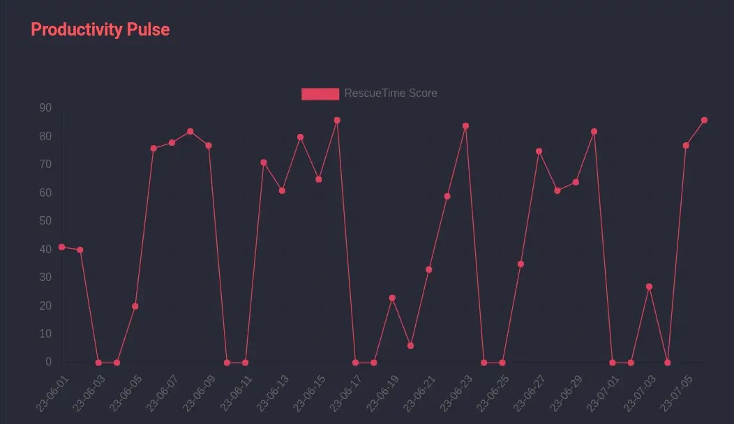
Here’s a small modification to the code in the article above to average that data inside the graph. You’ll have to have DataviewJS enabled and the Obsidian Charts plugin installed and enabled. You’ll also have to add your own journal path below.
```dataviewjs
const journalPath = '"path/to/your/journals"';
const chartColor = '#de425b';
const dailyNotesPlugin = app.internalPlugins.plugins['daily-notes'];
const dateFormat = dailyNotesPlugin.instance.options.format;
var labels = [];
var data = [];
var sortByName = ((a, b) => moment(a, dateFormat).format('YYYYMMDD') - moment(b, dateFormat).format('YYYYMMDD'));

var latest_journals = dv.pages(journalPath)
	.sort(j => j.file.name, 'asc', sortByName);

for (var i=0; i < latest_journals.length; i++) {
	var j = latest_journals[i];
	if (j['mood1'] !== undefined) {
		var average = (j['mood1'] + j['mood2'] + j['mood3'] + j['mood4']) / 4;
		data.push(average);
		labels.push(j.file.name);
	}
}

const lineChart = {
	type: 'line',
	data: {
		labels: labels,
		datasets: [{
			label: 'Avg Mood',
			data: data,
			backgroundColor: [chartColor],
			borderColor: [chartColor],
			borderWidth: 1
		}]
	}
}
window.renderChart(lineChart, this.container);
```