Bug Description
Fonts are rendered differently from place to place in Obsidian.
For example, a 400 weight 15px font is rendered differently in Preview Mode and Edit Mode. (I am sensitive enough to the visual appearance of fonts that I find it very distracting.)
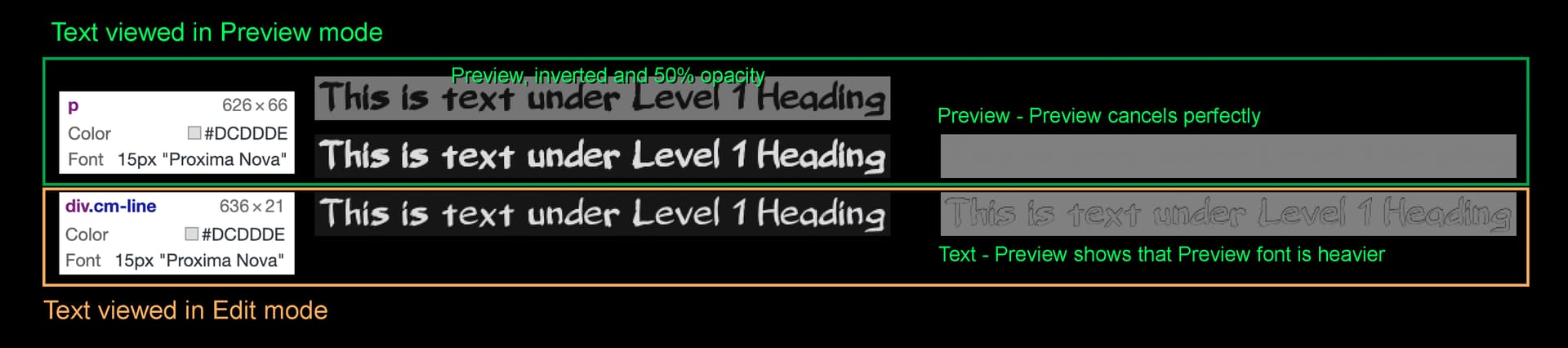
The difference is illustrated in the image below, which shows the same text in both modes. DevTool reports that the two fonts are identical (15 px, same color, font-weight 400) but as rendered the Preview Mode font is noticeably heavier. That difference is especially easy to see when subtracting one font from the other.
Steps to reproduce
First, I made absolutely sure that all rendering began with the same font data:
-
I specified my own fonts (Proxima Nova) in the theme CSS file using @font-face. I provided fonts with weights of 200, 300, 400, 600, 700, 800, and 900.
-
To clearly tag a specific font I then replaced the source data for the 400 weight font with the source data a font called “Belligerent Madness.”
To be clear, I swapped out:

/* Source data from Proxima Nova*/
@font-face {
    font-family: 'Proxima Nova';
    src: url(data:application/font-woff2;charset=utf8;base64,d09GMgABAAAAAE8EABIAA... ;
    font-weight: 400;
    font-style: normal;
}

with

/* Source data from Belligerent Madness */
@font-face {
    font-family: 'Proxima Nova';
    src: url(data:application/font-woff2;charset=utf8;base64,d09GMgABAAAAAISsABAAA... ;
    font-weight: 400;
    font-style: normal;
}
- I specified the default font weight in :root
:root {
  font-weight: 400;
}
- I then stepped through changing :root{font-weight} to 200, 300, 400, 600, 700, 800, and 900.
- The result was as expected. The page rendered with an actual Proxima Nova font for all weights except 400, which rendered using Belligerent Madness.
- All steps were checked along the way using DevTool, which reported that calculated values were as expected.
This established with certainty that all 400 weight text was being rendered using the same source font data.
The font that appears in the image above is Belligerent Madness, which means (conclusively) that both Preview Mode and Edit Mode were being rendered using the same font. (Again, the only place Belligerent Madness was available was through the font specification labelled Proxima Nova, font-weight:400.)
Expected result
What I should have seen is text that was identically rendered in both Preview Mode and Edit mode.
Actual result
The text rendered in Preview Mode was noticeably heavier than the text rendered in Edit Mode.
The difference can be seen in the image above:
-
The green box shows screen shots taken in Preview mode. The orange box shows screen shots taken in Edit mode.
-
The frames on the far left show DevTool reports on the two lines of text. Both modes showed the same color, size, and font specification. In the computed section of DevTool they also both showed a font-weight of 400.
-
The only difference is that in Preview Mode the text was inside a paragraph, while in Edit Mode the text was inside a span with class div.cm-line.
-
On the right, the top box shows the difference between the Preview font and itself. (This was made by taking the Preview font rendering, inverting it, then placing it on top of the original with 50% opacity. The result is perfectly flat, showing that the technique properly displayed the difference.)
-
The bottom box on the right shows the difference between the font rendered in Preview mode and the font rendered in Edit mode. The visible edges result from the heavier rendered weight in Preview mode. (Note that because of the way the difference was taken, the difference in the image is only 50% of the actual difference.)
Environment
macOS Monterey v12.3.1
iMac, 27-inch Retina 5K display
Obsidian v0.14.6
Apart from what is described above, this was done using the default Obsidian theme. CSS modifications were not made in snippets. Rather, I captured the default CSS from app.css in DevTool and used that as the theme that I modified.
Additional information
This feels like a Chromium bug. An obvious next step is to see if I can replicate the issue using Chrome directly.
