It can actually be done, but it’s a little tricky:
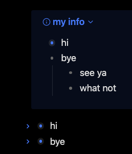
In the image, I’ve collapsed the first hi bullet item, as can be seen by the ring around the dot. So if you click with your mouse just to the left of the bullet (but not to the left of the callout icon), you’ll be able to collapse it.
In other words, it seems like the collapse indicator wrongfully adapts the color of the callout to such an extent that it is hidden. In my simple tests, this applies to both the default theme and Minimal theme, but not the Prism theme.
I’ve not figured out which parts of the CSS needs to be altered to make it visible again, but I’m sure it can be done somehow…
I’m kind of thinking that’s a no-go… The thing, as I’ve experienced it at least, is that when stuff is at a “secondary” level, they tend not to work as if they were at the “primary” level.
So the list you want to is not at the outer (or “primary”) level, but rather a part of a block quote (aka the callout), so therefore it’s at a “secondary” level. This can be seen in the DOM where the outer level list, is tagged with various “cm-list…” and “cm-fold-indicator” and so on. The one within the blockquote however, is just a “li” element with not extra class for folding or what not.
Some of the same “primary”/“secondary” behavior can be seen when using Admonition style callouts, where links within the callout won’t be renamed, and so on. Same applies to links within dataview queries, and headers from a dataview query can’t always be collapsed either.
The point being, that many of the plugins (and some of the “extra” functionality) can produce output which looks the same as the “base” / “primary” markup, but due to its “secondary” nature, they don’t behave the same.